Brand Launch: Swanky I Do’s

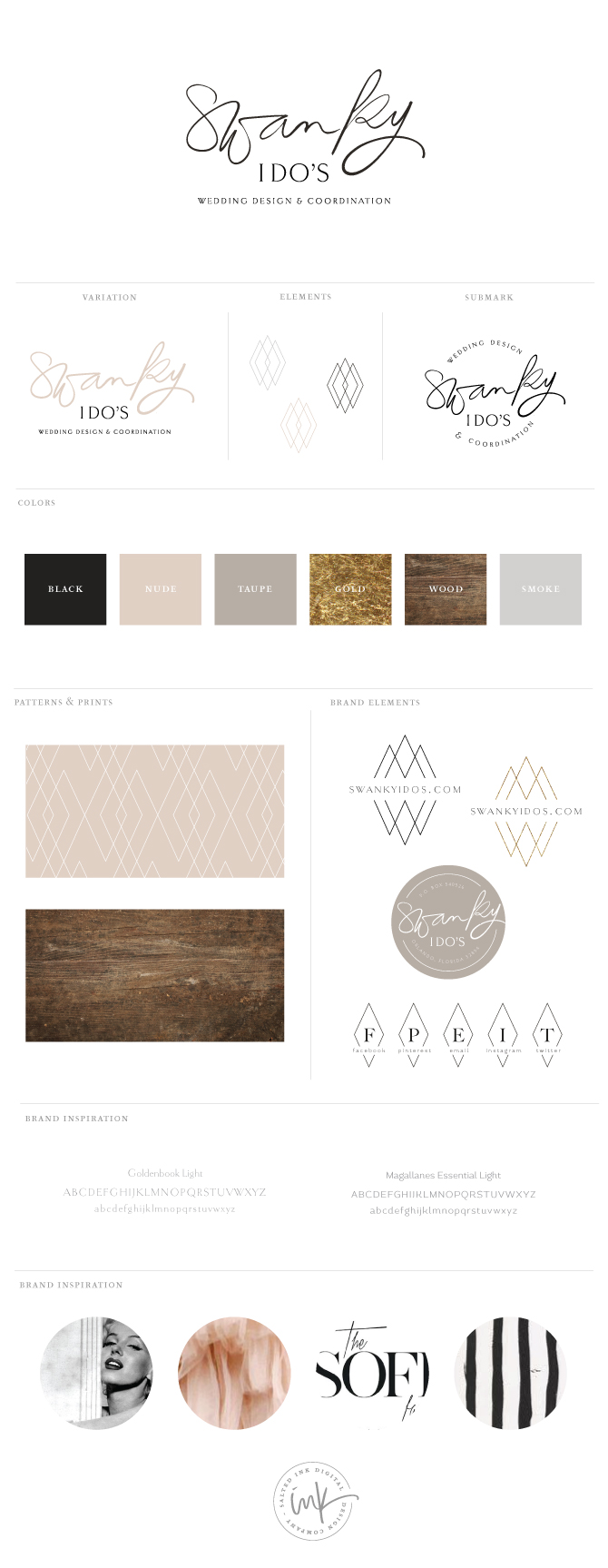
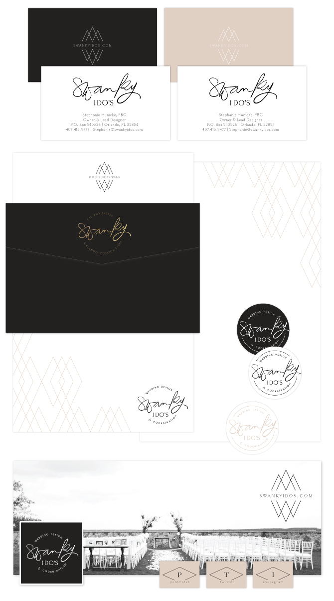
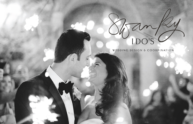
Swanky I Do’s is Orlando’s premier wedding and event planning company owned and operated by Stephanie Hunicke, lead designer and planner who was so wonderful to work with.  Stephanie was looking to create a more cohesive brand identity for her already successful and established wedding and event planning business.  We decided on a neutral color palette with a pop of gold foil and focused on showcasing her black and white photos in her branding material for a true “swanky” feel.  Her logo consists of a hand lettered brush pen and a thin serif font.  Check out the details of our process below along with the final product.

SwankyIDosBrandingInspriatoinFINAL

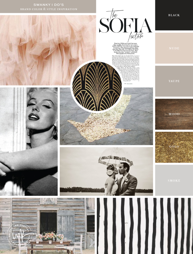
Inspiration Image Credits:  Tule // Sofia Factor // Pattern // Marilyn Monroe by Nick de Morgoli -1953 // Arrow // Couple // Barn // Stripes
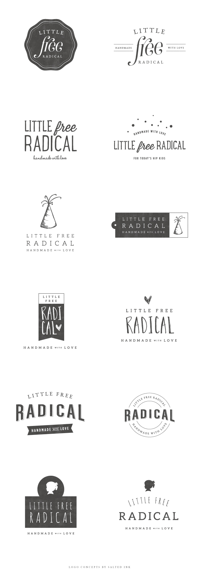
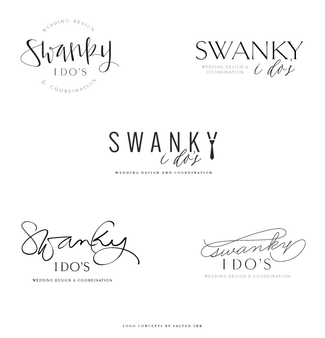
LOGO CONCEPTS

Stephanie was looking for the logos focus to be on placed on the word “swanky” with little or no imagery involved.
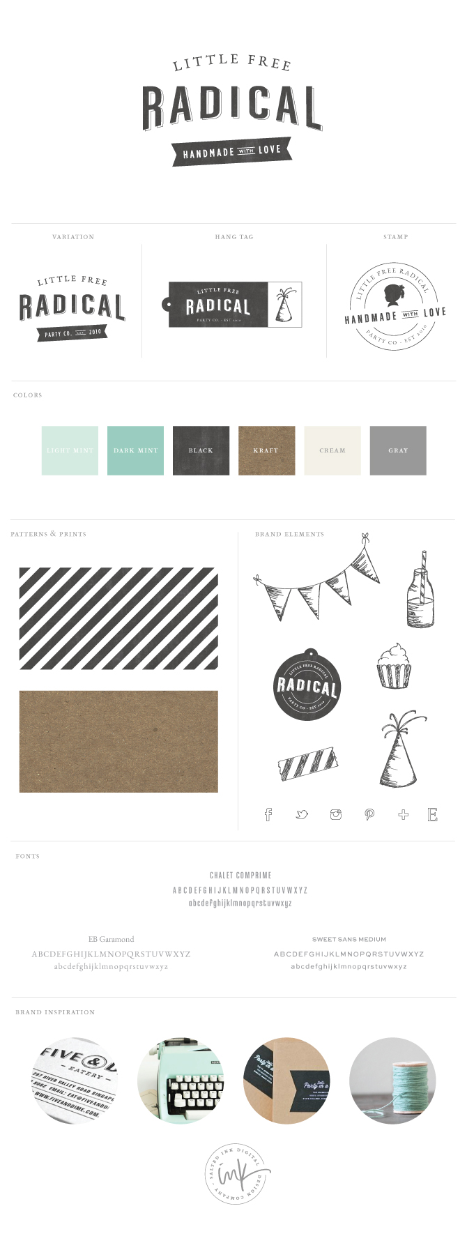
SwankyIDosBrandingConceptsFINAL

FINAL BRAND STYLING

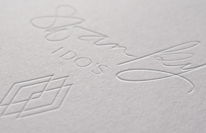
With a slight edit to the “k and y”, the brush pen logo was the winner and we chose a geo diamond mark as an element and pattern for branding accents.

SwankyIDosBrandFINALSwankyStationery

SwankyIDosBrandingLogoLetterpress

SwankyIDosBrandingPhoto1

SwankyIDosBrandingPhoto2

Brand Launch – Little Free Radical

If you love Etsy and handmade goods, you have probably already heard of Little Free Radical. Crystal, owner and mastermind behind LFR, sells handmade and eco friendly, locally manufactured products perfect for your next party, wedding or photo shoot. Coming from a formerly very colorful brand, Crystal was looking for a more minimal color palette this time around and really wanted to something with a retro/vintage feel. For the inspiration, we combined a couple shades of mint, black and gray as well as a dark kraft that she plans to use for her new packaging. 

LFRBrandingInspirationbySaltedInk
package  //  lager  //  typewriter  //  twine  //  tascosa  //  five & dime  //  the hollands

Once we established the overall mood and color palette for her new brand development, I got to work on the logo design. I had so many different ideas for this one that I actually ended up presenting quite a long list of options. I put together a variety of hand drawn lettering and elements as well as some fun font combinations.  Here are the samples:

LFRBrandingConceptsBySaltedInk

After seeing the different logo options, Crystal stuck true to her initial retro vision but also loved a lot of the elements in the other concepts like the party hat and silhouette. So, we combined and expanded on all of her favorite things to form one pretty awesome brand with lots of product sketches to be used on her new packaging. We also created some cool little tags, stickers, and stamps to get her started with plans to break ground on her new website in the fall.

LFRBrandingFinalbySaltedInk LRFstationery

Style Me Pretty Feature – Mint 102 Wedding Branding

Angela and I are always flattered to have our work from Mint 102 featured on Style Me Pretty, but this time is just a little extra special to me.  The Marshall/Dart wedding is featured on their Little Black Book Blog and Midatlantic Regional Blog blog today and we are so honored they found it worthy to share.  Please check out the full blog post on SMP with all the details and more pictures of how our crazy, windy, awesome party in the OBX all came together.  Also, feel free to visit our sister company, Mint102.com, to learn more about how Angela of Saffron Avenue and I joined creative forces to offer our custom wedding branding services.  Lovely photos below taken by Brent and Amanda of the awesome Millie Holloman Photography.

SMP-BlogMARSHALLDARTWEDDING