Hello, again!

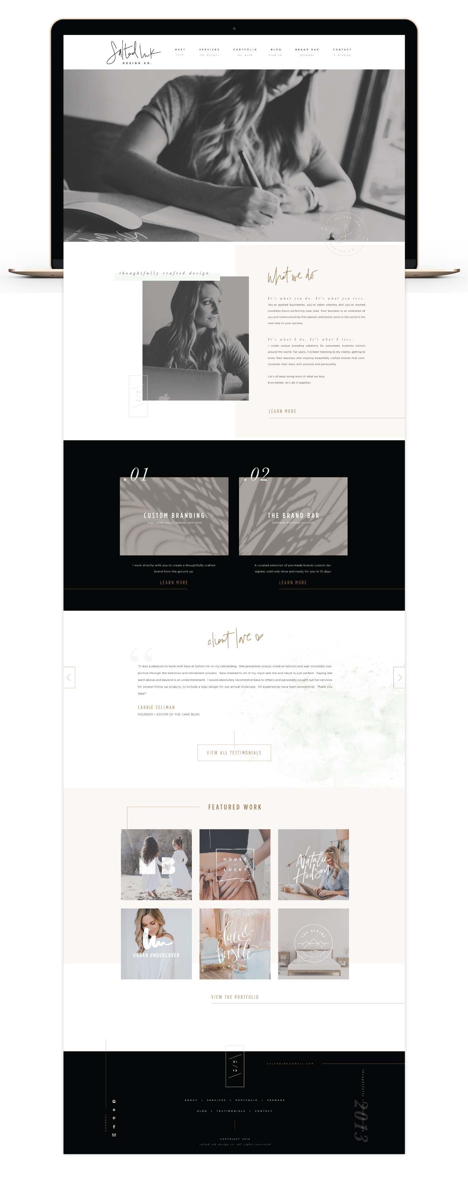
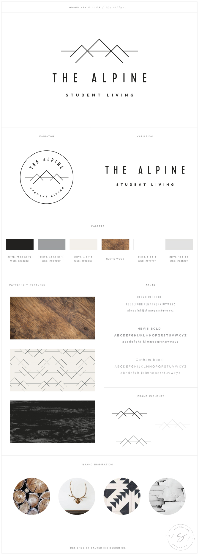
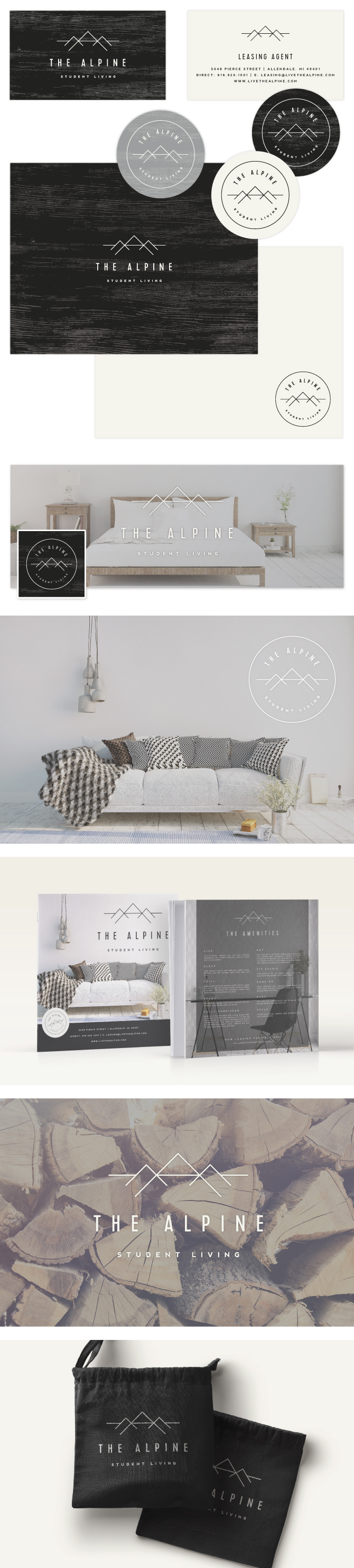
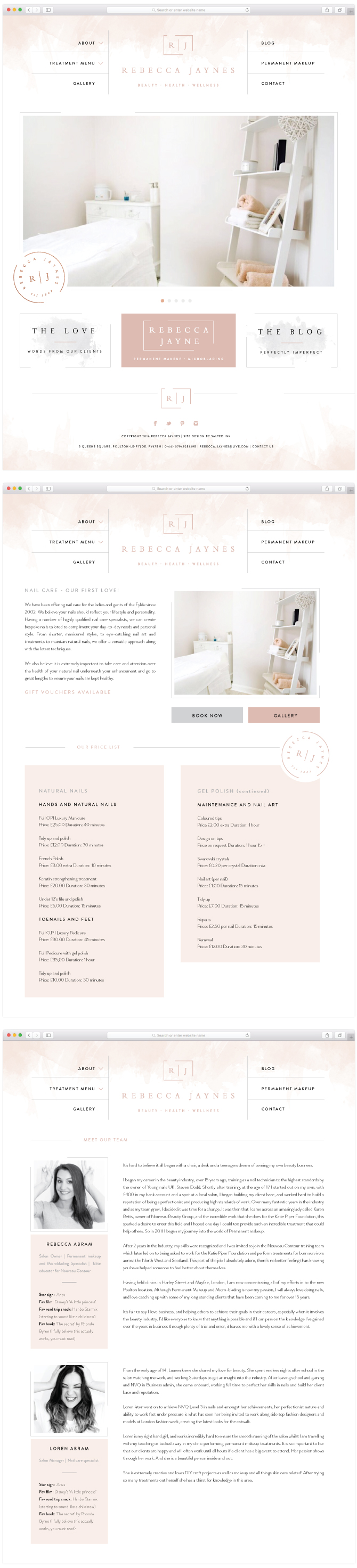
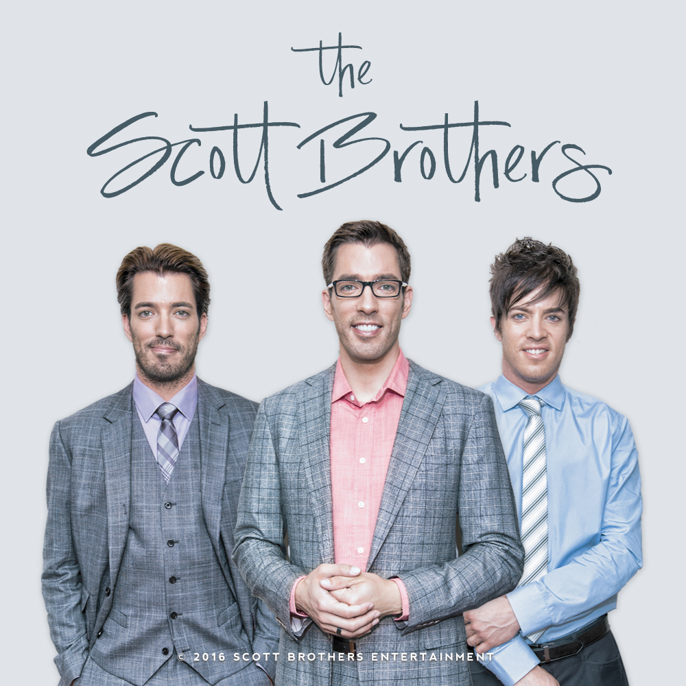
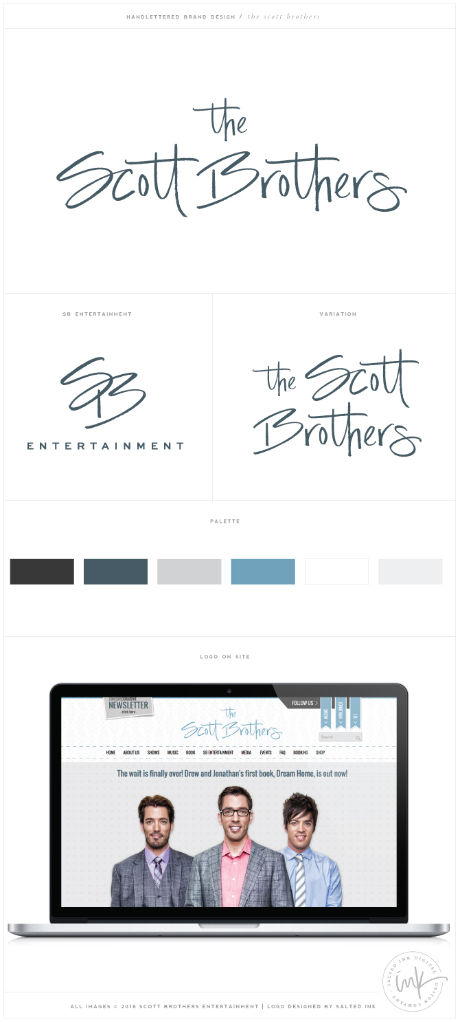
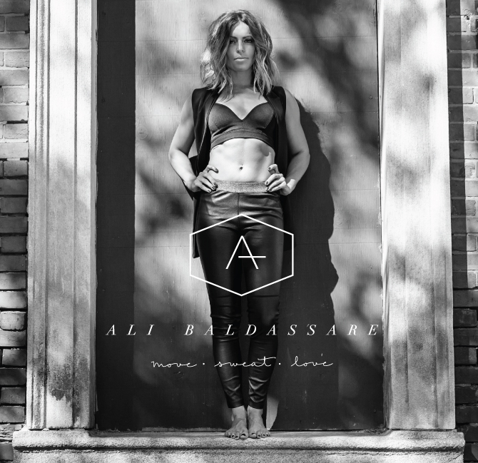
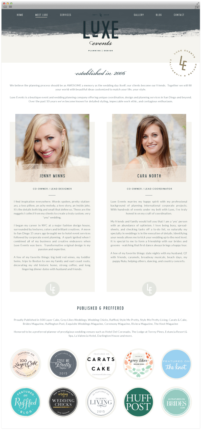
It feels SO good to be live! And just a few days past my 6th anniversary of going full time solo with Salted Ink back in 2013. If I am being honest, it’s taken me a lot longer then I would have liked to get this launched. But we’ve had 3 babies since I last redesigned my site in 2014 (gasp)… yep, 3 boys in 4 years. Finding balance in my role as a mom and business owner has been a learning curve and so often my own brand has taken a backseat to my client work and doing ALL the things moms do. But I am oh so grateful for this business and my clients that have allowed me to be at home with my all dude crew while still continuing to do what I love. This is truly my dream job.

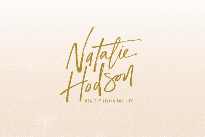
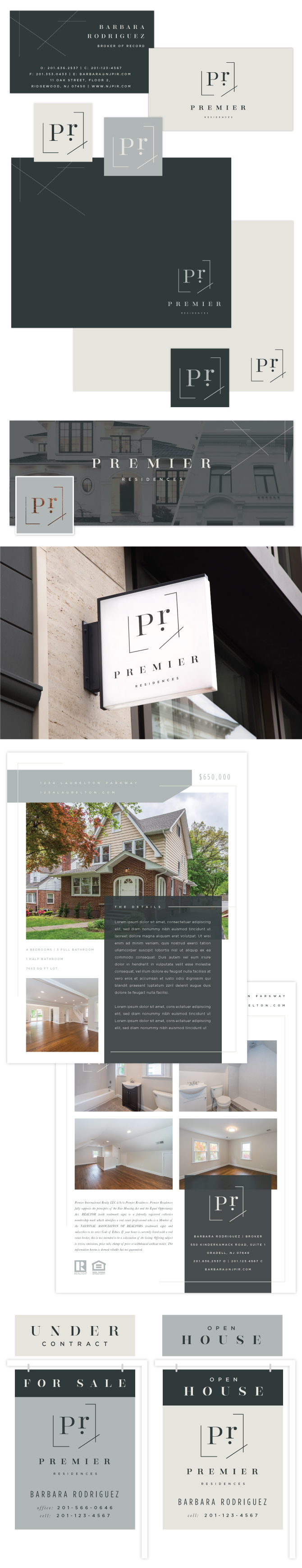
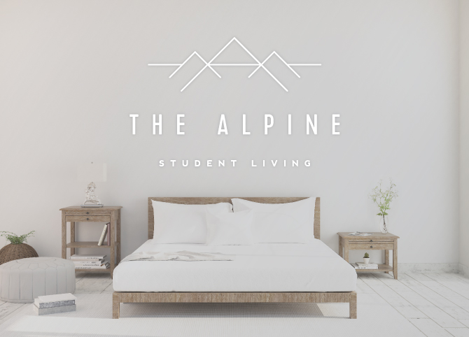
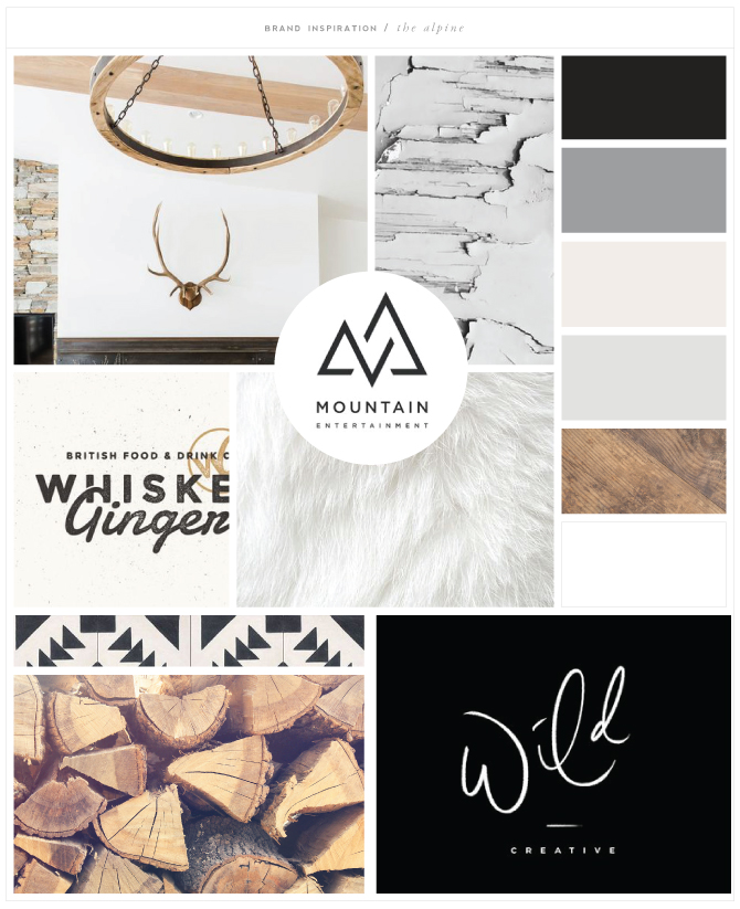
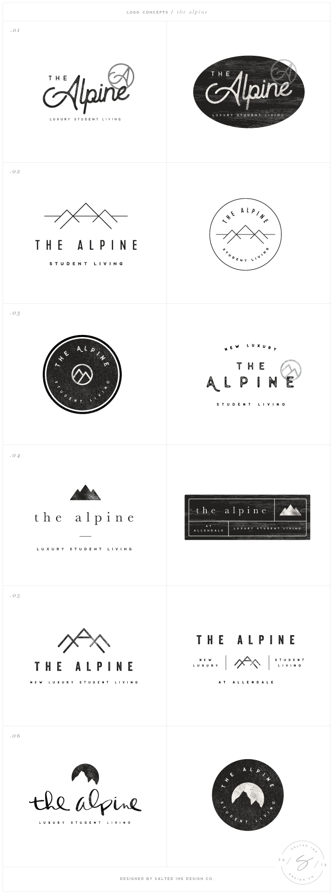
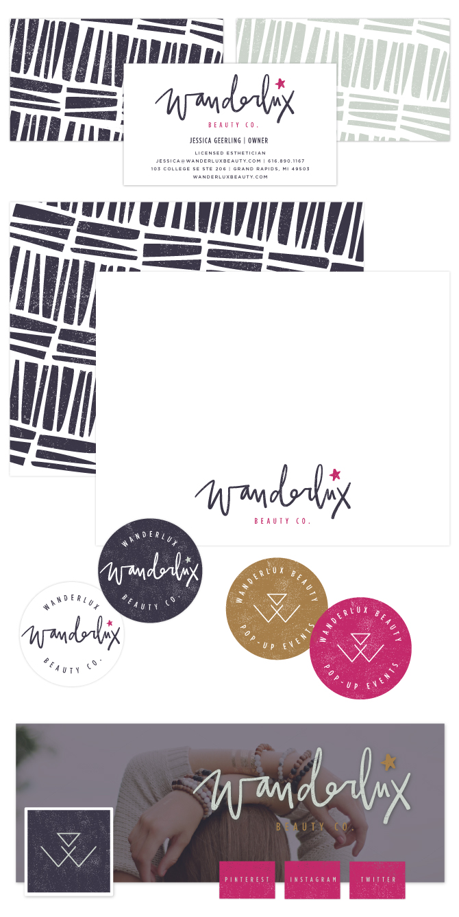
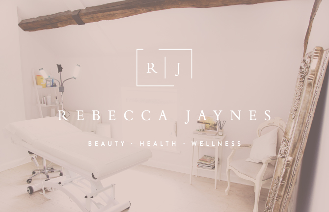
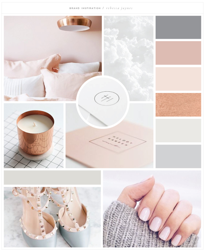
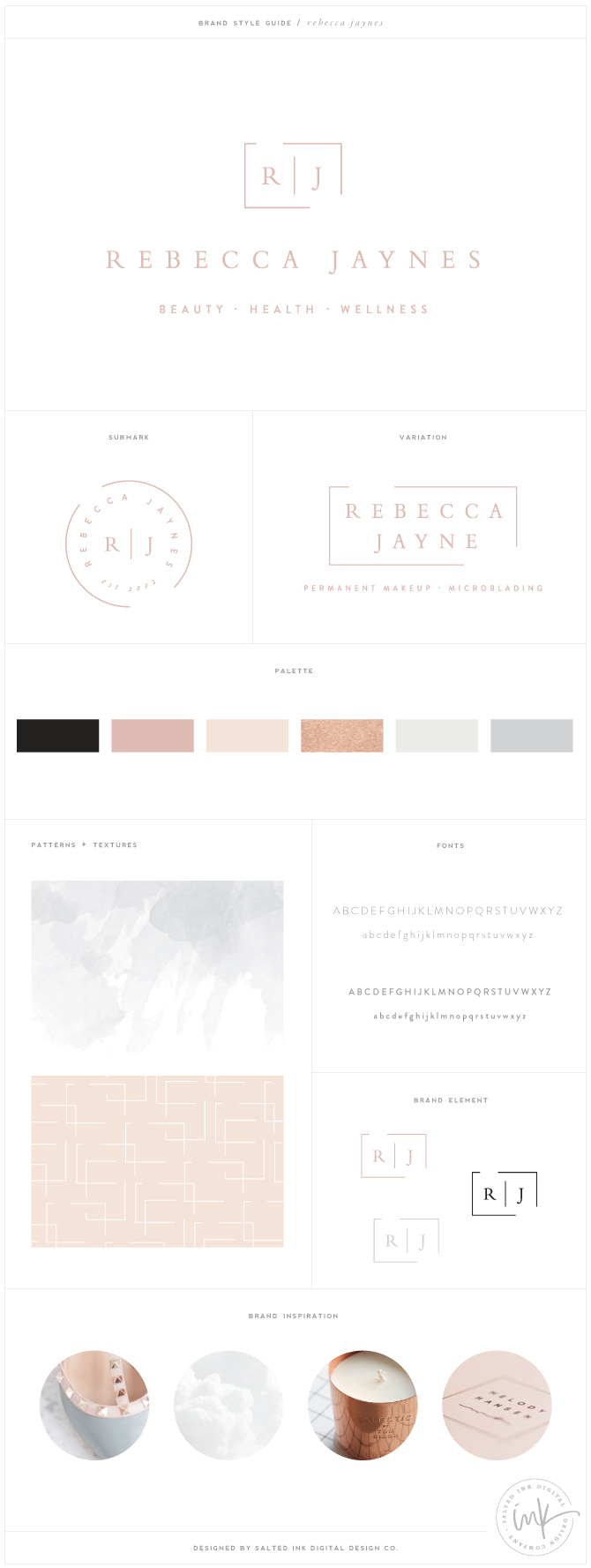
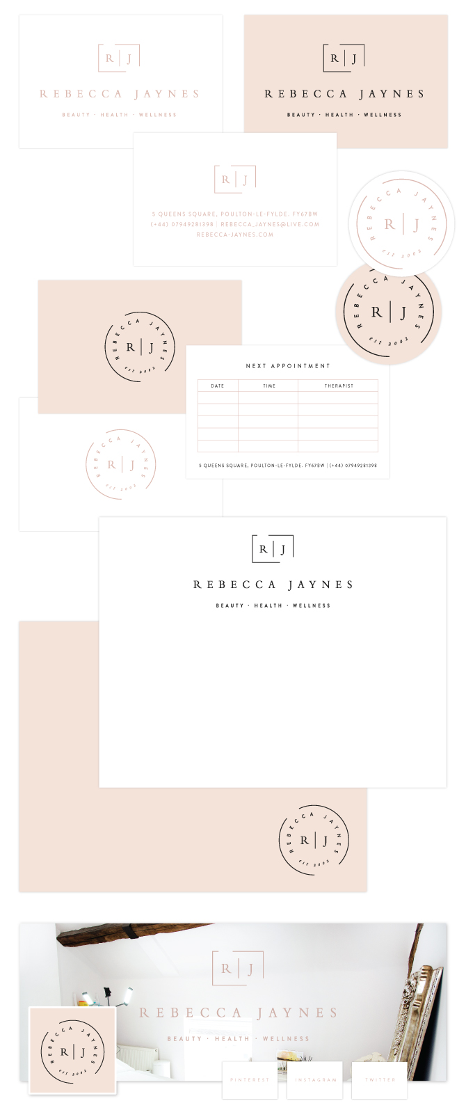
So this is the new Salted Ink. My hope is that it looks familiar but refreshed. The portfolio is updated with some fun new projects and there are new semi-custom premade brands in The Brand Bar ready for purchase. I have also reopened booking for fall/winter projects and will start scheduling consultation calls this week. Thank you for all the love leading up to this announcement – I have felt every bit of it.


Brand Launch: Natalie Hodson

Natalie is an Author, Athlete, Public Speaker, and rockstar inspirational mom that aims to inspires other mom’s to live a healthy lifestyle in a real and relatable way. I was so honored when Natalie contacted me to be a part of her rebrand last fall since I can totally relate to her message as a mom that values health and fitness but also knows first hand all the struggles that come with being a mom and trying to make it ALL happen. I worked closely with Natalie and her team to create a brand that was relatable and welcoming from the hand lettered logo concept to color palette and matching hand drawn icons. We teamed up with Cathy over at Love Inspired for the website component of this project because Natalie’s online presence was hugely important, very detailed and Cathy’s web expertise was the perfect fit to bring this brand to life on the web. You can check out the brand process below and also head on over to Natalie’s brand new site to see it all live!

paint / utah / tile / handlettering / Marine + Vine / Pattern

Brand Launch: Premier Residences

I love clients that want to step outside the box of their industry norm. My consultation call with Barbara of Premier Residences inspired me. She built her business from the ground up and was looking for a new brand design to match the vision and passion she poured into it over the years. Premier Residences was ready for a new look and I was grateful to have the opportunity to design that for their team. Barbara’s approach to real estate isn’t run of the mill – they are local experts with world class service and unparalleled marketing. She needed her new brand to reflect what makes them different – knowledge, experience and unmatched client service. We started with rich colors and a mixture of classic and clean fonts. From there we created a modern, memorable brand mark. You can check out our process and final brand below.

canvas | room 1 | room 2 | chair | house | palmetto house | march

Logo Concepts

Final Brand Guide

Brand Launch: The Alpine

The Alpine is a luxury student housing project in Allendale, Michigan and I had so much fun working with The Zimmer Development Company on their new brand identity. Honestly, I was blown away by how students are living these days. This place is amazing…a far cry from how I lived in college and the Zimmer Development Company is on the cutting edge of this very chic and turn key student living model. Their vision for The Alpine was a modern mountain lodge with lots of black, white and an overall neutral color palette. I love the end result and you can check out the final brand and snap shots from our design process below.

The Color Inspiration

lodge | bark | whiskey ginger | mountain entertainment | fur | tile | wild

The Concepts

The Final Brand

Brand Launch: Theoni

Working with Betsy and her talented team over at Theoni was an amazing experience. We started on this project last fall before I had baby #2 and I was in awe of Betsy’s vision for her newest lifestyle rental company. This is not your average event rental business…in fact, it isn’t even close. The Theoni Collection is located in Napa, California and their new showroom is chalked full of drool worthy pieces that will knock the socks off of any wedding guest. To be more specific, Theoni Collection offers an artful selection of hand-sourced event decor and tabletop accessories that inspire creativity and elevate what’s possible for any event. They pair personalized and unparalleled customer service with highly-curated decor items that you can’t find elsewhere. And their new showroom…well, it’s simply amazing. If that wasn’t awesome enough, Betsy even has a traveling showroom (#ontheroadwithwinnie) that brings all kind of visual inspiration to the Central Coast and LA.

Betsy had a vision for her brand and it was my pleasure bring it to life for her. She knew she wanted some type of unqiue, damask type brand mark paired with an elegant font so all of our concepts focused on that goal. Once we nailed the brand down, we got to work and branded everything from her delivery trucks to her launch party invites and beyond. You can check out our process and some photos of the new dreamy Theoni Showroom below. All of this beautiful photography is credited to Justin Lee Photography and florals in these photos by Mindy Rice. You can learn more about The Theoni Collection over at their lovely new home on the web which was designed and executed by the super talented Ross of FloAgency.

The Inspiration

burberry | Tracie Cheng | damask 1 | damask carpet | holly mathis | cabinets | pigeonhole

The Logo Concepts

The Final Brand Board

Marketing Collateral

The Theoni Showroom


Brand Launch: Wanderlux Beauty Co.

wanderluxbrandheader2

Wanderlux was a bit of a style shift for me compared to a lot of my recent projects and I LOVED it.  Working with these awesome colors and putting together this challenging new hand lettered style that I really hadn’t done before (amen for the ipad pro and ipad pencil) was just what I needed. It’s different, wild, a bit messy and full of boho chic vibrant tones. Jessica, owner and licensed esthetician, was a pleasure to work with and had a great vision for her new brand that made this such a refreshing project. We started with our inspiration board and applied the overall style to everything we did throughout her new brand. From the starry, grunge overlays to the modern “W” element for her pop-up events portion of her business – you can check out our entire process below.

The Brand Inspirationwanderluxbrandmoodcarpet  /  clip  /  sneaky-veg  /  wallpaper  /  texture  /  globe  /  room

The Logo Concepts

wanderluxbrandconcepts

The Final Brand Board

wanderluxbrandguide

Print and Social Media Design

wanderluxbrandstationery

Brand Launch: Rebecca Jaynes

rebeccajaynesbrandheaderimage

As I wait for this baby to get here, I am finally getting around to sharing some of the beautiful brands I launched earlier this year. I had the privilege of working with the wonderfully talented and so sweet Rebecca Abram, founder of Rebecca Jaynes Beauty Health and Wellness Salon in the UK this past spring/summer. I am so grateful she trusted me to lead her complete brand overhaul for her already successful beauty business. Her awesome new salon space with exposed rustic wood beams, white walls and feminine interior touches inspired the new look. We designed a new logo, color palette, print material, social presence and fully customized WordPress website in the process and it fit her timeless vision just perfectly. Here are some snapshots of our process and final products. You can also check out her site live at rebecca-jaynes.com.

Setting the Mood

rebeccajaynesbrandmood

room  /  clouds  /  candle  /  the fresh light  /  melody hansen  /  shoes  /  nails

The final brand design

rebeccajaynesbrandboard

Branded Print Material and Social Media Identity

rjstationery

A look inside the beautiful Rebecca Jayne’s Space

rebeccajaynesbrandpic1

rebeccajaynesbrandpic3

rebeccajaynesbrandpic2

Custom Designed and Developed WordPress Website

rebeccajayneswebsitebysaltedink


The Scott Brothers and SB Entertainment Hand Lettered Brand by Salted Ink

scottbrosinsta2

It was such a huge honor to be asked to design a couple hand lettered logos for these crazy talented brothers. You may know Drew and Jonathan Scott from their hit HGTV series Property Brothers and the multiple spinoffs like Buying + Selling and Brother vs. Brother just to name a couple. But like me, you may not have been aware of the empire they have built that spans far beyond their hit shows on the popular home and garden network.

From the Scott Living Home Collection to a New York Times best sellers book, these guys are a seriously successful and busy band of brothers. The Scott Brothers Lifestyle Brand and Scott Brothers Entertainment are the entities under which all of this creativeness lives and I had the opportunity to work on the logo development of both. I am so excited to share the final “The Scott Brothers” logo as well as the corresponding logo for “SB Entertainment,” their independent production company. Both logos are live on their sites and here are a few shots of the final product.

thescottbrothersbrandbysaltedink

Brand Launch: Ali Baldassare

AliBBrandHeader

I had the privilege to work with the this strong, sexy and talented lady on her new brand development this past fall and I just love how it all came together. Ali is a nationally certified and trained Pilates and fitness instructor & an ACE certified Fitness Nutrition Specialist transforming her clients lives up in Boston MA. She really wanted a fierce yet feminine new look and her awesome photo shoot by the talented Lucie Wicker Photography just fits her new vibe perfectly. Here’s a peek into our design process…

The Brand Inspiration

AliBBrandmoodboard

woman  //  pattern //  ar  //  texture  //  nyc  //  kayli  // woman

LOGO CONCEPTS

AliBBrandConcepts

Final Brand

AliBBrandboard

AliBBrandPrint2

Brand Launch: Luxe Events

LuxeBrandLogoOverlay3

I am SO excited to share this gorgeous new brand that the super talented girls of Luxe Events and I have been working on these past few months. Jenny and Cara, the creative and oh-so organized powerhouse duo behind Luxe out in San Diego, were the coolest and sweetest clients I could have ask for. Their style is completely on point and their kindness and enthusiasm throughout the project made this transformation one of my favorites to date. These girls are simply the best at what they do and I would totally hire them in a heartbeat. We invite you to check out the final brand development and their beautiful new home on the web along with a peek into our creative process in the snapshots below. I hope you love it as much as we do!

Color Inspiration

LuxeBrandMood

art   |   knobs   |   floral   |   The Oliver   |   art   |   No 4   |   Plates

Concept Development

LuxeBrandConcepts LuxeBrandBoard

Brand Collateral

LuxeBrandCollateral

LuxeBrandLogoOverlay2

Custom WordPress Website Design + Development

LUXEwebHOME LUXEwebBLOG LUXEwebABOUT