Brand Launch: Lace & Bustle Bridal

LaceandBustleBridalBrandstorefront

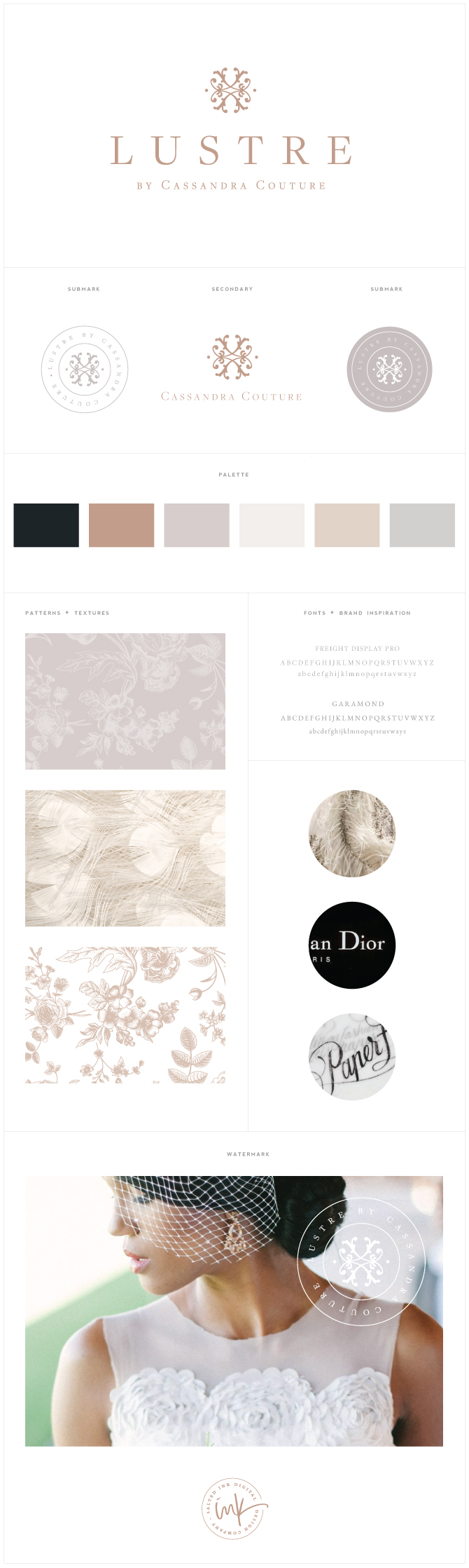
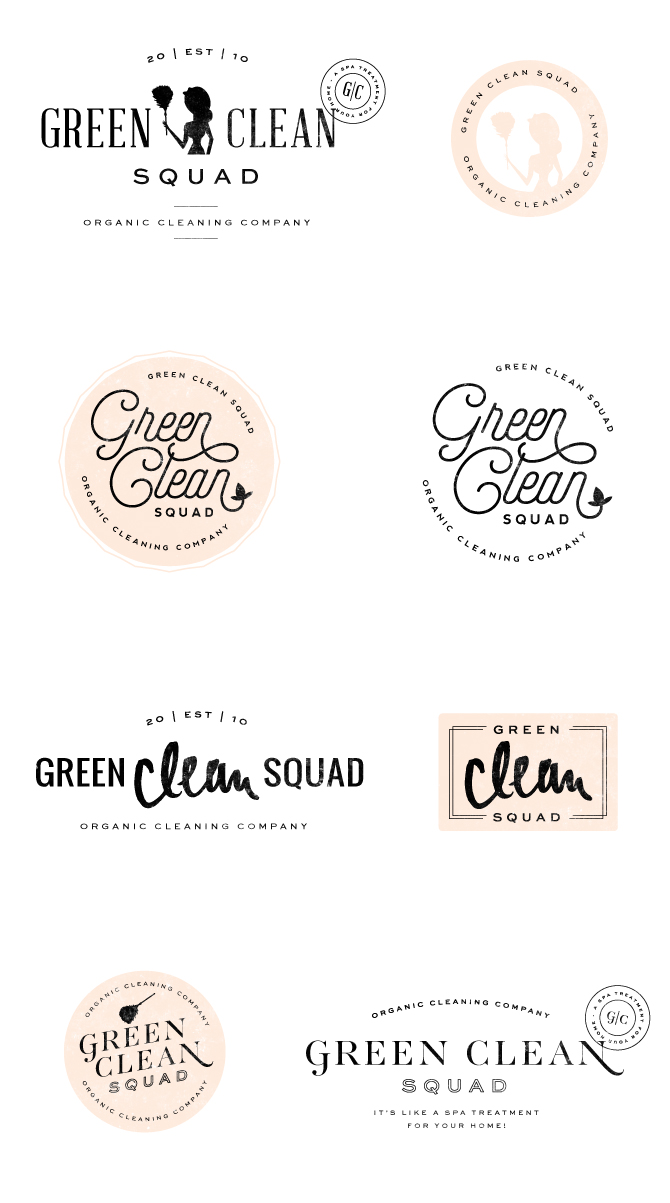
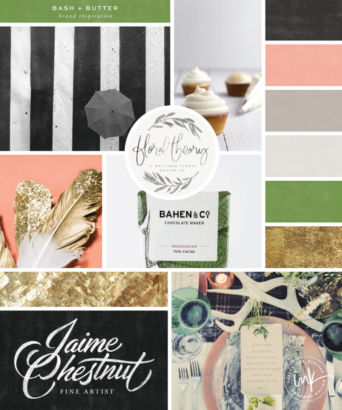
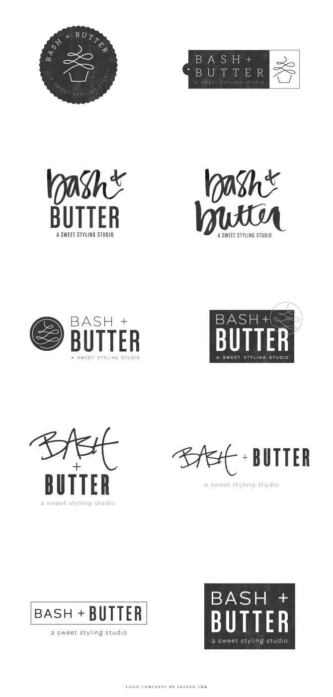
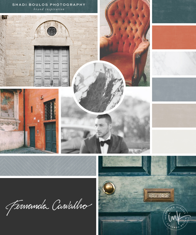
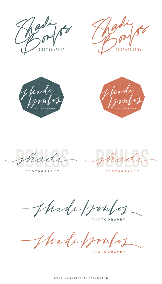
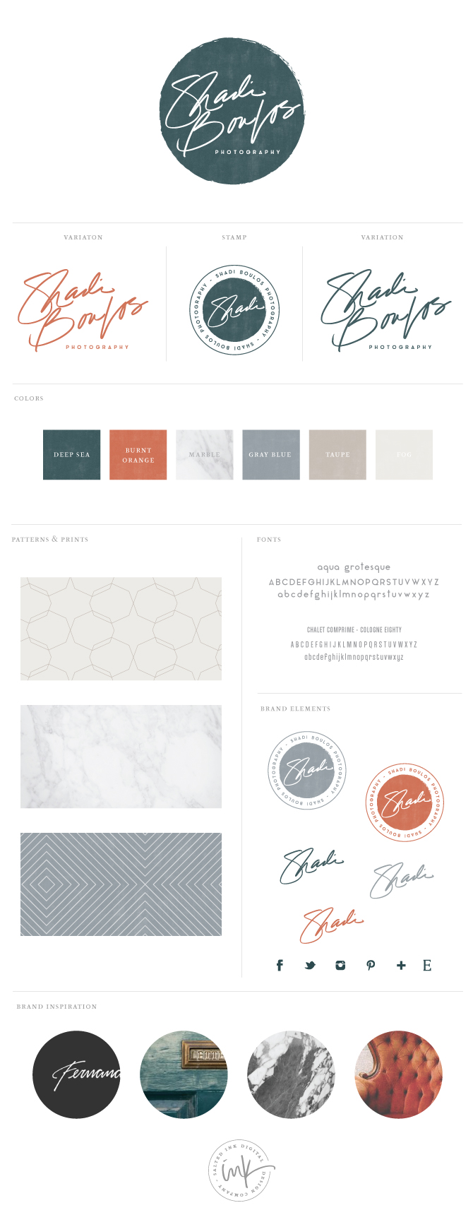
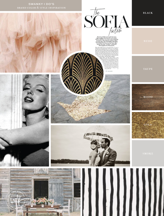
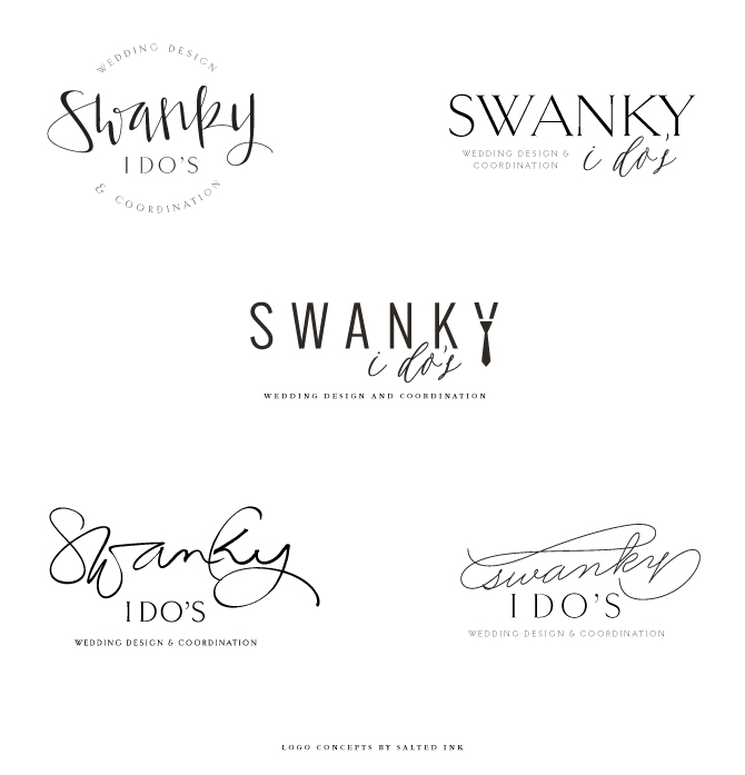
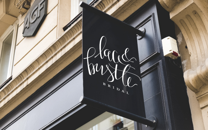
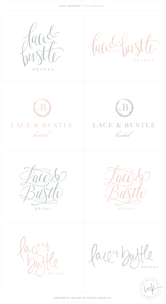
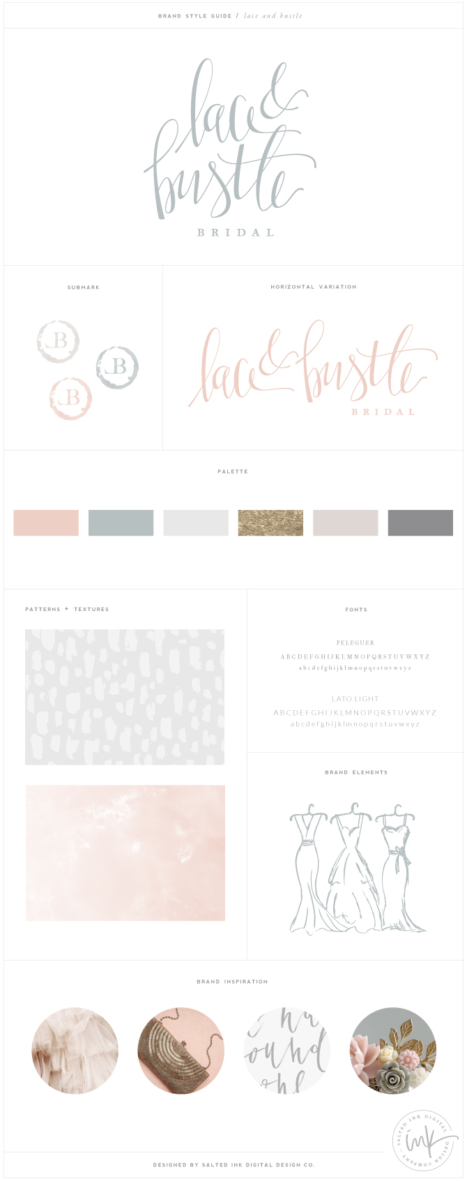
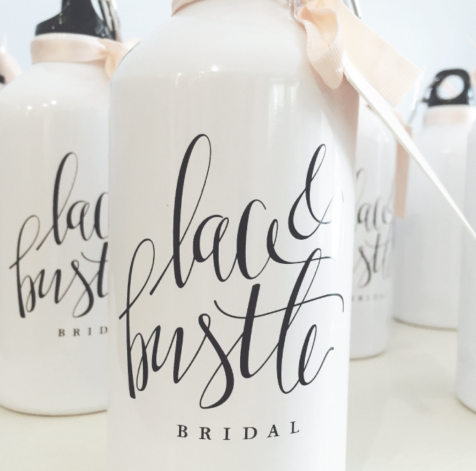
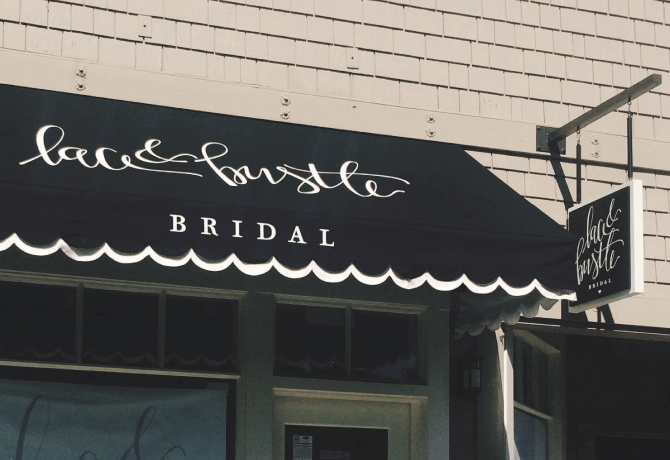
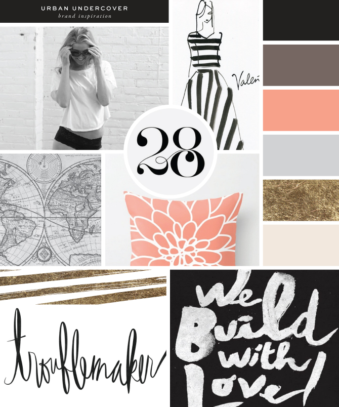
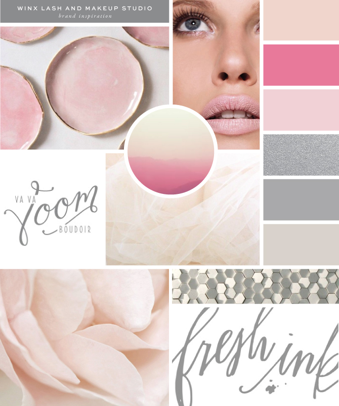
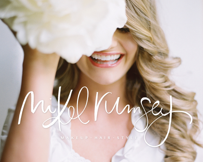
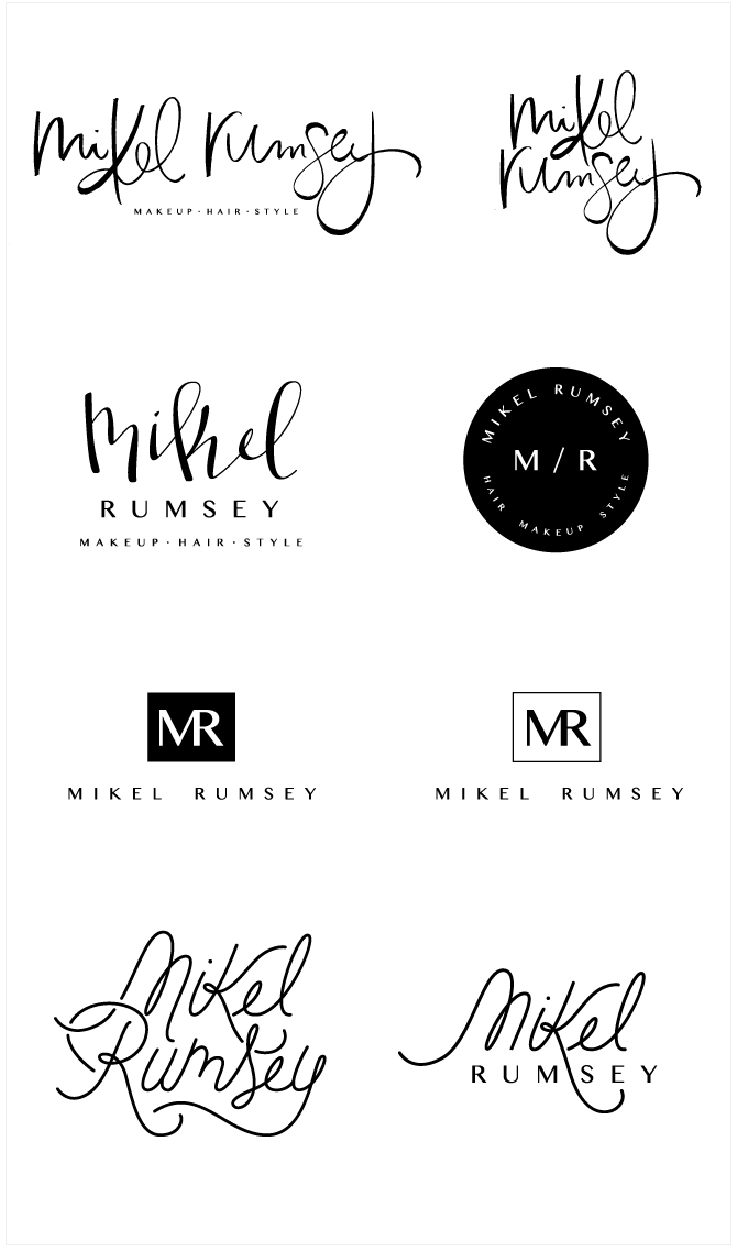
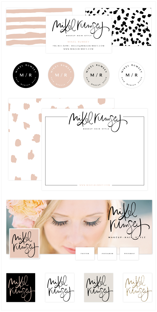
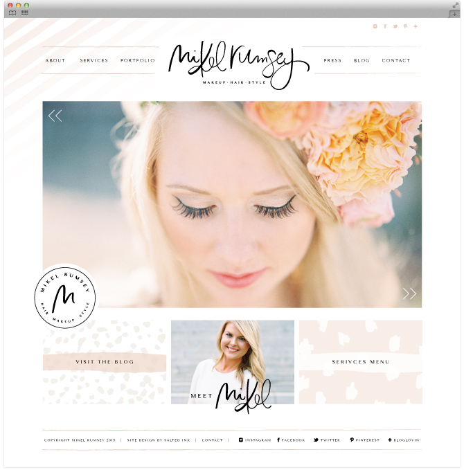
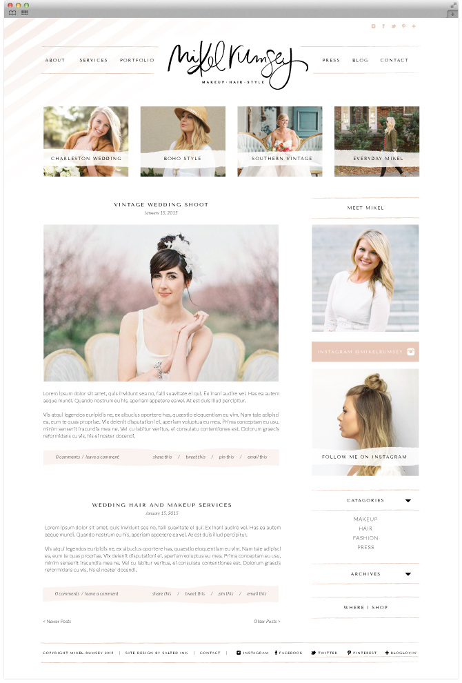
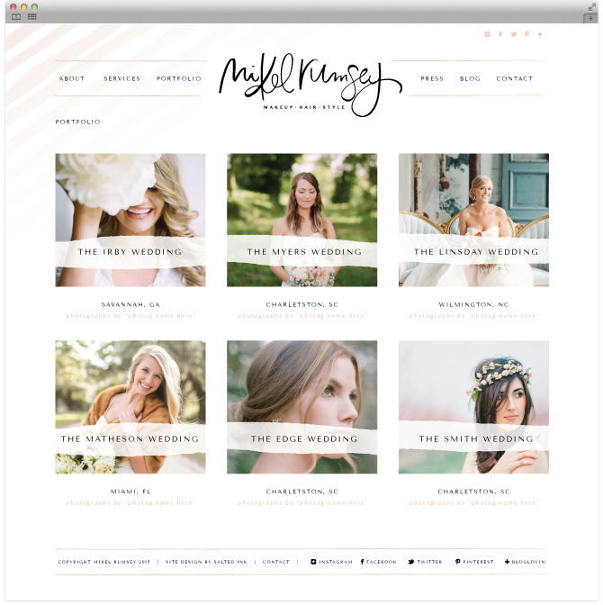
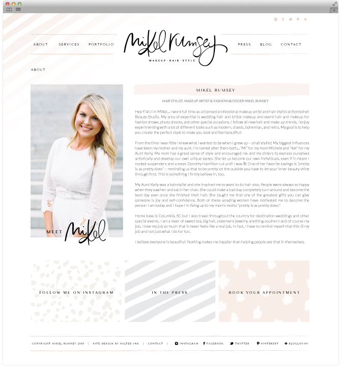
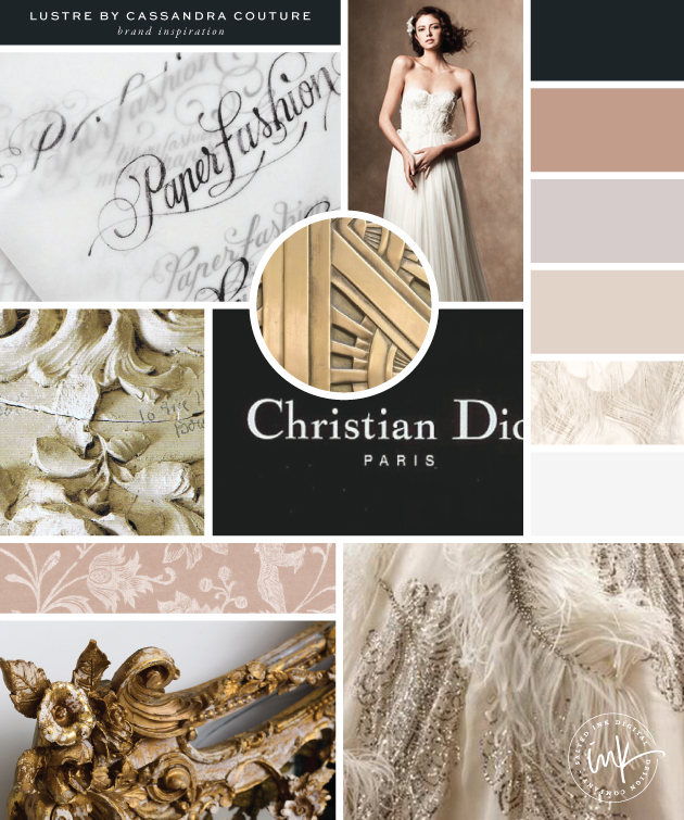
Hey there California Brides – the new Lace and Bustle Bridal Boutique is now open out in Lafayette. Owned by the sweetest of clients, Victoria Hansen, this beautiful shop was designed with so much love. The intimate shop’s selection focuses on timeless bridal style with a vintage flair. Victoria and I came up with a soft color palette that went on to inspire her interior brick and mortar store design.  The custom modern calligraphy logo was the final pick and we hand drew a few wedding dress brand elements to complete her new brand. Below is a peak into our branding process and a few snap shots from the new shop!

LaceandBustleBridalBrandMood

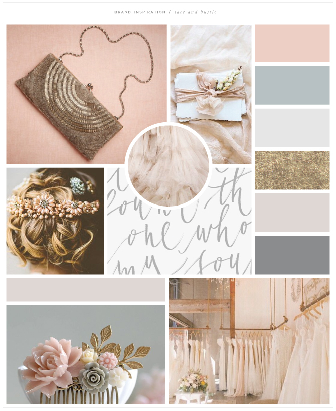
clutch  //  paper  //  hairpiece  //  tule  //  calligraphy  //  hair comb  // elle shop

LaceandBustleBridalBrandConcepts

LaceandBustleBridalBrandStyleGuide

LaceandBustleBridalBrandPic1

LaceandBustleBridalBrandPic3

LaceandBustleBridalBrandPic2

LBstationery

Brand Launch: Urban Undercover

UUHEADER

Urban Undercover designs smarter multi-functional essentials that fit better, look better and last longer so you can go about experiencing life. Their practical yet adorable travel tuck pouch makes discretely carrying an extra pair easy. Sairey, the brains and design power behind this operation, and I happen to share a love for black and white with a touch of funky flair which made this project a perfect match. What started as a simple refresh turned into a full blown makeover and I am totally loving the end product we created together. Below is a sneak peak into our brand design process and the full blown custom designed wordpress woocommerce site we launched earlier this summer.

Brand and Color Inspiration

UrbanUndercoverInspoBoard2

model  /  sketch  /  28  /  pillow  /  stripes  /  troublemaker  /  we build with love

The Logo Concepts

UrbanUndercoverBrandConcepts

Final Brand Board and Styling

UrbanUndercoverBrandBoard2

Print and Social Branding

UrbanUndercoverstationary

Custom WordPress Website with WooCommerce Integration

uuweb1

visit the live site at www.urbanundercover.com


Brand Launch: Winx Lash & Makeup Studio

WinxBrandingHeaderImage

Another beautiful hand lettered brand from this past spring. Winx Lash & Makeup Studio has been consistently voted Houston’s Best Lash Salon and I had so much fun working with owner, Trishia Wiggins, on her new brand and learning all about lashes! Trishia new the new vibe she was going for with her new brand we just had to figure out exactly what that looked like. We had fun translating some of the exact paint colors of her studio to her new brand and working with different variations of hand drawn styles and glyphs for Winx. In the end, Trishia went with the hand drawn calligraphy concept – which I loved as well! I also had the opportunity to design their print material along with their brand new wordpress website which is showcased below.

The Color Inspiration

WinxBrandingInspiration

plates // face // vava voom // horizon // tule // flower // tiles // fresh ink

Final Brand and Stying

WinxBrandingFinalBrandBoard

Branded Print Material

WinxStationery

Custom WordPress Website Design

WinxBrandingWeball

Brand Launch: Mikel Rumsey

MiKel-Rumsey-Brand-header3

I’ve been trying to get caught up from my maternity leave and this is the first in a string of beautiful brands I have yet to launch from my pre-Marshall days. Mikel Rumsey is a super stylish hair and makeup artist out of South Carolina who also has a love for fashion. Her work as been featured in Martha Stewart Weddings, The Knot, Weddings Unveiled, Tryve Magazine, Geraldine Magazine, and Smitten Magazine, as well as Style Me Pretty, Southern Weddings, Grey Likes Weddings, Wedding Chicks…the list goes on. Mikel came to Salted Ink looking for a full brand makeover that spoke more to her own individual style. From the soft and neutral color palette to the hand lettered brush pen logo, this brand is truly one after my own heart.

The Inspiration

MiKel-Rumsey-Brand-Inspo

art // blazer // feather // geo pattern // hazel // dots // things // abstract

The Logo Concepts

MiKel-Rumsey-Brand-concepts2

The Final Brand Board and Styling

MiKel-Rumsey-Brand-Board

Print and Social Brand Design

MiKelStationery2

Custom WordPress Website Design

MiKel-Rumsey-Brandweb1

MiKel-Rumsey-Brandweb2

MiKel-Rumsey-Brandweb3

MiKel-Rumsey-Brandweb4


Brand Launch: Lustre by Cassandra Couture

LUSTREbyCassandraBrandPic1

Very pumped to share this new brand for the talented Cassandra Couture, owner of Lustre. Cassandra is a classically trained couturier specializing in completely custom wedding gowns for some very lucky brides. I really enjoyed getting to know Cassandra’s style and helping bring her vision for her new brand to life. Being primarily in the wedding industry, she needed a brand that was feminine and classic. We started with a mostly neutral color palette to set a romantic tone. Our branding concepts were across the board from handwritten calligraphy to clean serif fonts. We also created a beautifully branded custom WordPress website that Cassandra will be officially launching after her own wedding this summer but a few sneak peeks of her design are included below. Best wishes to this lovely bride-to-be with her upcoming wedding in June…you can bet her wedding dress will be to die for!

INSPIRATION

LUSTREbyCassandraBrandMOOD
Paper fashion / dress / texture / gold / dior / headboard / dress

LOGO CONCEPTS

LUSTREbyCassandraBrandCONCEPTS
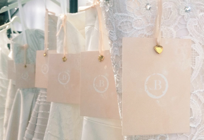
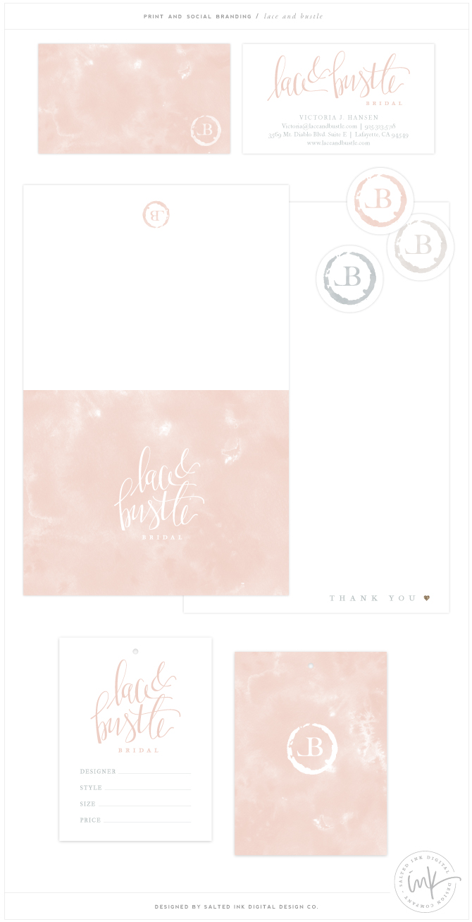
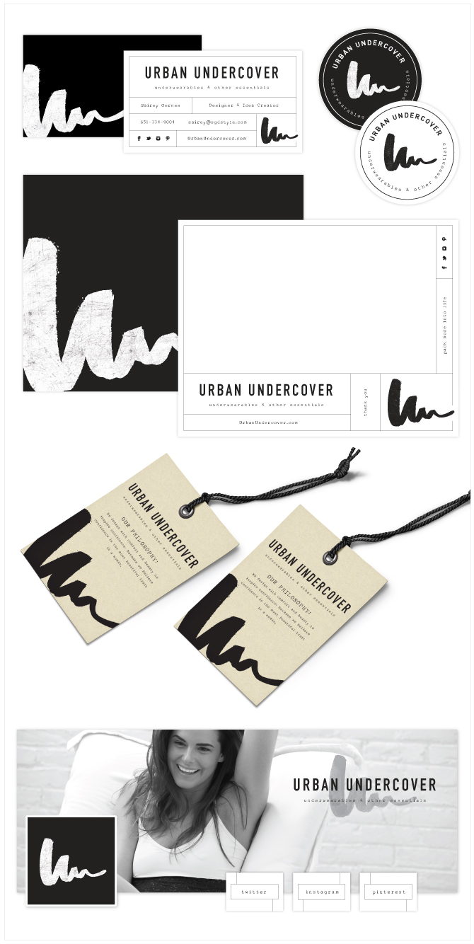
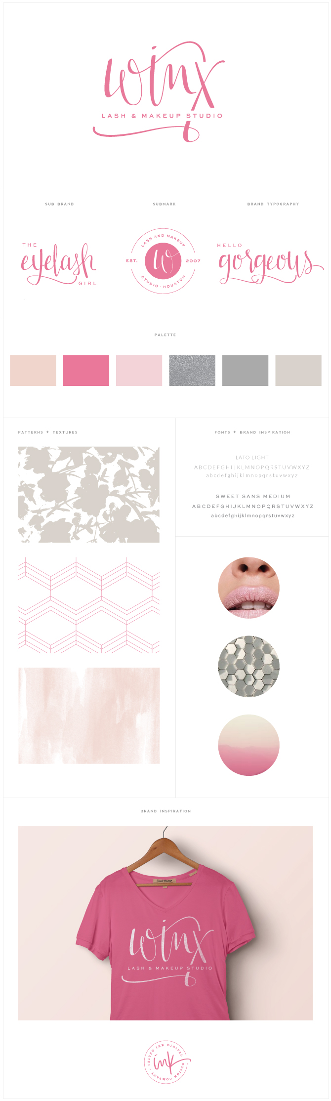
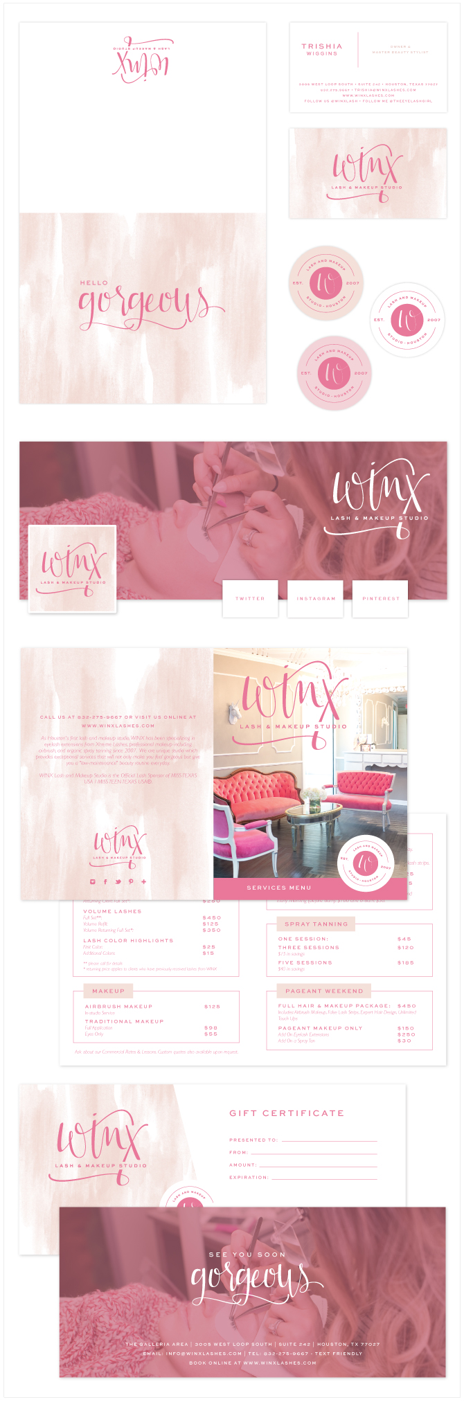
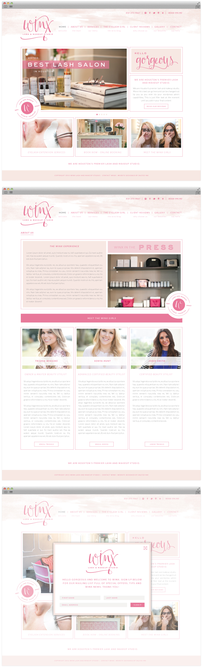
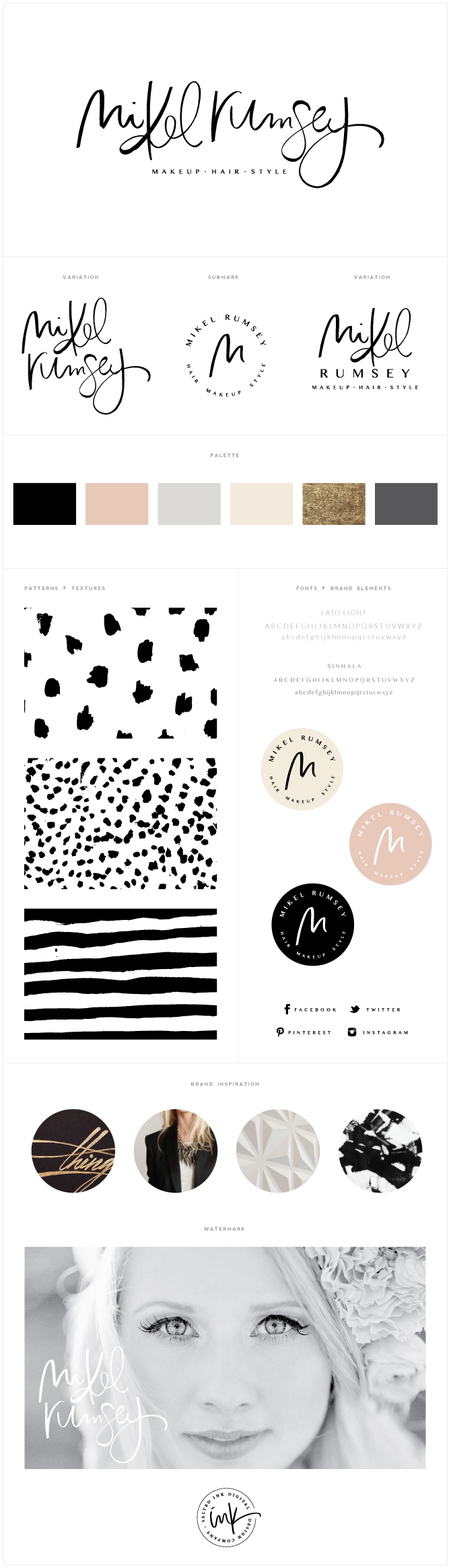
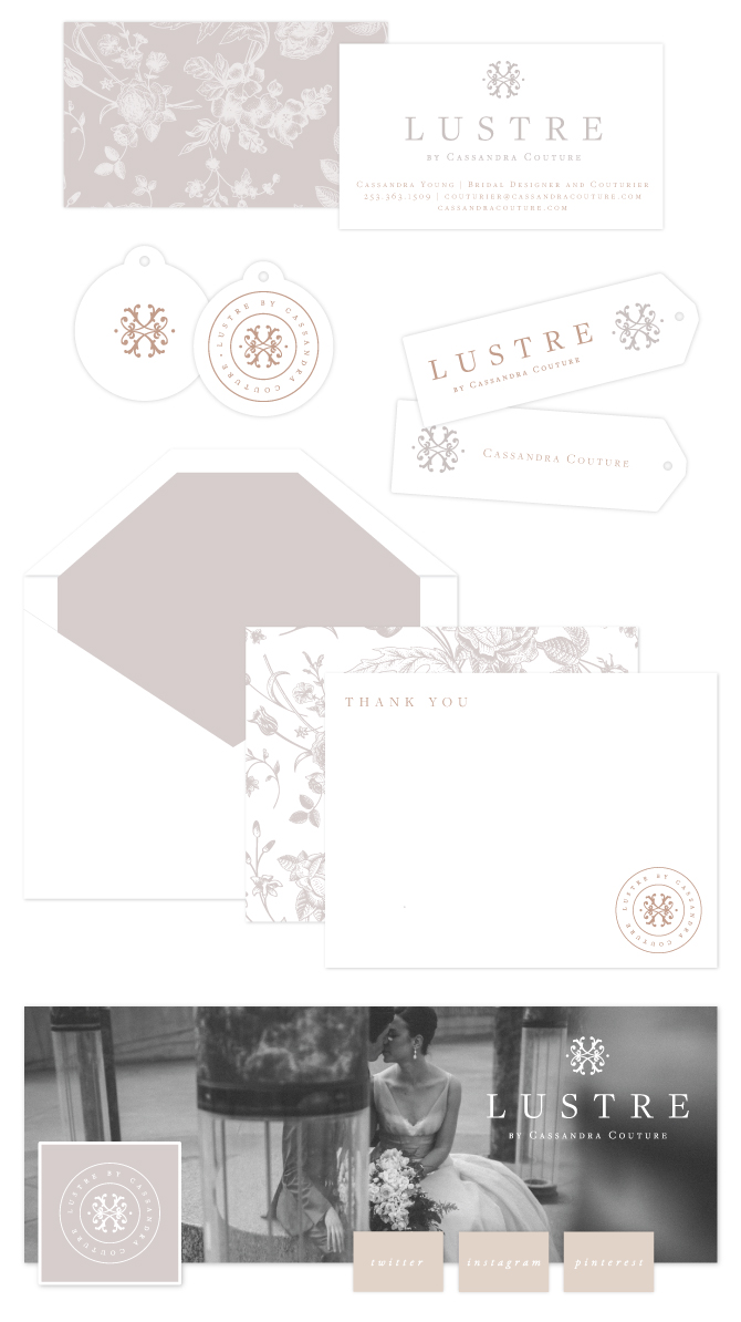
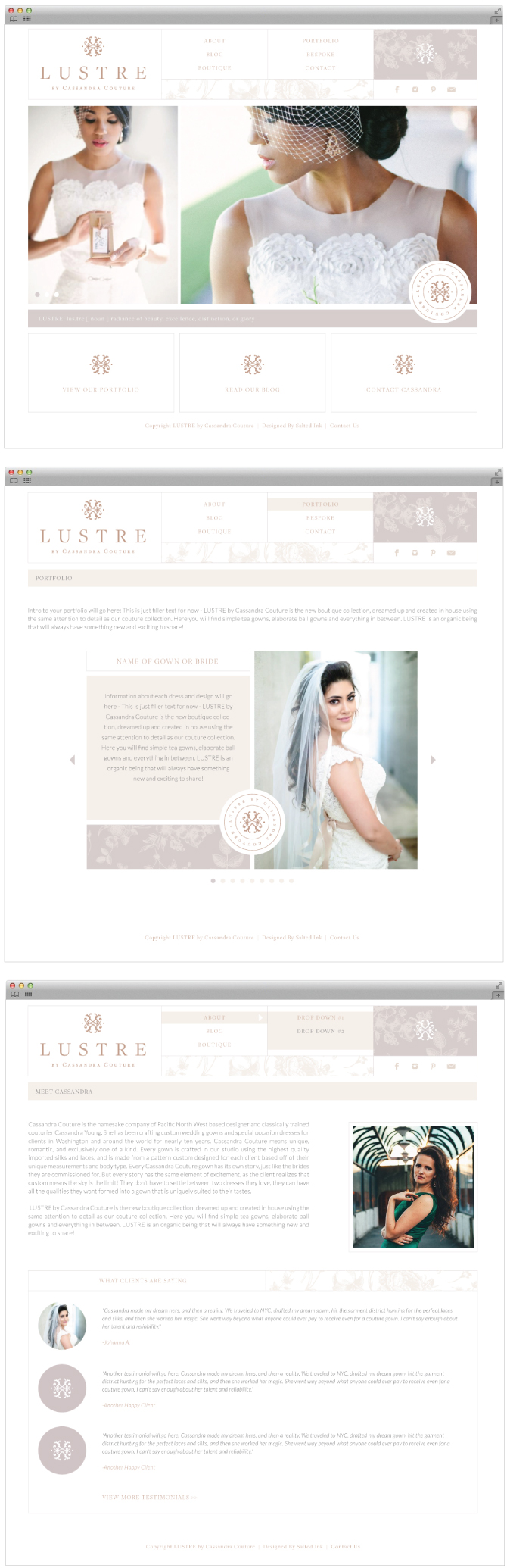
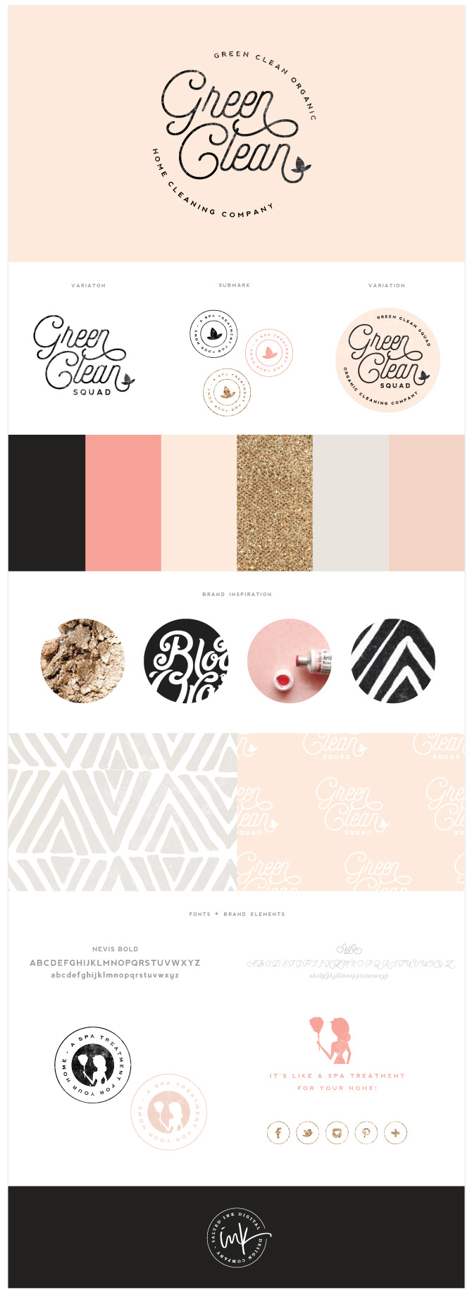
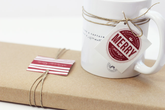
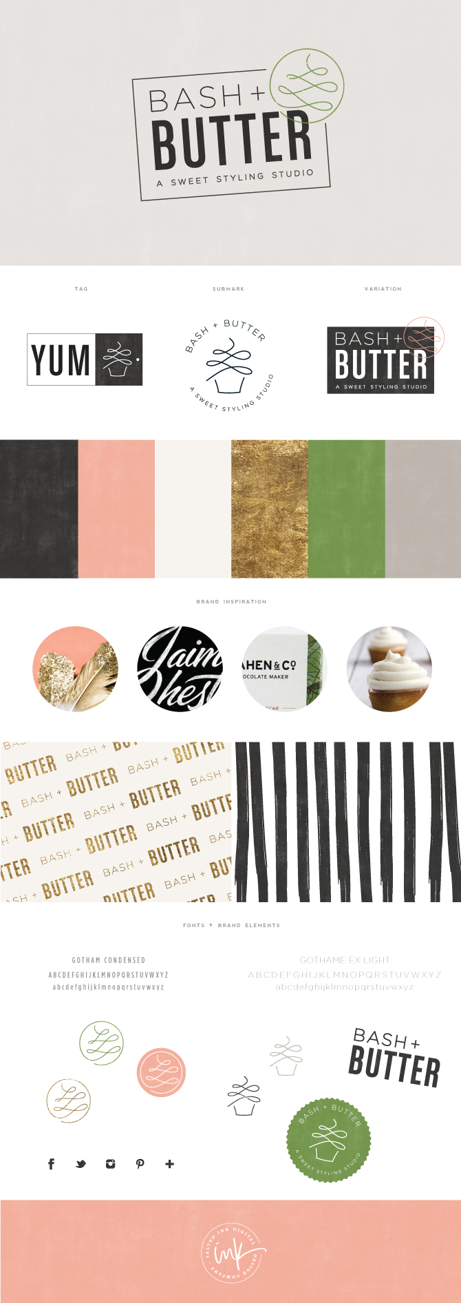
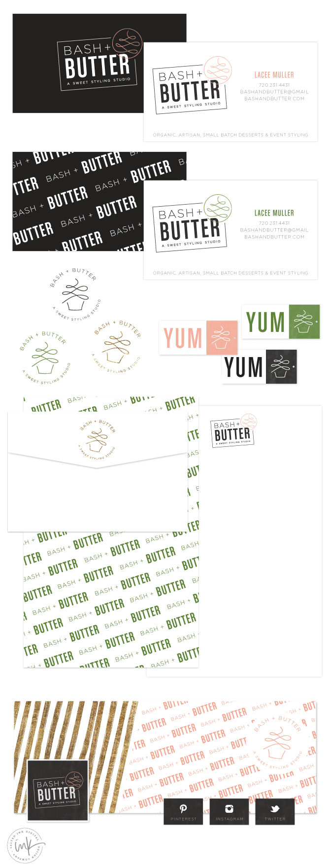
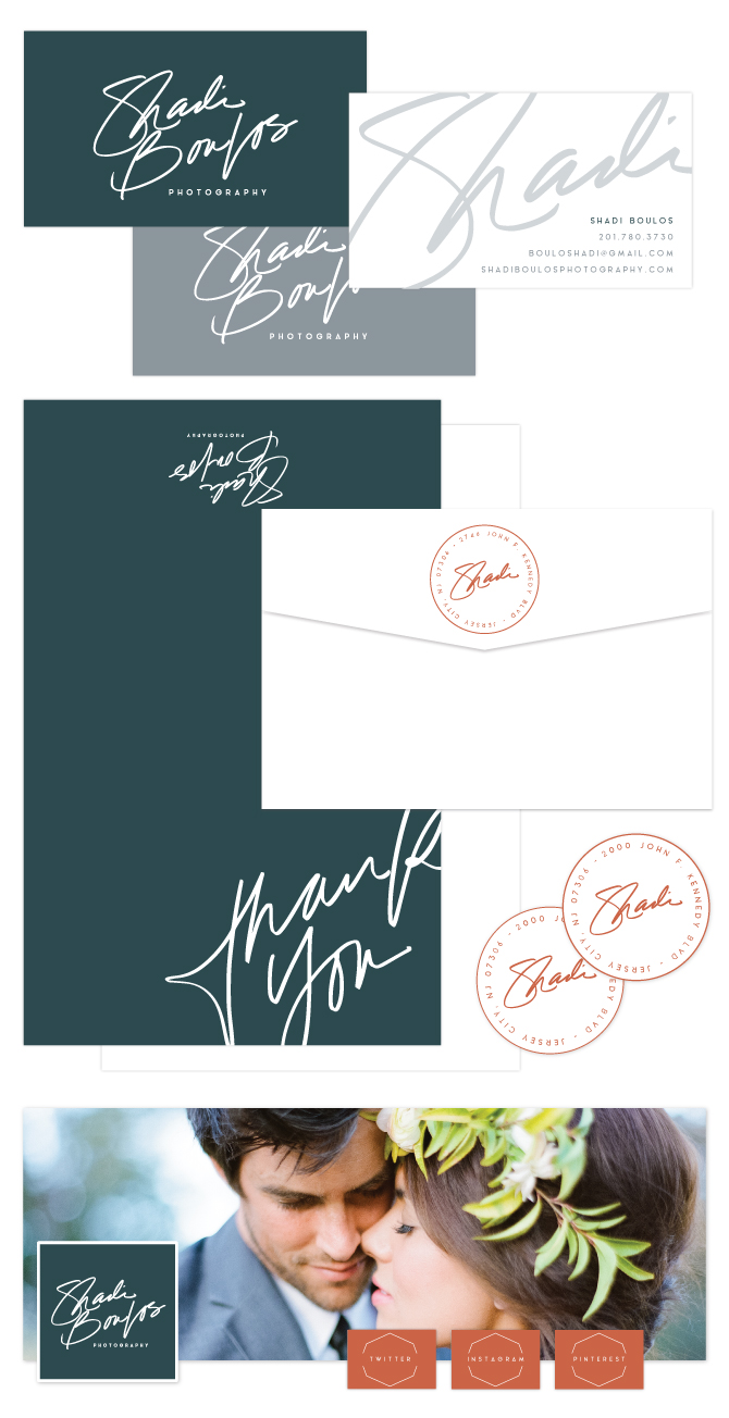
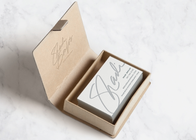
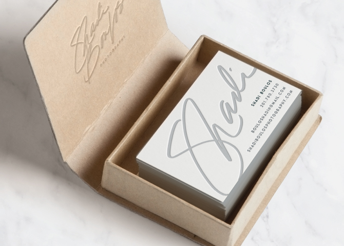
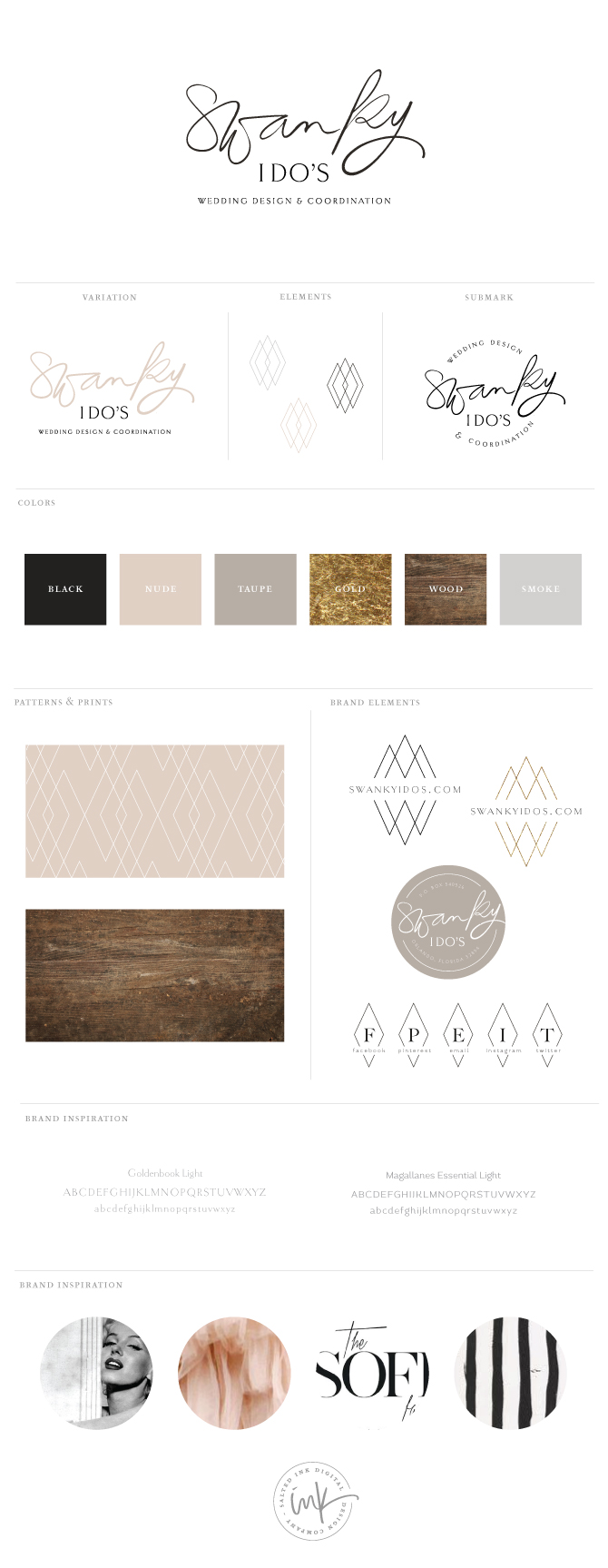
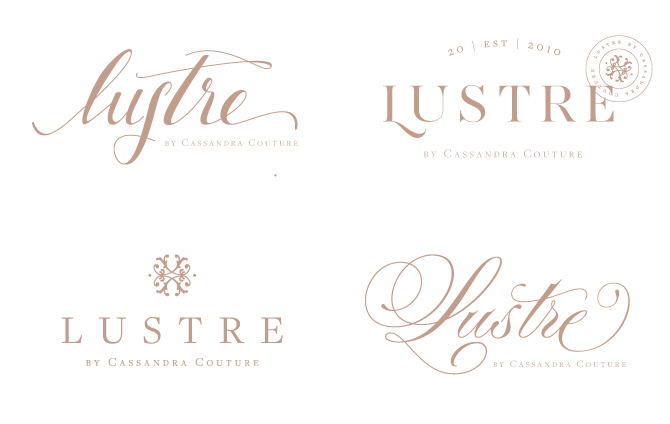
Final Brand Styling and Print Materials
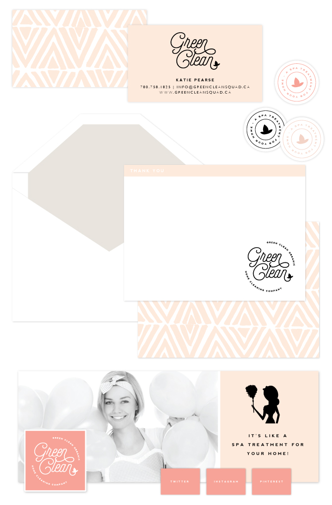
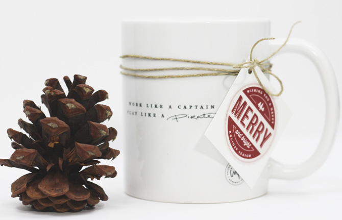
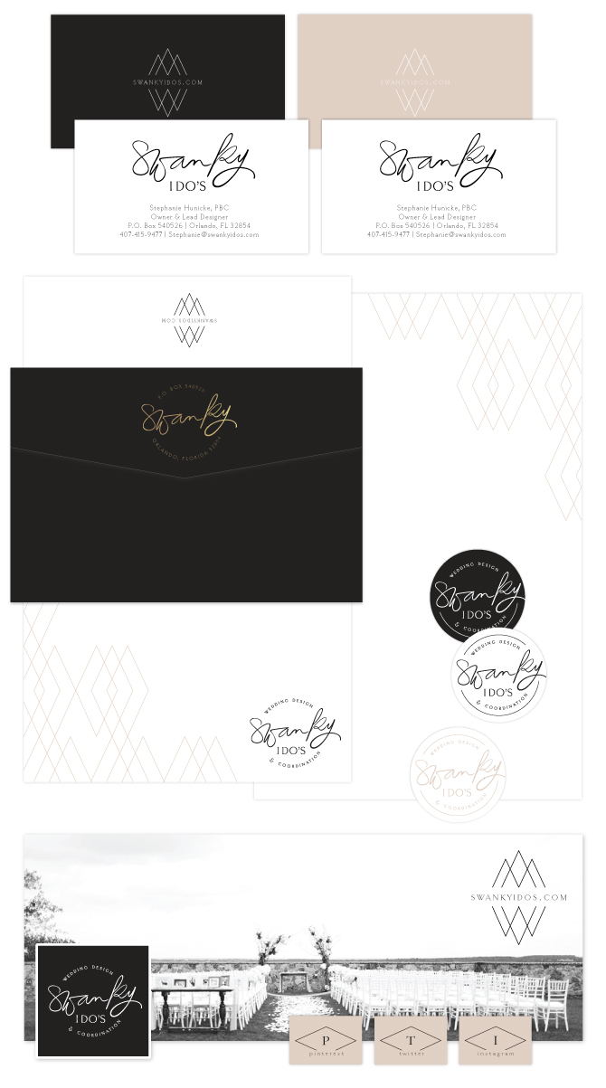
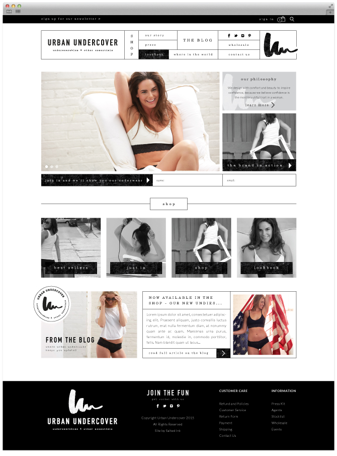
LUSTREbyCassandraBrand

StationeryLustre

CUSTOM WORDPRESS WEBSITE

LUSTREbyCassandraBrandWEB

Brand Launch: Green Clean Co.

GreenCleanPic1

Happy 2015 all.  So we are already more than half of the way through January and I am just now writing my first blog of the year…yikes. I feel like I am just getting caught up from my little holiday sabbatical but it does feel so good to be back and in the swing of things. Here is a little brand I had the honor of designing back in October for the lovely Katie, owner of Green Clean Organic Home Cleaning Company in Canada. Katie really wanted to stand out from her competition in the area and loved the idea of a very glam color palette complete with gold glitter, a bold black and several shades of coral and peach.  Already a fan of the retro style, she went with a slightly throwback circular logo and we were able to keep a little consistency from her old brand by refurbishing her little cleaning lady icon from her previous logo as an element in her new brand. A little peek into our branding process is below…

The Inspiration

Green-Clean-Squad-Organic-Cleaning-Co.-BrandMoodSmall
blood orange / pants / makeup / the studio shop / watercolor / june & jae / earnest postal service

The Logo Concepts

Green-Clean-Squad-Organic-Cleaning-Co.-BrandConcepts

The Final Brand and Styling

BRandNewwithboarder3

GreenCleanStationery

Free Downloadable Christmas Tag Set

9.1

I am just finishing up my Christmas shopping and starting to get these goodies wrapped.  This year, I decided to design a little Christmas tag set to add some personality to my plain kraft go-to wrapping paper and thought I would share. For those of you looking for some tags, feel free to download the 8.5×11 printable spread here (and if you would like to do a double side print with the “to” and “from” on the back, here is a back design only file).  Happy gift wrapping!

2

9

8

Brand Launch: Bash + Butter

BashandButterBrandInsta

Bash + Butter is a new sweet styling studio curated by the lovely Lacee Muller and serving the Denver Colorado area.  Her dessert tables and treats are not only beautiful but made from only the highest quality ingredients as well.    To start, Lacee and I worked together to develop a colorful palette that she thought fit her new brand to a tee.  You can follow a few snapshots of our branding process below.

BashandButterBrandInspiration

Stripes  //  cupcakes  //  floral theory  //  feather  //  gold  //  bahen  //  jaime chestnut  //  table scape

The Logo Concepts

BashandButterConcepts

The Final Brand and Styling

BashandButterFinalBRAND

Print and Social Brand Design

BashandButterStationery2

Brand Launch: Shadi Boulos Photography

ShadiBPhotoBrandPic5

I am totally pumped about this new handwritten brand design for Shadi Boulos Photography.  I am a big fan of Shadi’s amazing photography skills and he was so wonderful to work with throughout this process.  We started with a strong color palette and designed a free flowing hand written logo accented with clean lined geometric patterns.  Check out the little peak into our process below…

The Inspiration

We derived most of our color palette from the orange walls and deep sea door photo on the middle left of the mood board below.  We then added in a light gray blue and some marble to finish the strong color palette.

ShadiBPhotoBrandInspiration

door  //  chair  //  door  //  marble  //  groom  //  fernanda  //  door

The Logo Concepts

Shadi knew he wanted a hand written text based logo that had some personality.  Below are a few of the options we came up with to suite his taste.

ShadiBPhotoBrandConcepts

The Final Brand and Styling

We decided to go with the rough edge circle for the main variation of Shadi’s logo but included the unbound versions for him to use as well.  We also created a little circle submark/stamp for his return address and a watermark variation.  Here’s a look at the full brand…

ShadiBPhotoBrandFinalBrand

ShadiBPhotoStationery

ShadiBizCard1

ShadiBizCard2

ShadiBPhotoBrandPic3

ShadiBPhotoBrandPic1

 Beautiful images compliments of Shadi Boulos Photography

Brand Launch: Swanky I Do’s

Swanky I Do’s is Orlando’s premier wedding and event planning company owned and operated by Stephanie Hunicke, lead designer and planner who was so wonderful to work with.  Stephanie was looking to create a more cohesive brand identity for her already successful and established wedding and event planning business.  We decided on a neutral color palette with a pop of gold foil and focused on showcasing her black and white photos in her branding material for a true “swanky” feel.  Her logo consists of a hand lettered brush pen and a thin serif font.  Check out the details of our process below along with the final product.

SwankyIDosBrandingInspriatoinFINAL

Inspiration Image Credits:  Tule // Sofia Factor // Pattern // Marilyn Monroe by Nick de Morgoli -1953 // Arrow // Couple // Barn // Stripes

LOGO CONCEPTS

Stephanie was looking for the logos focus to be on placed on the word “swanky” with little or no imagery involved.

SwankyIDosBrandingConceptsFINAL

FINAL BRAND STYLING

With a slight edit to the “k and y”, the brush pen logo was the winner and we chose a geo diamond mark as an element and pattern for branding accents.

SwankyIDosBrandFINALSwankyStationery

SwankyIDosBrandingLogoLetterpress

SwankyIDosBrandingPhoto1

SwankyIDosBrandingPhoto2