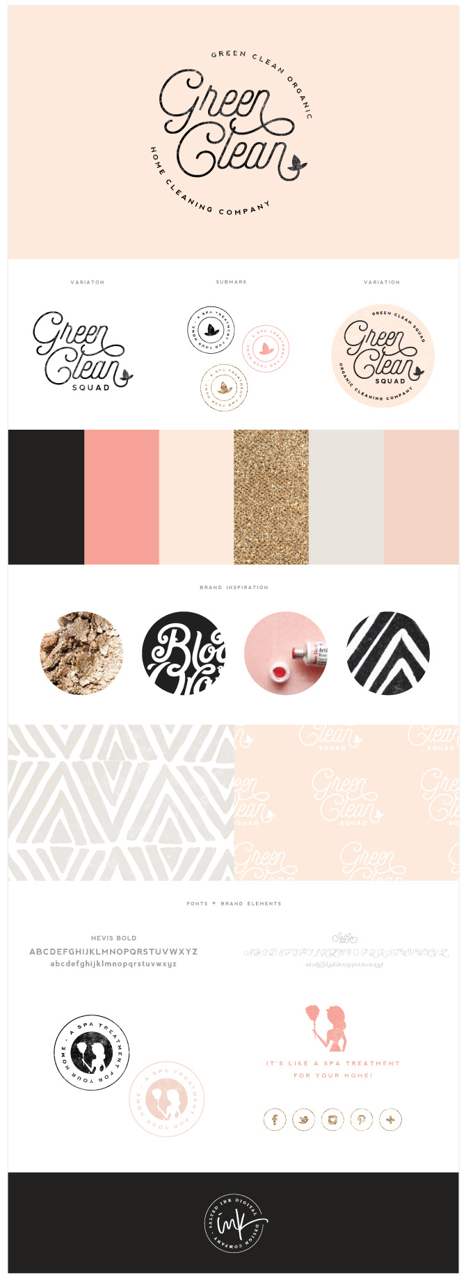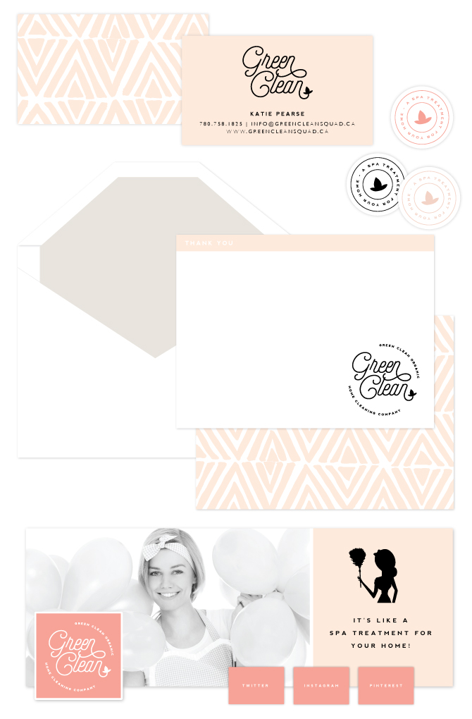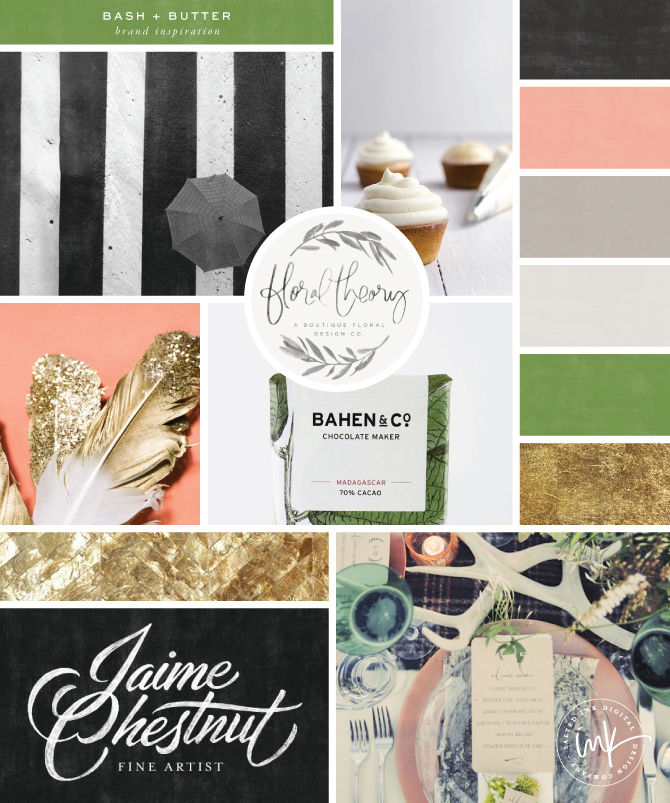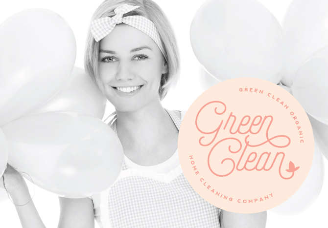
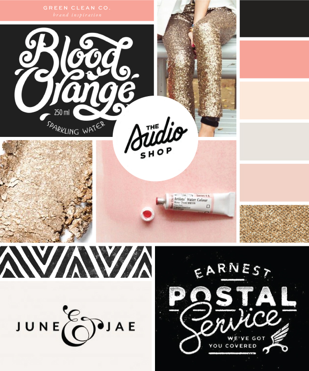
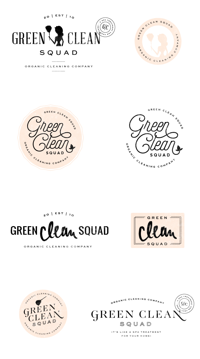
Happy 2015 all. So we are already more than half of the way through January and I am just now writing my first blog of the year…yikes. I feel like I am just getting caught up from my little holiday sabbatical but it does feel so good to be back and in the swing of things. Here is a little brand I had the honor of designing back in October for the lovely Katie, owner of Green Clean Organic Home Cleaning Company in Canada. Katie really wanted to stand out from her competition in the area and loved the idea of a very glam color palette complete with gold glitter, a bold black and several shades of coral and peach. Already a fan of the retro style, she went with a slightly throwback circular logo and we were able to keep a little consistency from her old brand by refurbishing her little cleaning lady icon from her previous logo as an element in her new brand. A little peek into our branding process is below…
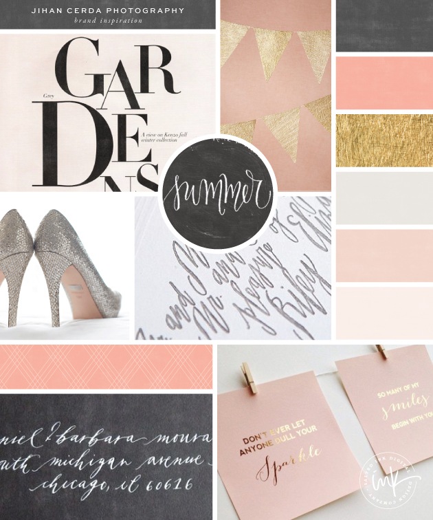
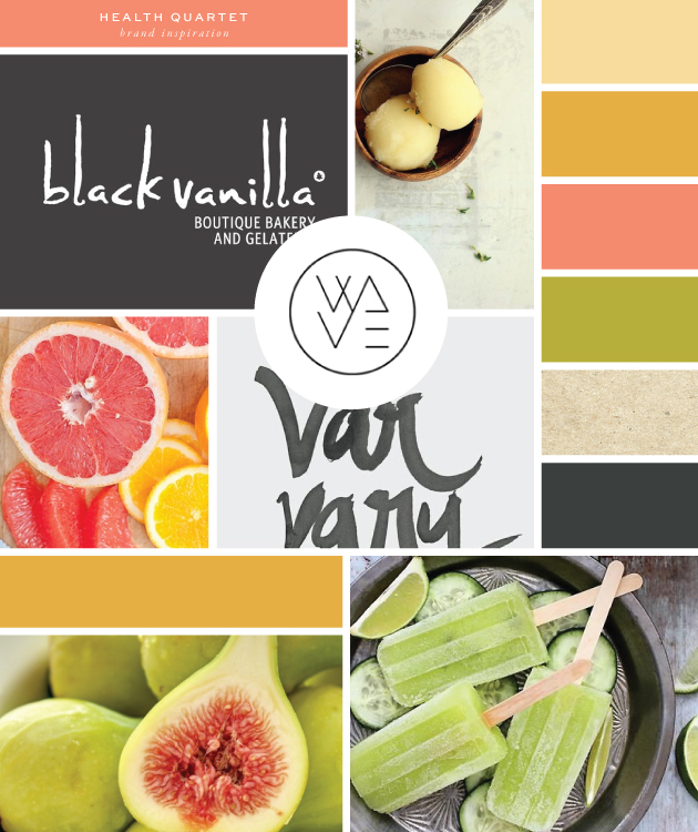
The Inspiration
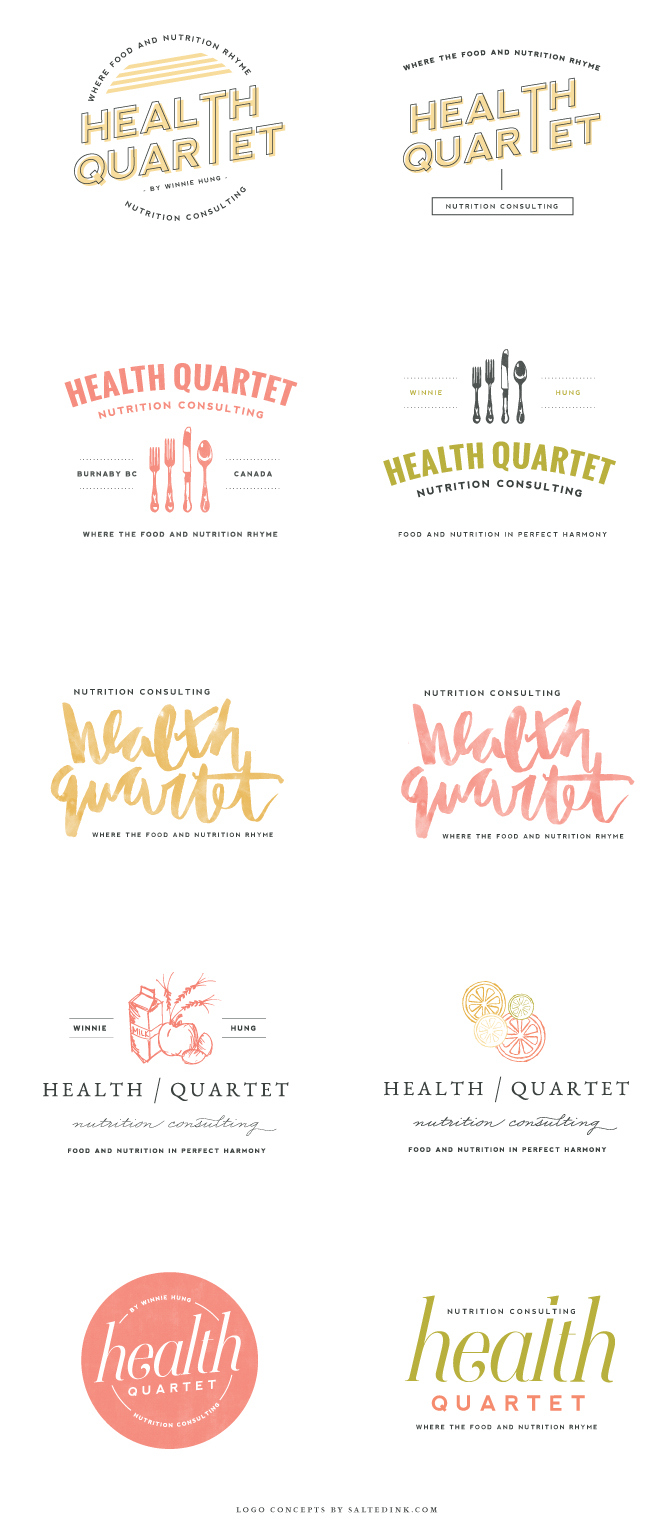
The Logo Concepts
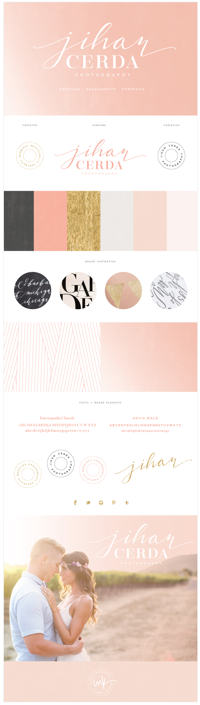
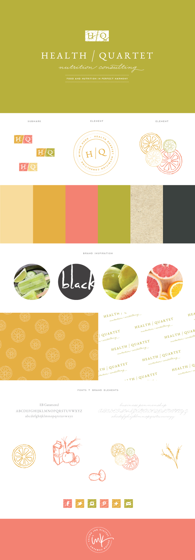
The Final Brand and Styling