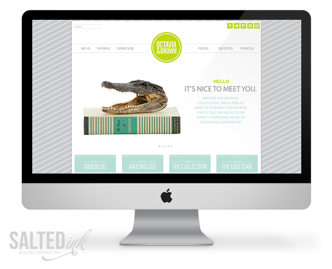
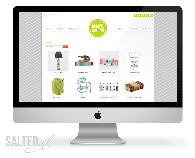
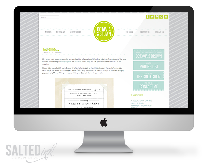
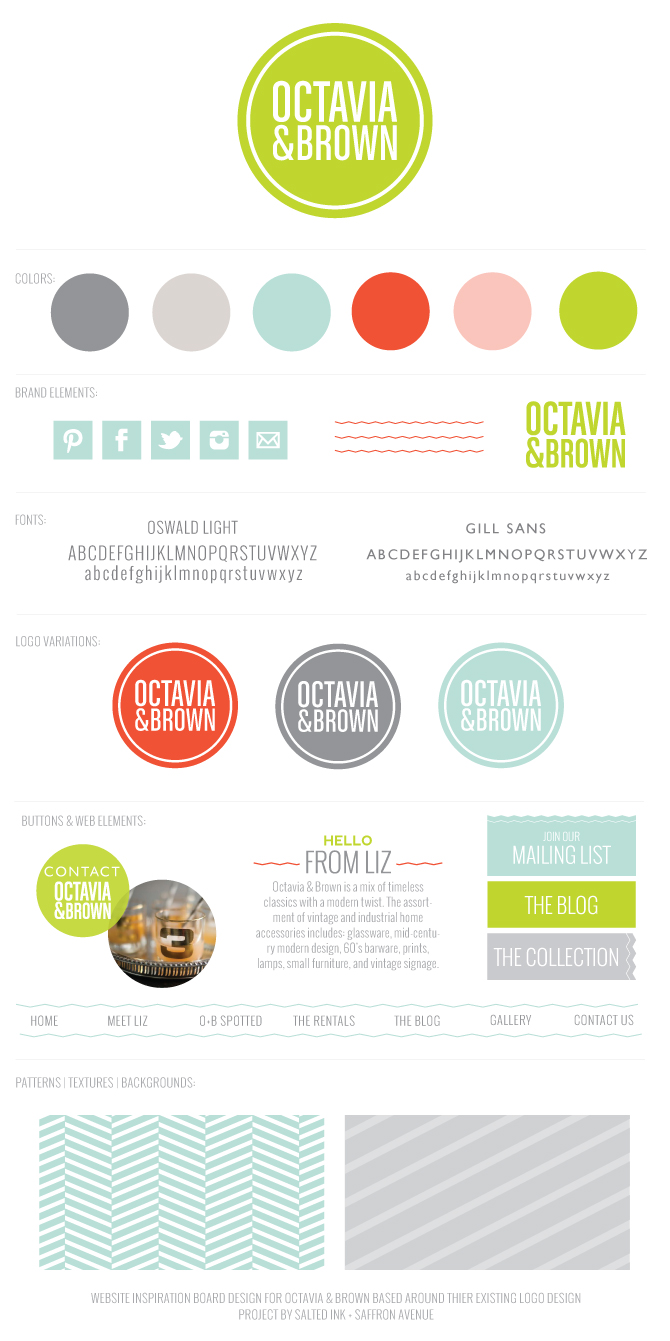
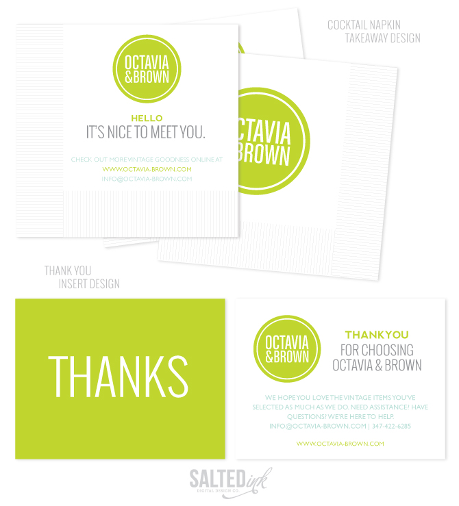
If you love vintage as much as I do, you will love this next project. Angela of Saffron Avenue & I had the awesome opportunity to work together with the vintage experts of Octavia & Brown on the design of their new website, brand refresh, and a couple of cool marketing pieces to match. Liz, the brains behind the O&B operation, had a vision and we worked with her to bring that vision to life. She already had an awesome brand in place so we designed the new site around her current logo but switched up the color palette and added in some fun new elements to give it a modern/vintage look. Angela and I started by creating a branding board with new colors, elements, and backgrounds. We also added in and customized the RW Elephant software that helps Liz manage and show off her inventory and ties in perfectly with her WordPress based site. Take a look at the screen shots, branding board and marketing pieces below and be sure to visit www.octavia-brown.com to learn more about O&B. If you love vintage, you’ve got to check out Liz’s collection!


Thanks so much Sara and Angela! We love our new site and fantastic marketing materials.
You are so welcome, Liz! Thank you for letting us be a part of this project. We really enjoyed working with you and love how everything came out!