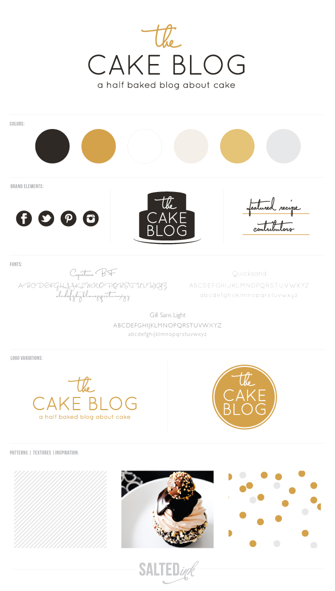
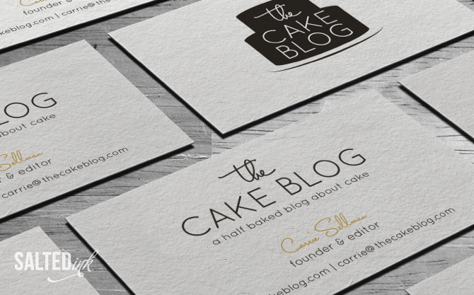
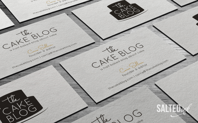
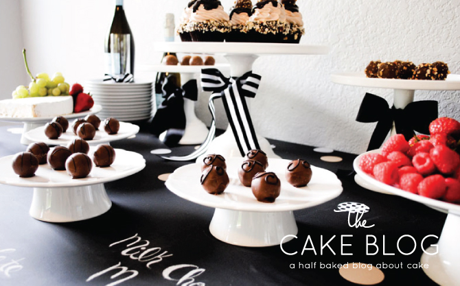
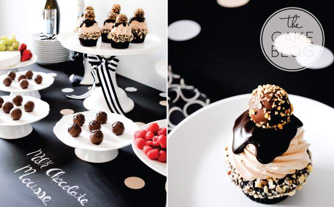
I loved joining creative forces with Carrie, founder and editor of the widely popular and super tasty The Cake Blog, on this project to help reinvent her already well established brand. With over half a million hits each month, Carrie knew her rebrand was a huge decision so we went back and forth a few times until she knew this was “it.” Carrie was set on a clean, modern, “crate and barrel” type feel, so we stuck to the theory of less is definitely more for her new look. We went with a color palette of predominately black accented by pops of mustard and subtle diagonal striped pattern to set off her fresh new brand.
Carrie may be one of the sweetest and most multitalented clients I have ever had the opportunity to work with. Not only is she a full time successful business owner and mom, she also has a fantastic design eye and is a darn good website designer! She actually took the new look we created and recently redesigned thecakeblog.com which just went live over the weekend! A big thanks to Carrie for allowing me the opportunity to be a part of her rebrand and please listen to your sweet took and go check out the new look on her blog at thecakeblog.com. {watermarked photos below compliments of The Cake Blog}


Beautiful job, Sara! Now all I can think about is a big slice of chocolate cake!
Thanks Anna! I know, her work looks so yummy!
Thank you for doing such a fabulous job Sara! I absolutely love our new look and you were such a pleasure to work with! Already looking forward to next time….
Thank you so much for letting me be a part of this project, Carrie ! I loved working with you and look forward to working with you again in the future!
Hi, I’m in love with this project, but what’s the name of the handwriting font? It’s illegible.. Thank you
Thanks Giulia! The script font is Capistrano.