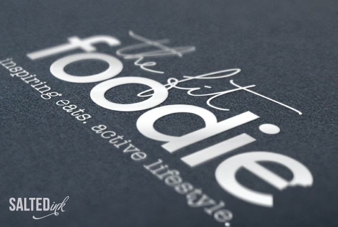
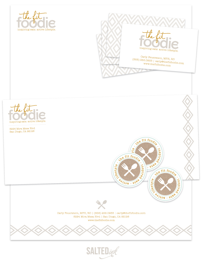
Pretty pumped to show off the new look I created with Carly from The Fit Foodie. She is a registered dietitian out in San Deigo/La Jolla, CA area who was on a mission to develop a fresh new brand for her business. Carly was going for a clean, modern look with a touch of hand written scrip and kraft to pull it all together. We developed a soft, mostly neutral color palette with pops of mint and blush to add a feminine touch. Carly’s custom WordPress website followed suit with clean white spaces, bold lines and color blocked buttons. Check out a snapshot of the new Fit Foodie Brand below and be sure to visit her new site to see more. Carly – Thanks for trusting me with your new brand! I enjoyed working with you and can’t wait to see where you take your new business from here.
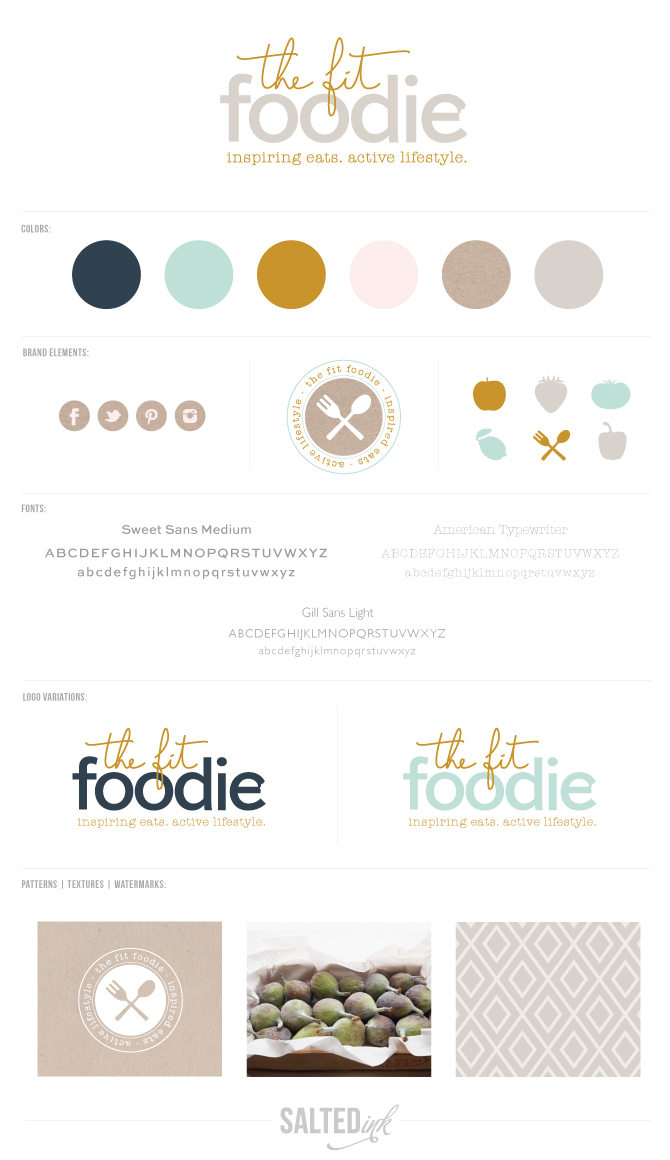
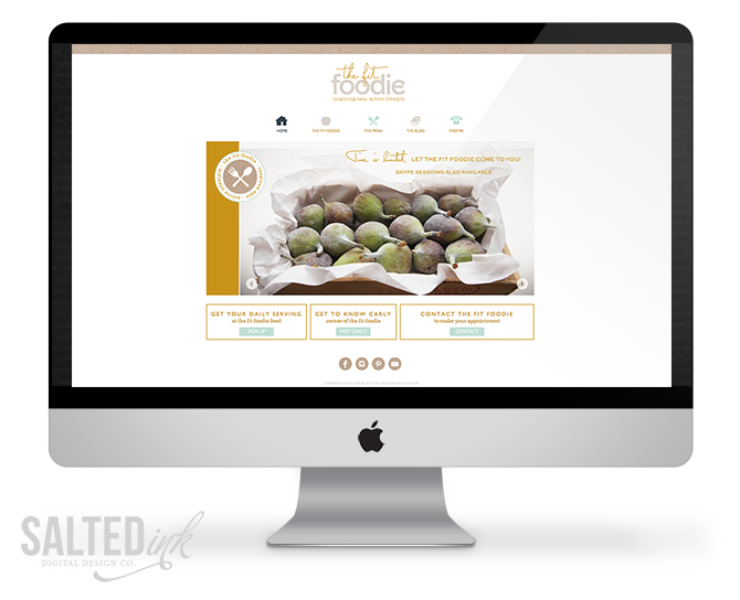
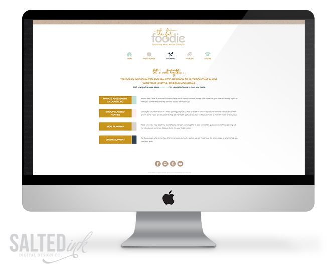
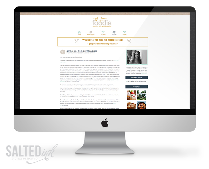
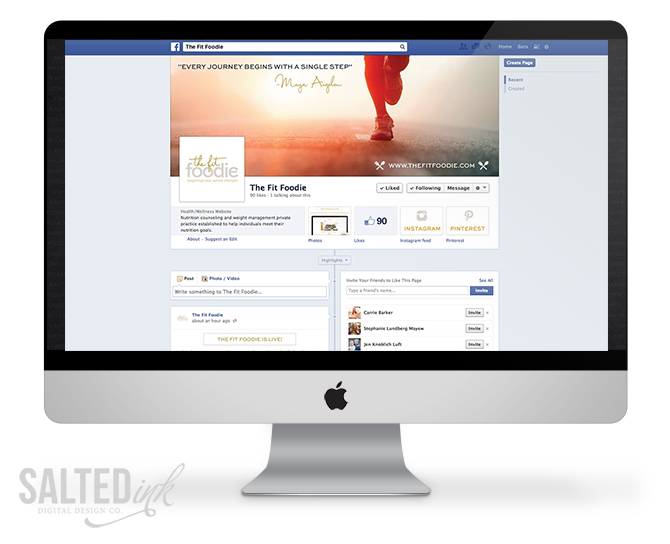


I really like this design. Right now I’m very drawn to the combination of mint and mustard for color schemes and this one combines them perfectly. I also like your mix of the three different fonts in the logo.
I recently started following your blog through Saffron Avenue. Both of you have such complete branding designs. I’m really enjoying everything you post! Hope you are having a wonderful holiday!
Thanks Jamie! I love those colors too.
Beautiful branding! Would you mind sharing what the script font name is?
Hi Julia – I actually hand wrote “the fit” but it closely resembles the font Capistrano that we used throughout the website and branding.