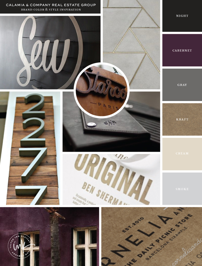
Calamia & Company Real Estate Group is the best of the best in domestic and international real estate in the Pheonix/Scottsdale, AZ area. They really wanted to build a unique and modern brand that would visually stand apart from their competitors and appeal to their higher end clientele. As part of the larger Berkshire Hathaway Home Services umbrella, they also had to be sure that their new palette would include the BHHS cabernet and cream colors, yet be able to stand on it’s own when needed. We started by combining a limited color palette of blacks, grays and kraft to the already set cabernet and creams to create a lovely starting point.

sew | pattern | street numbers | starcow | palomino | ben sherman | eggplant wall | cornelia & co.
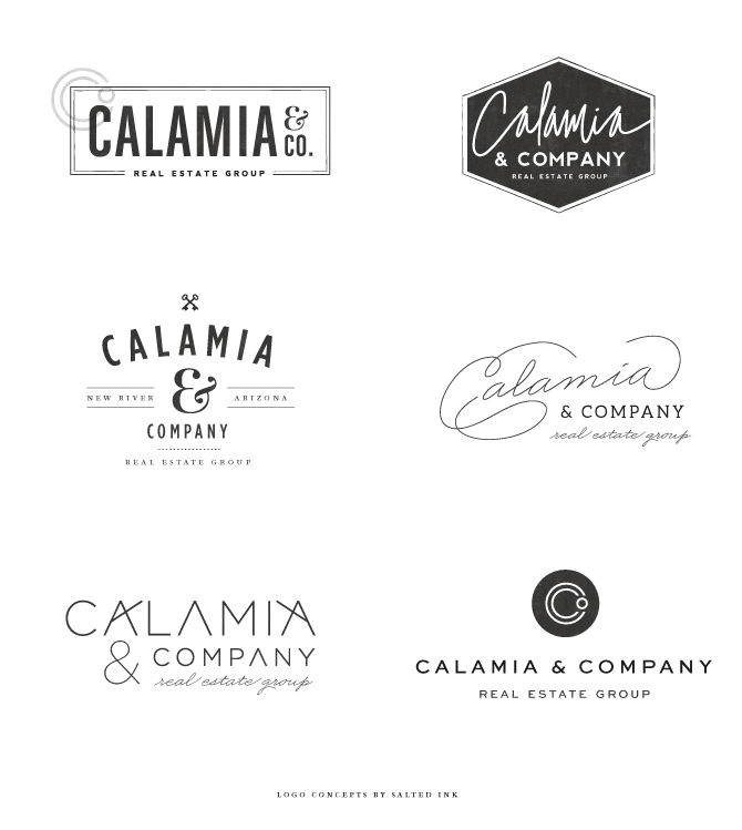
After we nailed down the color palette and overall feel with some angular patterns and tall clean sans serif fonts, we moved to the logo design portion of the process. The logo concepts for this phase are shown below:

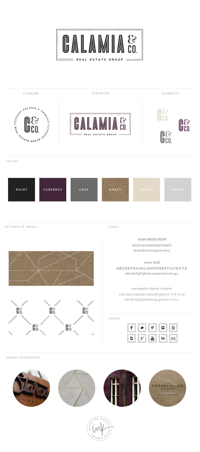
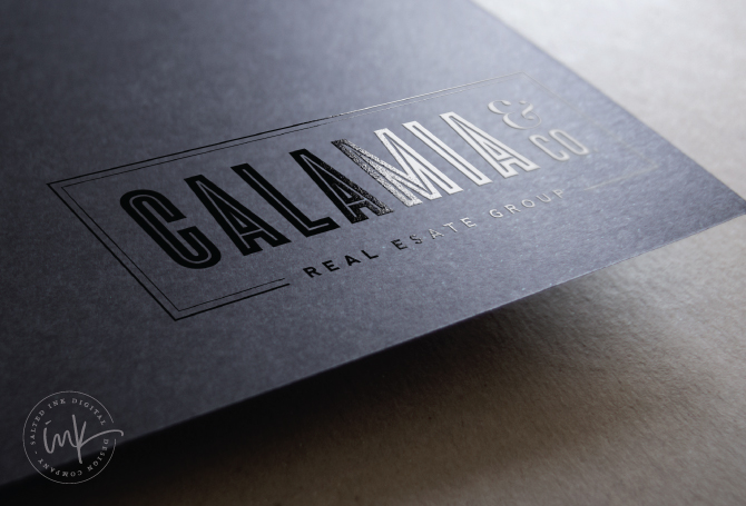
We went back for a round of revisions to the initial presentation and the final logo incorporated everything that the Calamia & Co team wanted in their new look including a boarder, mix of sans serif and serif fonts, a slim inline font and a circular submark. A big thanks to Megan for choosing me to be a part of their team branding project and I hope you guys enjoy your new look! 


