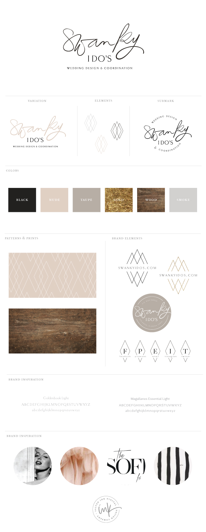
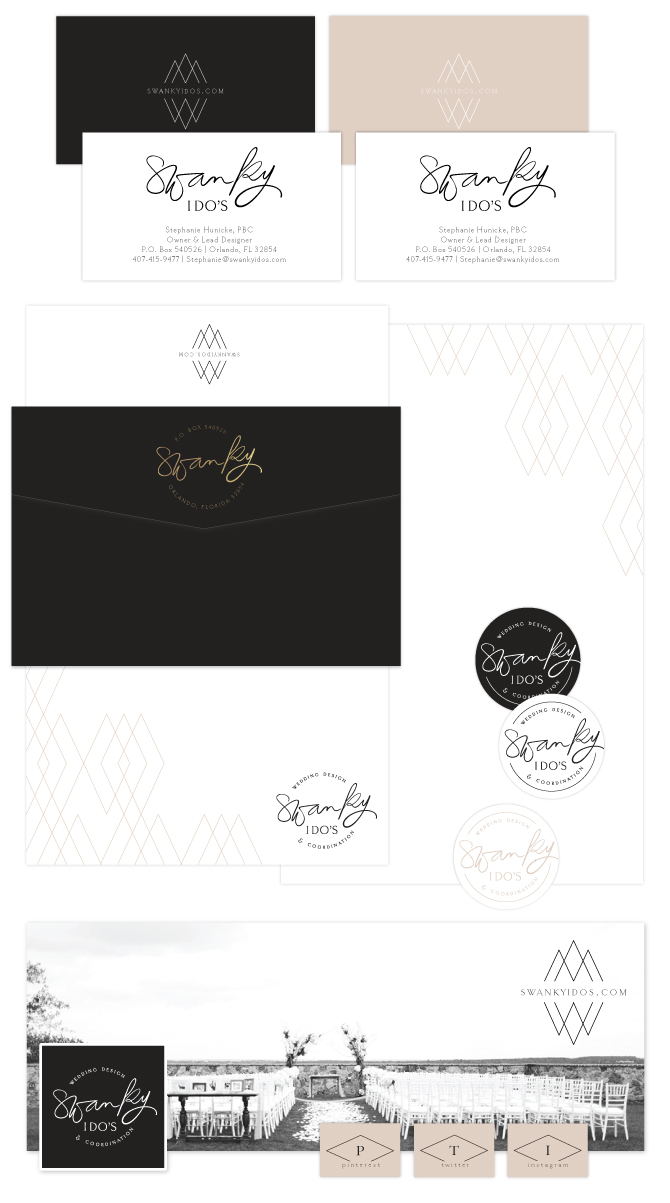
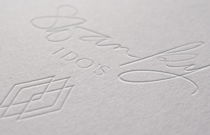
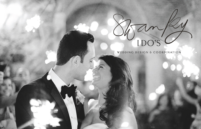
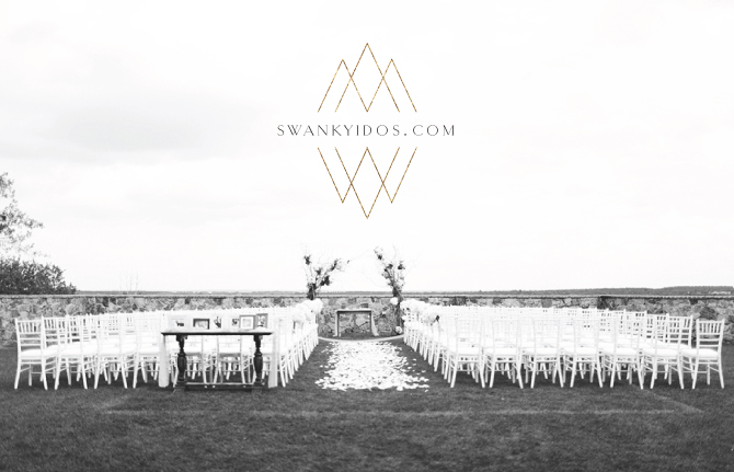
Swanky I Do’s is Orlando’s premier wedding and event planning company owned and operated by Stephanie Hunicke, lead designer and planner who was so wonderful to work with. Stephanie was looking to create a more cohesive brand identity for her already successful and established wedding and event planning business. We decided on a neutral color palette with a pop of gold foil and focused on showcasing her black and white photos in her branding material for a true “swanky” feel. Her logo consists of a hand lettered brush pen and a thin serif font. Check out the details of our process below along with the final product.
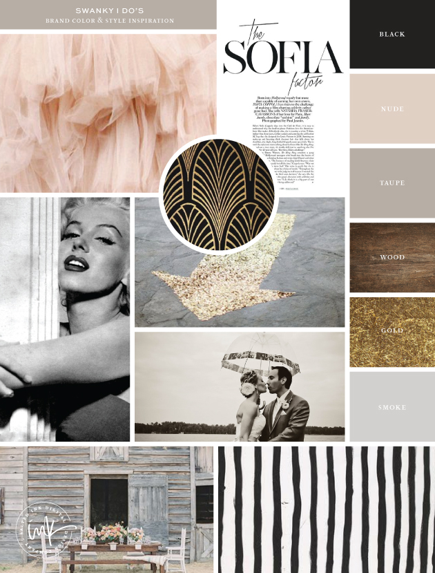
Inspiration Image Credits: Tule // Sofia Factor // Pattern // Marilyn Monroe by Nick de Morgoli -1953 // Arrow // Couple // Barn // Stripes
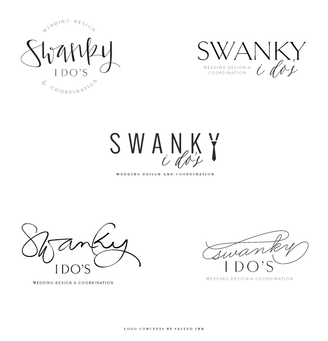
LOGO CONCEPTS
Stephanie was looking for the logos focus to be on placed on the word “swanky” with little or no imagery involved.
FINAL BRAND STYLING
With a slight edit to the “k and y”, the brush pen logo was the winner and we chose a geo diamond mark as an element and pattern for branding accents.


Such a lovely design! I love the design of the word “swanky”, and the diamond mark really adds the swanky feel. Well done!
Thanks so much Yuni! This is a favorite of mine for sure. I was in love with the muted color palette.