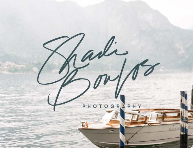
I am totally pumped about this new handwritten brand design for Shadi Boulos Photography. I am a big fan of Shadi’s amazing photography skills and he was so wonderful to work with throughout this process. We started with a strong color palette and designed a free flowing hand written logo accented with clean lined geometric patterns. Check out the little peak into our process below…
The Inspiration
We derived most of our color palette from the orange walls and deep sea door photo on the middle left of the mood board below. We then added in a light gray blue and some marble to finish the strong color palette.
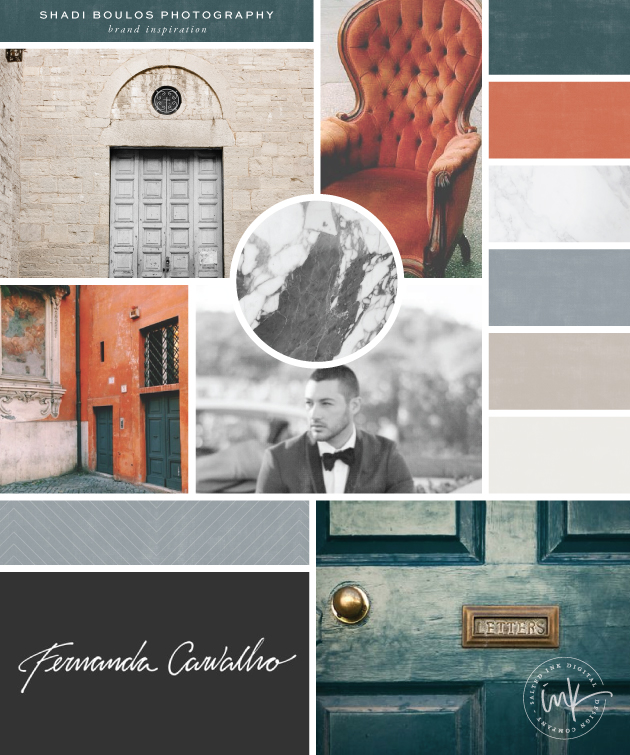
door // chair // door // marble // groom // fernanda // door
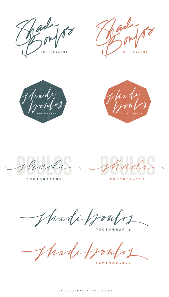
The Logo Concepts
Shadi knew he wanted a hand written text based logo that had some personality. Below are a few of the options we came up with to suite his taste.
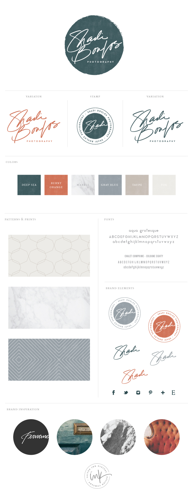
The Final Brand and Styling
We decided to go with the rough edge circle for the main variation of Shadi’s logo but included the unbound versions for him to use as well. We also created a little circle submark/stamp for his return address and a watermark variation. Here’s a look at the full brand…
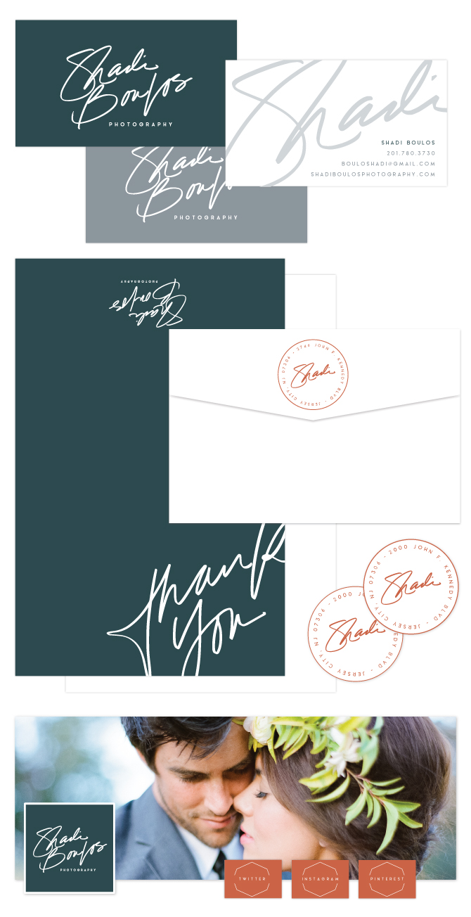
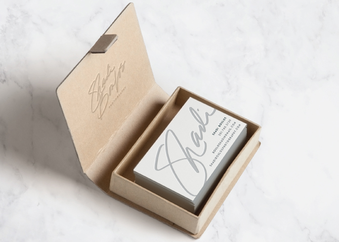
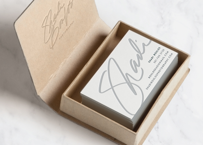
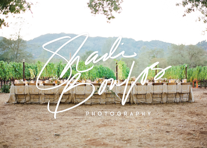
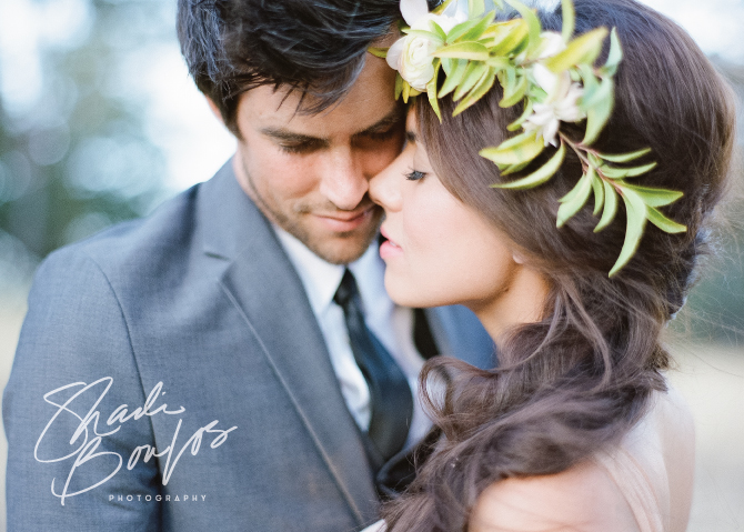
Beautiful images compliments of Shadi Boulos Photography


Gorgeous work. Really nice to see a very masculine brand that will appeal to both the sexes. Love the colour palette too! You nailed this one
Thanks Jen! I loved the change up with these masculine colors too. Definitely fun to do something a little different.
i LOVE this! I have a logo, but I would love a full brand like you did here (when I have the funds, of course! 🙂 I’ll be keeping you in mind. I’ve been following you for a while and I’m ALWAYS blown away. Congrats to your success, and congrats to Shadi.
Thanks so much Annie! You are too sweet. I hope our paths cross in the future 🙂