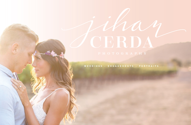
Now that I am on my official holiday “break”, I finally have some time to post about all the fun brands I had the pleasure of designing this last half of 2014. All my lovely Instagram followers had a few previews of this brand in the works and now I am excited to share the final product for Jihan Cerda Photography. Jihan is an oh-so-talented photographer out in California and her work is just gorgeous. I am definitely jealous of all my photography clients as they are just so damn good at something I am ever-so-slowly trying to get better at…taking awesome pictures. Obviously, I have a long way to go but as you can tell by some of her lovely snapshots in this post, Jihan really makes it happen for her clients. Here is a little peek into our branding process…
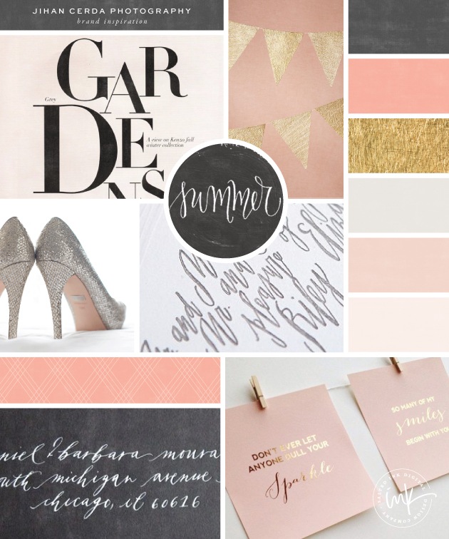
Brand & Color Inspiration
Jihan really wanted a soft, fun and feminine color palette for her new brand as weddings are her main gig. This is beautiful color mood board below is what we came up with and it fit her goals perfectly.
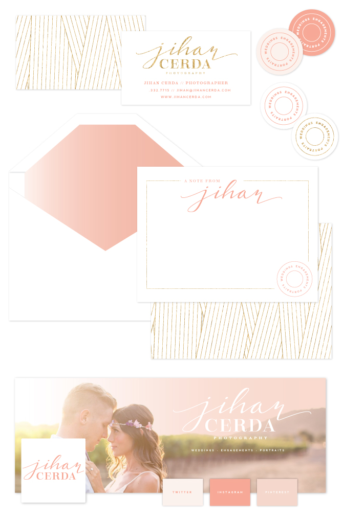
The Final Brand Styling
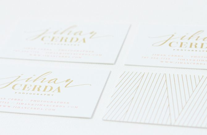
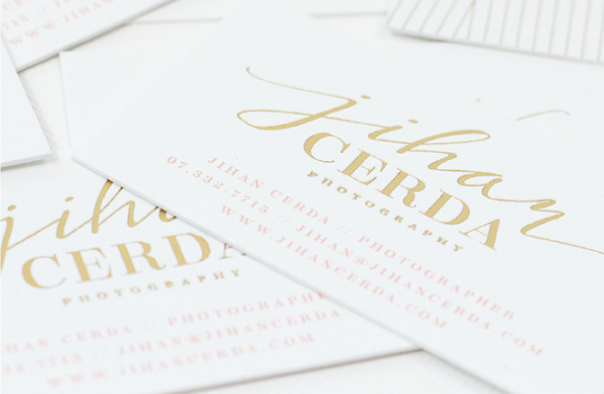
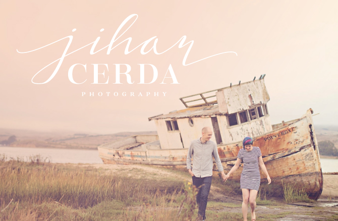
With our beauty of a color palette in place, she chose a soft hand written calligraphy mixed with a strong serif font for her main logo. We also made a clean little submark for her watermarks, stamps and stickers. Jihan was set on gold foil cards, which turned out beautifully and are pictured below as well (don’t mind my beginner photography skills).



*swoon*
Thanks Ruth 😉
A visual buffet, my eyes love your work!
Thanks Jacob!
Your designs are SO BEAUTIFUL! You are definitely an amazing source for inspiration.
I am a newbie blogger and trying to do everything myself (love learning) including my branding. Thank you so much for sharing all of your incredible work! My site looks so amateur right now, it’s cracking me up 🙂
xoxo
Brenda
À LA PLAGE
Thanks Brenda! And don’t worry, we all started somewhere. I look at some of the stuff I did years ago and laugh myself. The key is to keep going and keep learning. You will get there 🙂