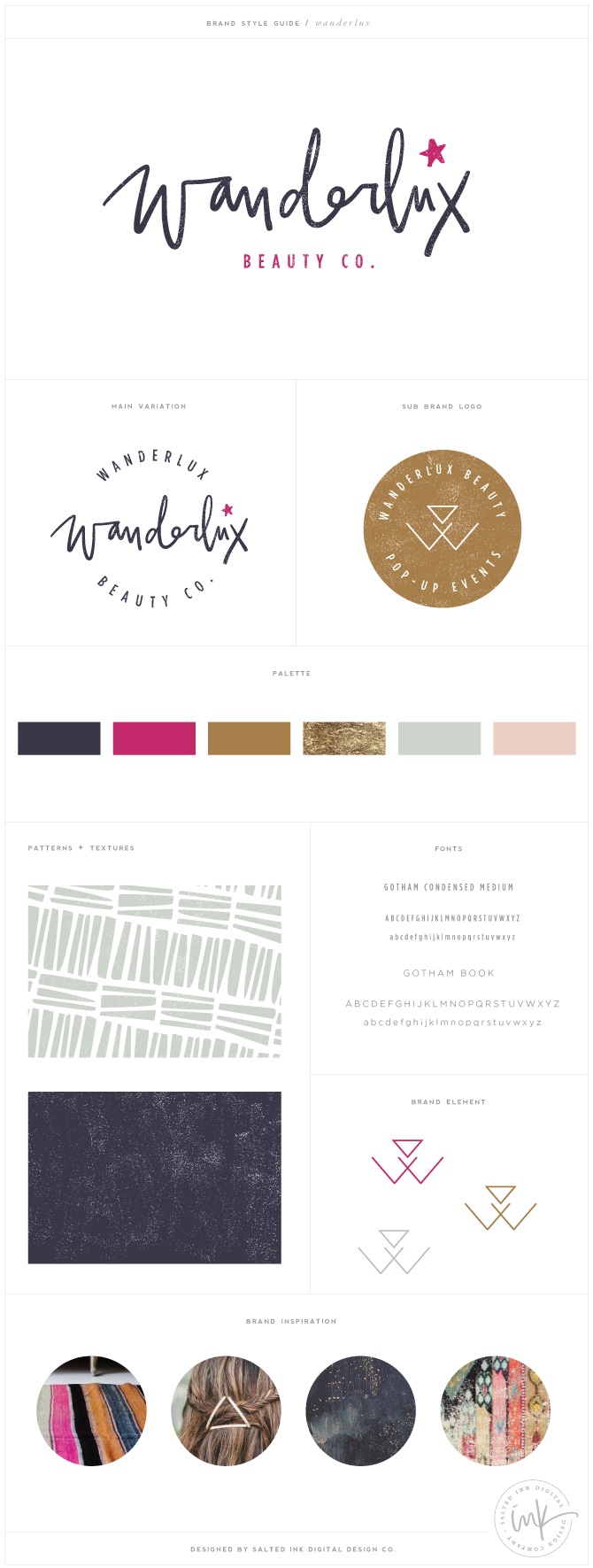
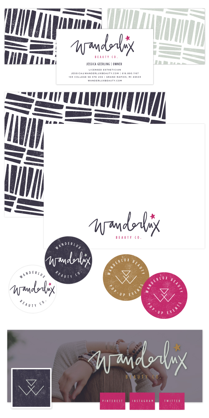
Wanderlux was a bit of a style shift for me compared to a lot of my recent projects and I LOVED it. Working with these awesome colors and putting together this challenging new hand lettered style that I really hadn’t done before (amen for the ipad pro and ipad pencil) was just what I needed. It’s different, wild, a bit messy and full of boho chic vibrant tones. Jessica, owner and licensed esthetician, was a pleasure to work with and had a great vision for her new brand that made this such a refreshing project. We started with our inspiration board and applied the overall style to everything we did throughout her new brand. From the starry, grunge overlays to the modern “W” element for her pop-up events portion of her business – you can check out our entire process below.
The Brand Inspiration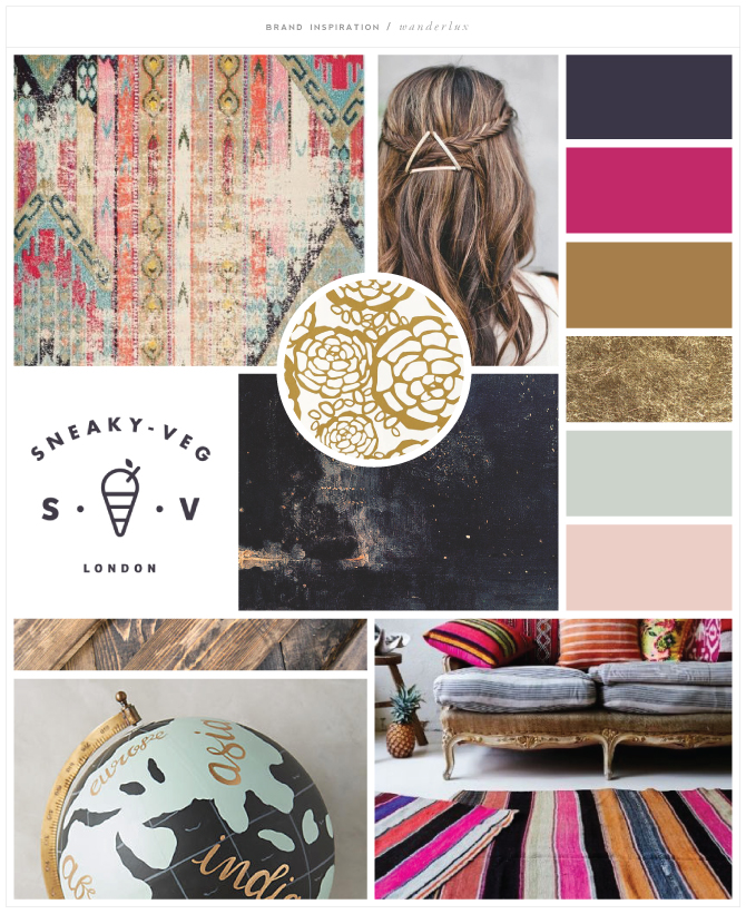 carpet / clip / sneaky-veg / wallpaper / texture / globe / room
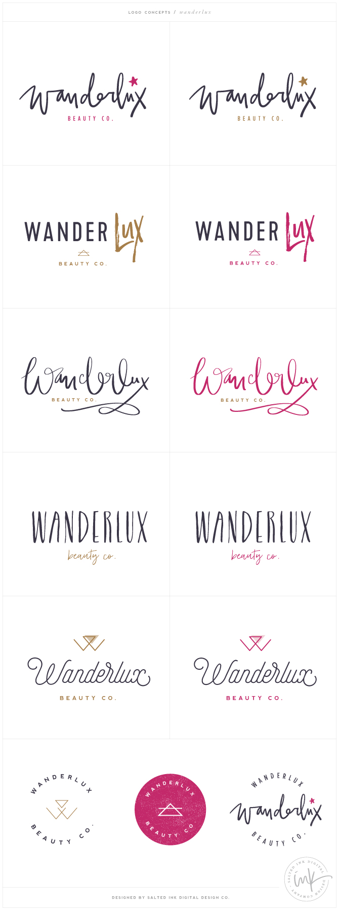
The Logo Concepts
The Final Brand Board
Print and Social Media Design


Beautiful! I’d love to know what some of the fonts in the discarded logo ideas are! That script font is gorgeous along with the structured cursive font! Great work!