Brand Launch: Jihan Cerda Photography

JihanCardPic8

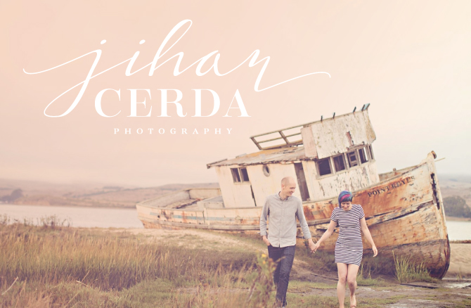
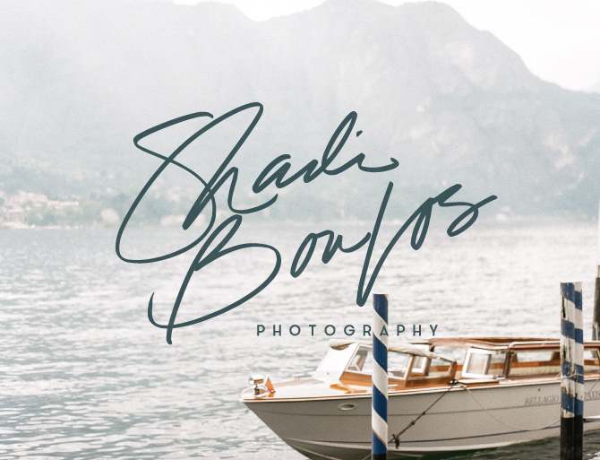
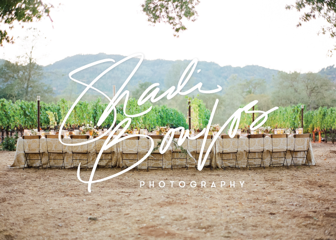
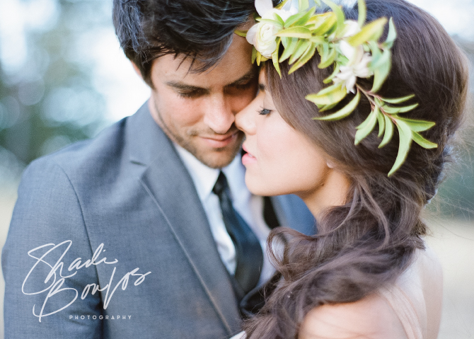
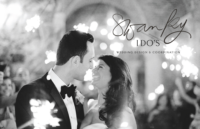
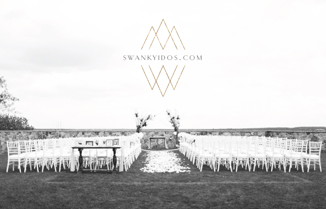
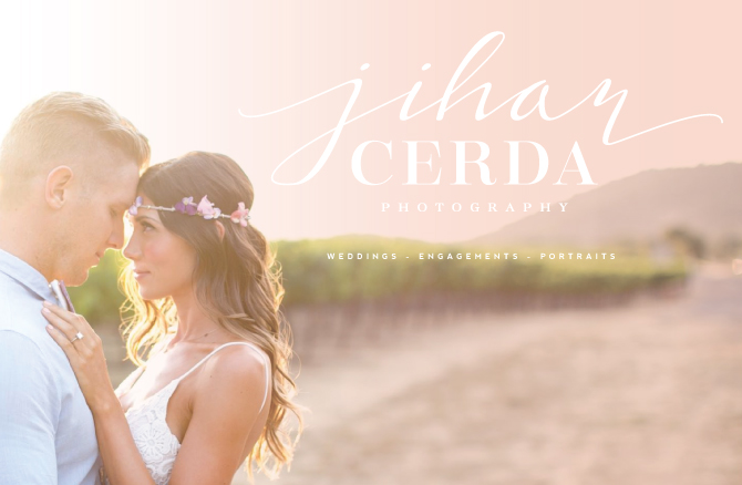
Now that I am on my official holiday “break”, I finally have some time to post about all the fun brands I had the pleasure of designing this last half of 2014.  All my lovely Instagram followers had a few previews of this brand in the works and now I am excited to share the final product for Jihan Cerda Photography. Jihan is an oh-so-talented photographer out in California and her work is just gorgeous. I am definitely jealous of all my photography clients as they are just so damn good at something I am ever-so-slowly trying to get better at…taking awesome pictures.  Obviously, I have a long way to go but as you can tell by some of her lovely snapshots in this post, Jihan really makes it happen for her clients.  Here is a little peek into our branding process…

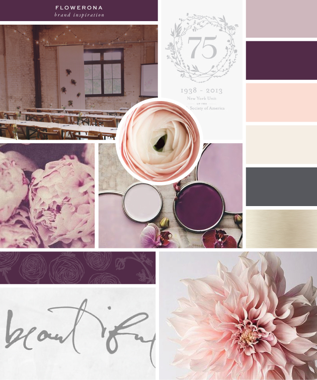
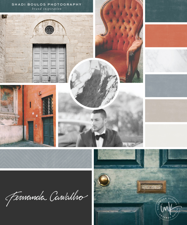
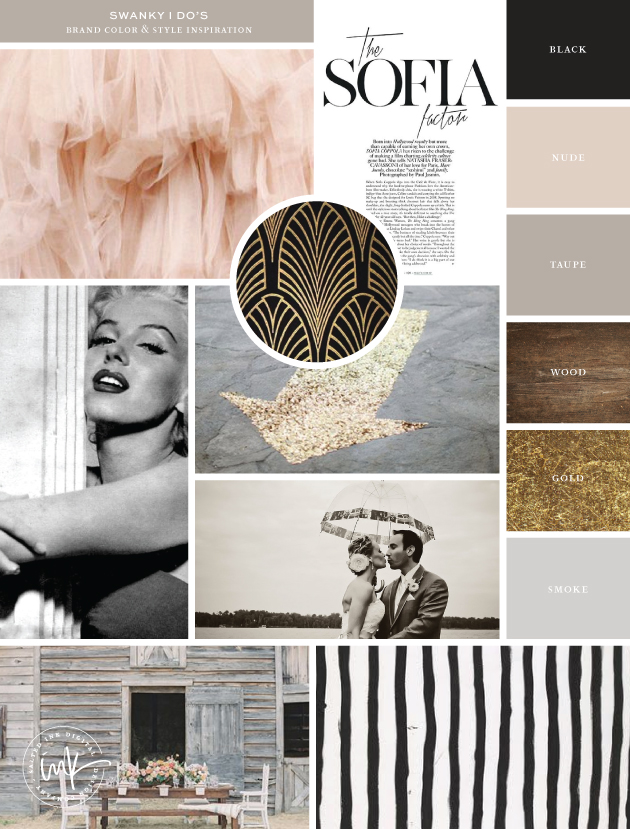
Brand & Color Inspiration

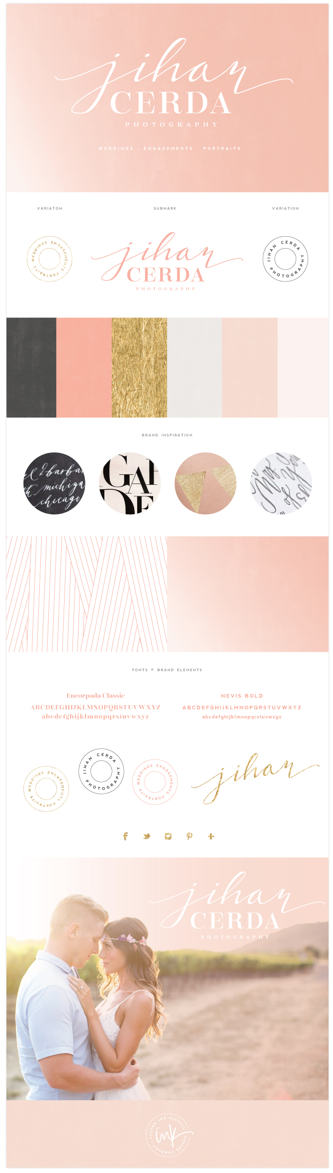
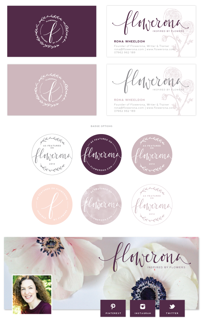
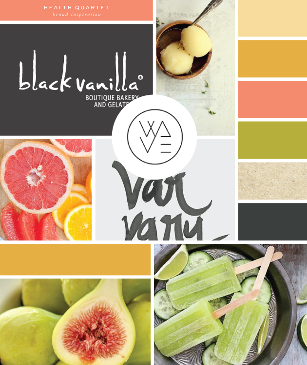
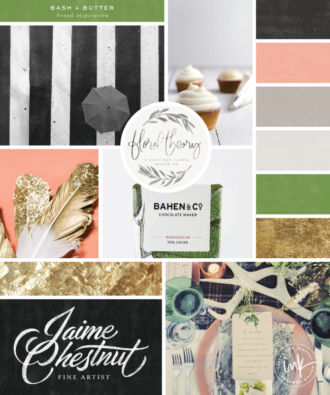
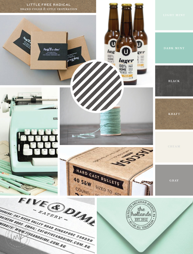
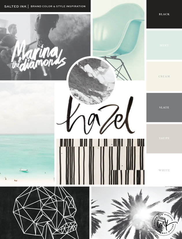
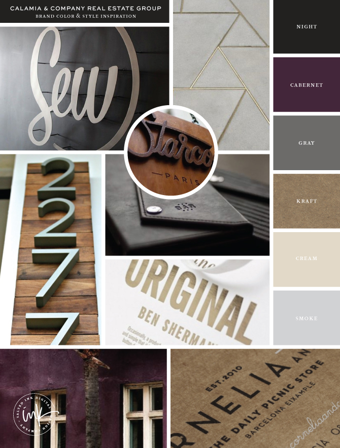
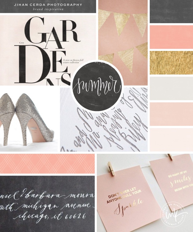
Jihan really wanted a soft, fun and feminine color palette for her new brand as weddings are her main gig.  This is beautiful color mood board below is what we came up with and it fit her goals perfectly.

JihanBrandInspiration
gardens / flags / summer / heels / calligraphy / address / gold foil

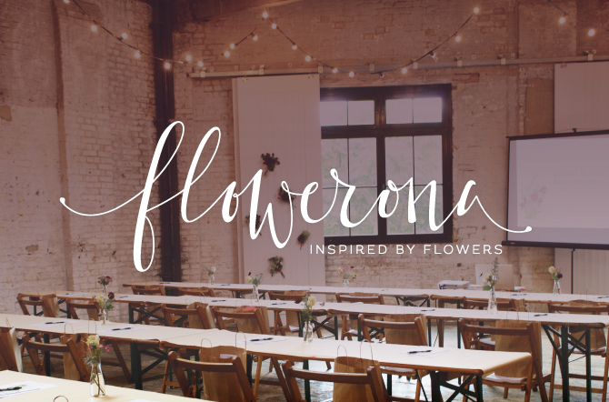
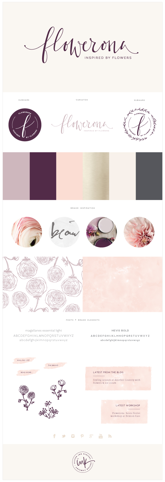
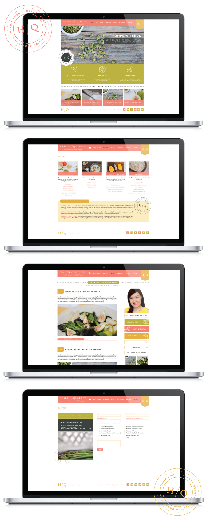
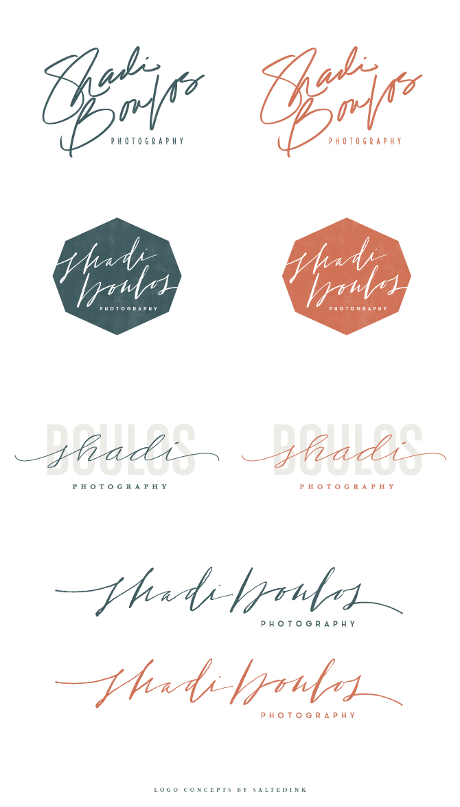
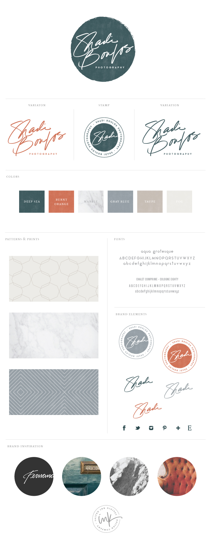
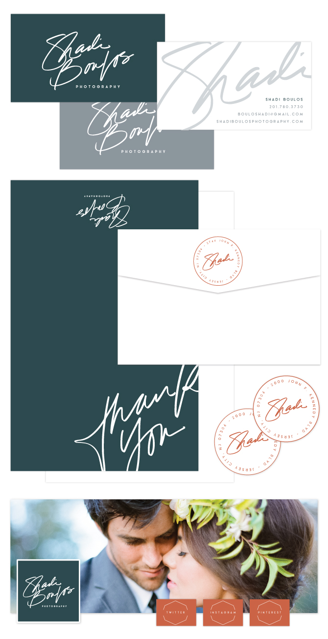
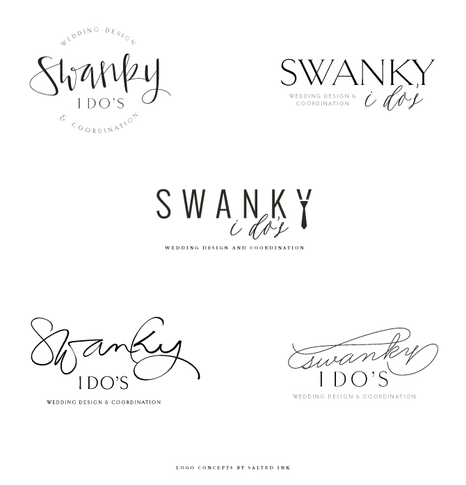
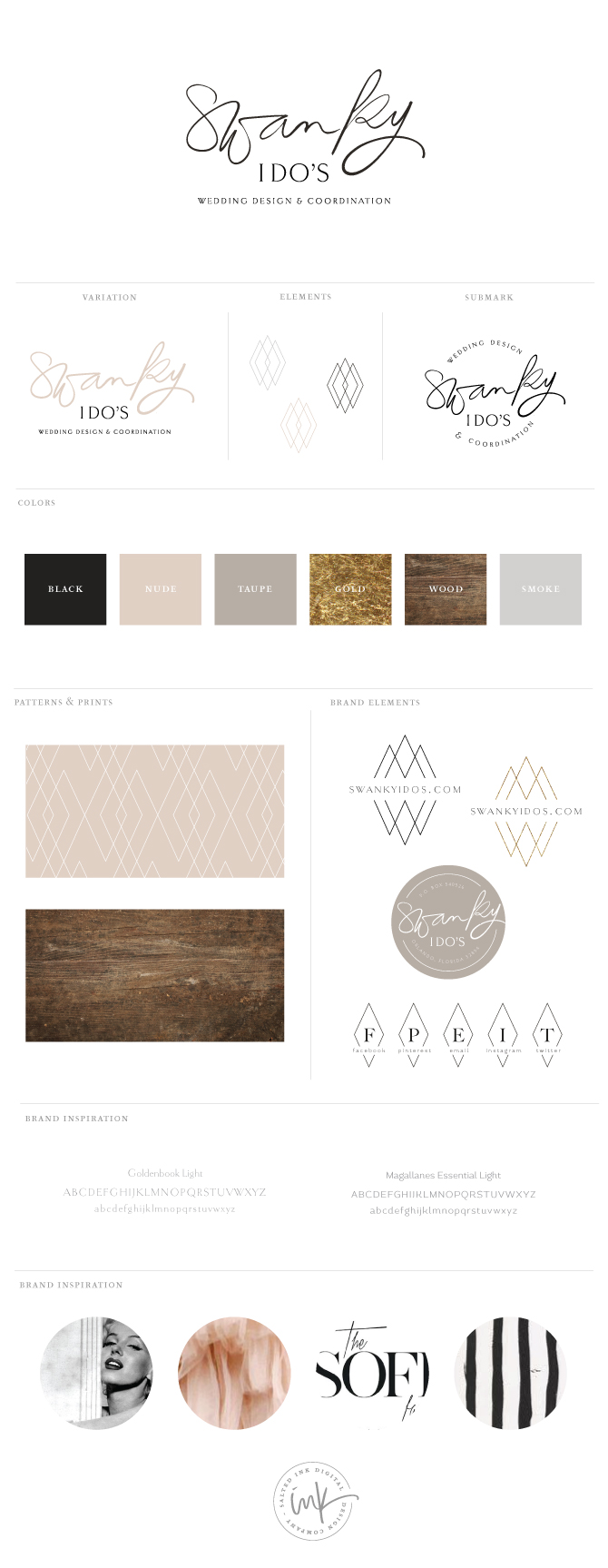
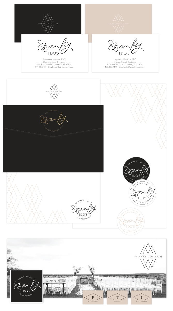
The Final Brand Styling

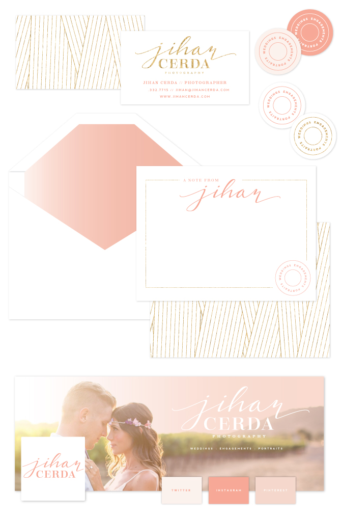
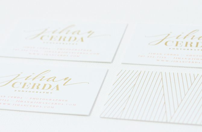
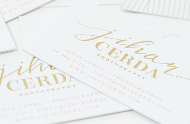
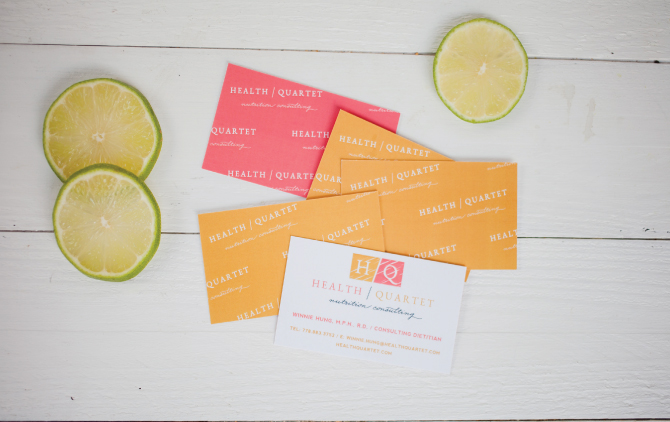
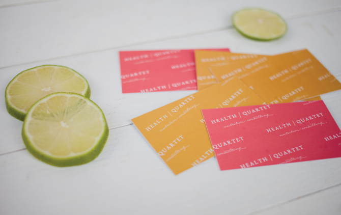
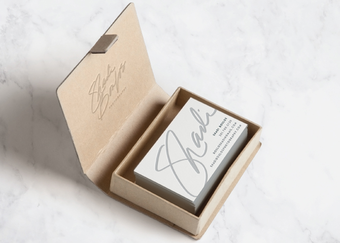
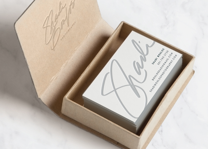
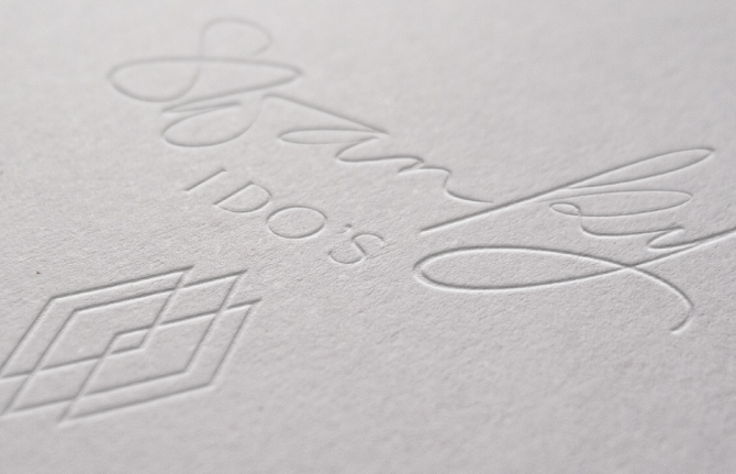
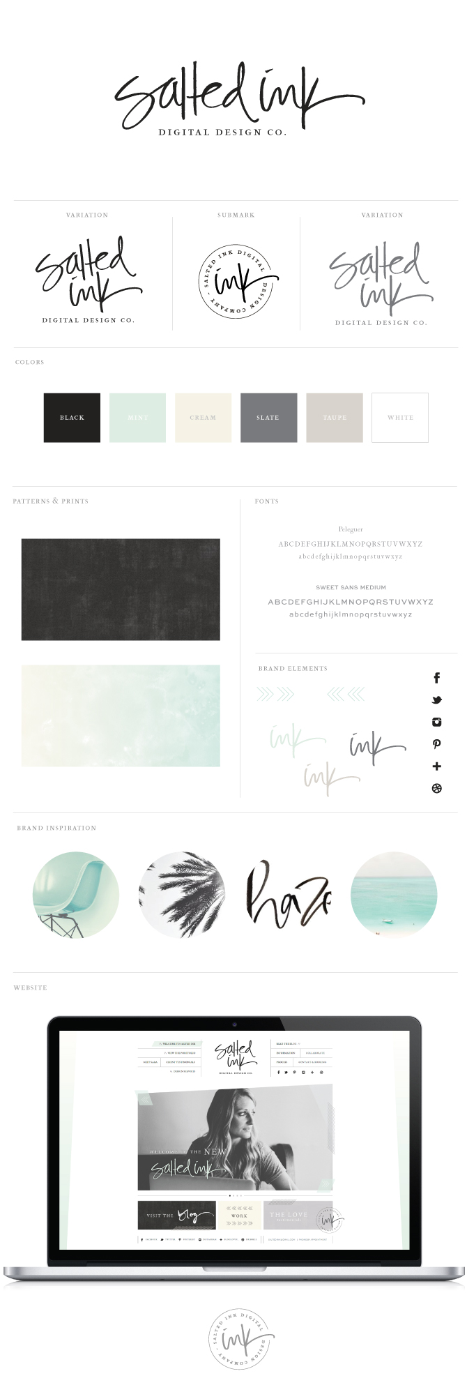
With our beauty of a color palette in place, she chose a soft hand written calligraphy mixed with a strong serif font for her main logo.  We also made a clean little submark for her watermarks, stamps and stickers.  Jihan was set on gold foil cards, which turned out beautifully and are pictured below as well (don’t mind my beginner photography skills).

JihanBrand2

JihanStationery

JihanStationery2

JihanStationery1

JihanCardPic7

Brand Launch: Flowerona

FloweronaBrandpic

Finally launched today – the new Flowerona!  Rona is the founder, writer and trainer at of her very popular blog, flowerona.com. Rona came to me earlier this year in search of a more elegant and updated feel for her lovely floral blog. Her former look was very bright and colorful, so this time she wanted to move in an opposite direction with deep purples and pastels for a more calming, feminine style. She chose a free hand calligraphy logo with hand sketched flower elements and watercolor backgrounds. We also created a lovely custom WordPress website to beautifully match Rona’s new brand all suited up with Workshop features and a custom mobile friendly site since a lot of her readers are checking her out around the clock on their devices.  A special thank you to Rona for trusting me to design her new brand and to the awesome Fiona Humberstone for bringing us together for this project.  You can check out some highlights from our process and final brand below.

The Inspiration

FloweronaBrandInspiration
room / logo / flower / vintage print / paint / beautiful / flower

The Final Brand and Styling

FloweronaBrandbySaltedink4

Branding Material and Facebook

Flowerona-Stationery

Custom WordPress Website with Mobile Friendly Responsiveness

FloweronaWEbHomeFloweronaWEbBLOG

FloweronaWEbWORKSHOP

FloweronaWEbCONTACT

Mobilefriendly

Brand Launch: Health Quartet

HQPic9

Say hello to the new citrus inspired brand designed for Health Quartet, a nutrition consulting company out of Burnaby BC in Canada. Winnie Hung, M.P.H., R.D. was looking for a fresh new brand to break into the health consultancy market in her area.  She chose very bright, refreshing colors and a very simple main logo with a mix of serif and script fonts. We made a cute little circle submark for stamps and stickers and also created a repeating pattern out of her text logo which she used on the back of her cards and folders. And for fun, we added in some hand drawn food group and citrus elements for her website and print material.

The Inspiration

HQinspirationboardsmall
black vanilla // sherbert // grapefruit //  wave // var vary // fruit // popsicles
 

The Logo Concepts

HealthQuartetConcepts

The Final Brand and Styling

HQLogoandBrandbySaltedInkNew
HealthQuartetStationery
HQPic6
HQPic5
HQPic7

Custom WordPress Website

Once we nailed down the branding, we created a completely custom and user friendly wordpress site for Winnie. The front end of the site beautifully matches her new brand but the backend is just as awesome. We build our wordpress sites to be completely custom and user friendly for each of our clients individual needs. That makes for easy site updates and really happy clients. Winnie will be officially launching her site in the next few week as she works tirelessly on adding content to her blog and resources page, but for now you can check out a preview of the design below. All of these beautiful images are compliments of Joey Armstrong – Thanks so much for your help with this project, Joey!

HQinspirationboardWEB

Brand Launch: Bash + Butter

BashandButterBrandInsta

Bash + Butter is a new sweet styling studio curated by the lovely Lacee Muller and serving the Denver Colorado area.  Her dessert tables and treats are not only beautiful but made from only the highest quality ingredients as well.    To start, Lacee and I worked together to develop a colorful palette that she thought fit her new brand to a tee.  You can follow a few snapshots of our branding process below.

BashandButterBrandInspiration

Stripes  //  cupcakes  //  floral theory  //  feather  //  gold  //  bahen  //  jaime chestnut  //  table scape

The Logo Concepts

BashandButterConcepts

The Final Brand and Styling

BashandButterFinalBRAND

Print and Social Brand Design

BashandButterStationery2

Brand Launch: Shadi Boulos Photography

ShadiBPhotoBrandPic5

I am totally pumped about this new handwritten brand design for Shadi Boulos Photography.  I am a big fan of Shadi’s amazing photography skills and he was so wonderful to work with throughout this process.  We started with a strong color palette and designed a free flowing hand written logo accented with clean lined geometric patterns.  Check out the little peak into our process below…

The Inspiration

We derived most of our color palette from the orange walls and deep sea door photo on the middle left of the mood board below.  We then added in a light gray blue and some marble to finish the strong color palette.

ShadiBPhotoBrandInspiration

door  //  chair  //  door  //  marble  //  groom  //  fernanda  //  door

The Logo Concepts

Shadi knew he wanted a hand written text based logo that had some personality.  Below are a few of the options we came up with to suite his taste.

ShadiBPhotoBrandConcepts

The Final Brand and Styling

We decided to go with the rough edge circle for the main variation of Shadi’s logo but included the unbound versions for him to use as well.  We also created a little circle submark/stamp for his return address and a watermark variation.  Here’s a look at the full brand…

ShadiBPhotoBrandFinalBrand

ShadiBPhotoStationery

ShadiBizCard1

ShadiBizCard2

ShadiBPhotoBrandPic3

ShadiBPhotoBrandPic1

 Beautiful images compliments of Shadi Boulos Photography

Brand Launch: Swanky I Do’s

Swanky I Do’s is Orlando’s premier wedding and event planning company owned and operated by Stephanie Hunicke, lead designer and planner who was so wonderful to work with.  Stephanie was looking to create a more cohesive brand identity for her already successful and established wedding and event planning business.  We decided on a neutral color palette with a pop of gold foil and focused on showcasing her black and white photos in her branding material for a true “swanky” feel.  Her logo consists of a hand lettered brush pen and a thin serif font.  Check out the details of our process below along with the final product.

SwankyIDosBrandingInspriatoinFINAL

Inspiration Image Credits:  Tule // Sofia Factor // Pattern // Marilyn Monroe by Nick de Morgoli -1953 // Arrow // Couple // Barn // Stripes

LOGO CONCEPTS

Stephanie was looking for the logos focus to be on placed on the word “swanky” with little or no imagery involved.

SwankyIDosBrandingConceptsFINAL

FINAL BRAND STYLING

With a slight edit to the “k and y”, the brush pen logo was the winner and we chose a geo diamond mark as an element and pattern for branding accents.

SwankyIDosBrandFINALSwankyStationery

SwankyIDosBrandingLogoLetterpress

SwankyIDosBrandingPhoto1

SwankyIDosBrandingPhoto2

Brand Launch – Little Free Radical

If you love Etsy and handmade goods, you have probably already heard of Little Free Radical. Crystal, owner and mastermind behind LFR, sells handmade and eco friendly, locally manufactured products perfect for your next party, wedding or photo shoot. Coming from a formerly very colorful brand, Crystal was looking for a more minimal color palette this time around and really wanted to something with a retro/vintage feel. For the inspiration, we combined a couple shades of mint, black and gray as well as a dark kraft that she plans to use for her new packaging. 

LFRBrandingInspirationbySaltedInk
package  //  lager  //  typewriter  //  twine  //  tascosa  //  five & dime  //  the hollands

Once we established the overall mood and color palette for her new brand development, I got to work on the logo design. I had so many different ideas for this one that I actually ended up presenting quite a long list of options. I put together a variety of hand drawn lettering and elements as well as some fun font combinations.  Here are the samples:

LFRBrandingConceptsBySaltedInk

After seeing the different logo options, Crystal stuck true to her initial retro vision but also loved a lot of the elements in the other concepts like the party hat and silhouette. So, we combined and expanded on all of her favorite things to form one pretty awesome brand with lots of product sketches to be used on her new packaging. We also created some cool little tags, stickers, and stamps to get her started with plans to break ground on her new website in the fall.

LFRBrandingFinalbySaltedInk LRFstationery

The New Salted Ink

WelcomeNewBlog

The new site is finally live!  And damn, it is so hard to design for yourself.  Designers – I know you hear me here.  This date is also extra meaningful as this marks the first anniversary of my full time self employment – whewww.  When I first launched back in August of 2013, I feel like I rushed a bit into a brand and website design so I could get to work on making this dream a reality.   I have evolved as a designer over the past year, as we all do, but definitely feel like there were many aspects of my old brand that are just “me.” So I hung on to those oldie-but-goodies from my former self and added in some brush pen work, palms and a mid-century/coastal flare to form – what I hope is – a more polished Salted Ink.  Thank you all for your support through my launch build up and I hope you like the new look.  A special thank you to Dana Hawley Photography for these lovely pics you’ll see around the site.

SaltedInkInspraiton

Inspiration Image Credits: marina  //  chair  //  beach  //  marble  //  hazel  //  pattern  //  geo skull  //  palms

SaltedInkNewBrandBySaltedInk