Brand Launch – Little Free Radical

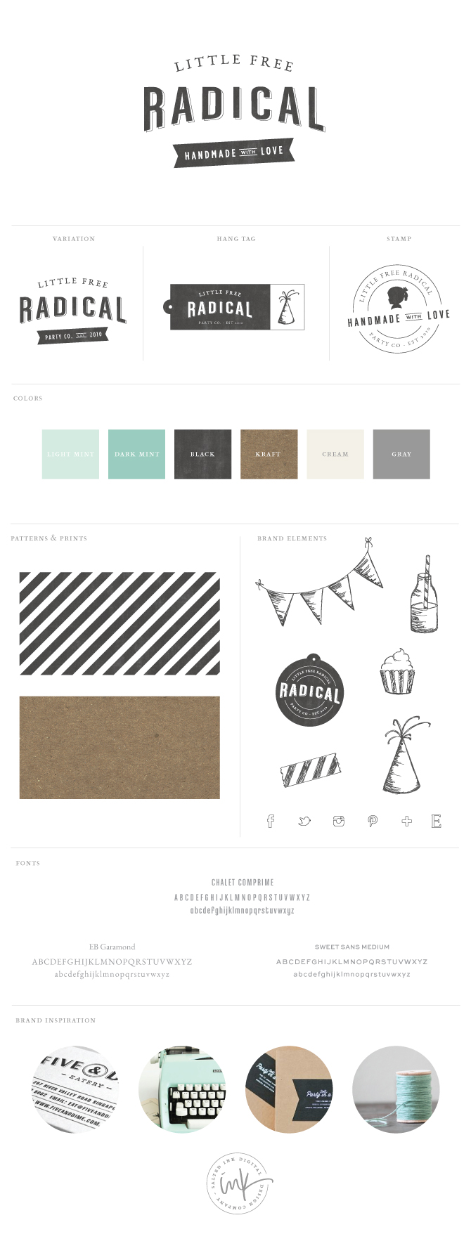
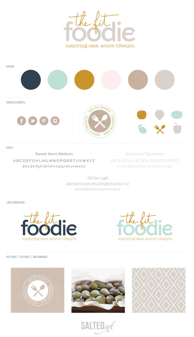
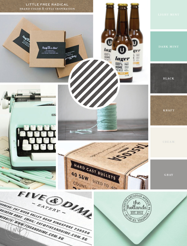
If you love Etsy and handmade goods, you have probably already heard of Little Free Radical. Crystal, owner and mastermind behind LFR, sells handmade and eco friendly, locally manufactured products perfect for your next party, wedding or photo shoot. Coming from a formerly very colorful brand, Crystal was looking for a more minimal color palette this time around and really wanted to something with a retro/vintage feel. For the inspiration, we combined a couple shades of mint, black and gray as well as a dark kraft that she plans to use for her new packaging. 

LFRBrandingInspirationbySaltedInk
package  //  lager  //  typewriter  //  twine  //  tascosa  //  five & dime  //  the hollands

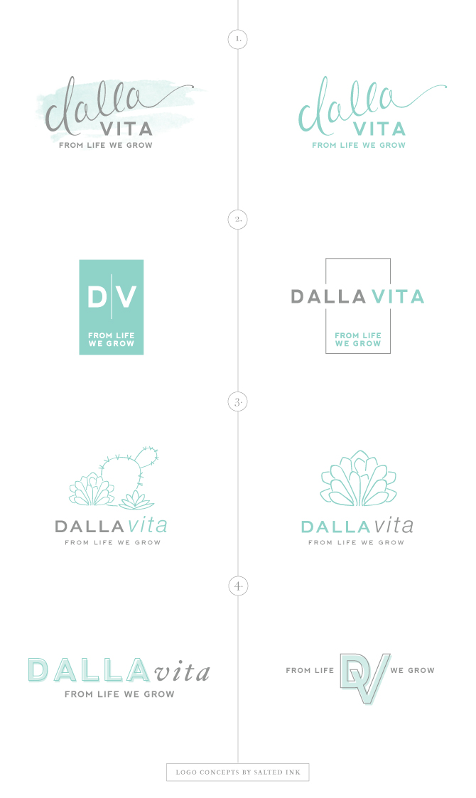
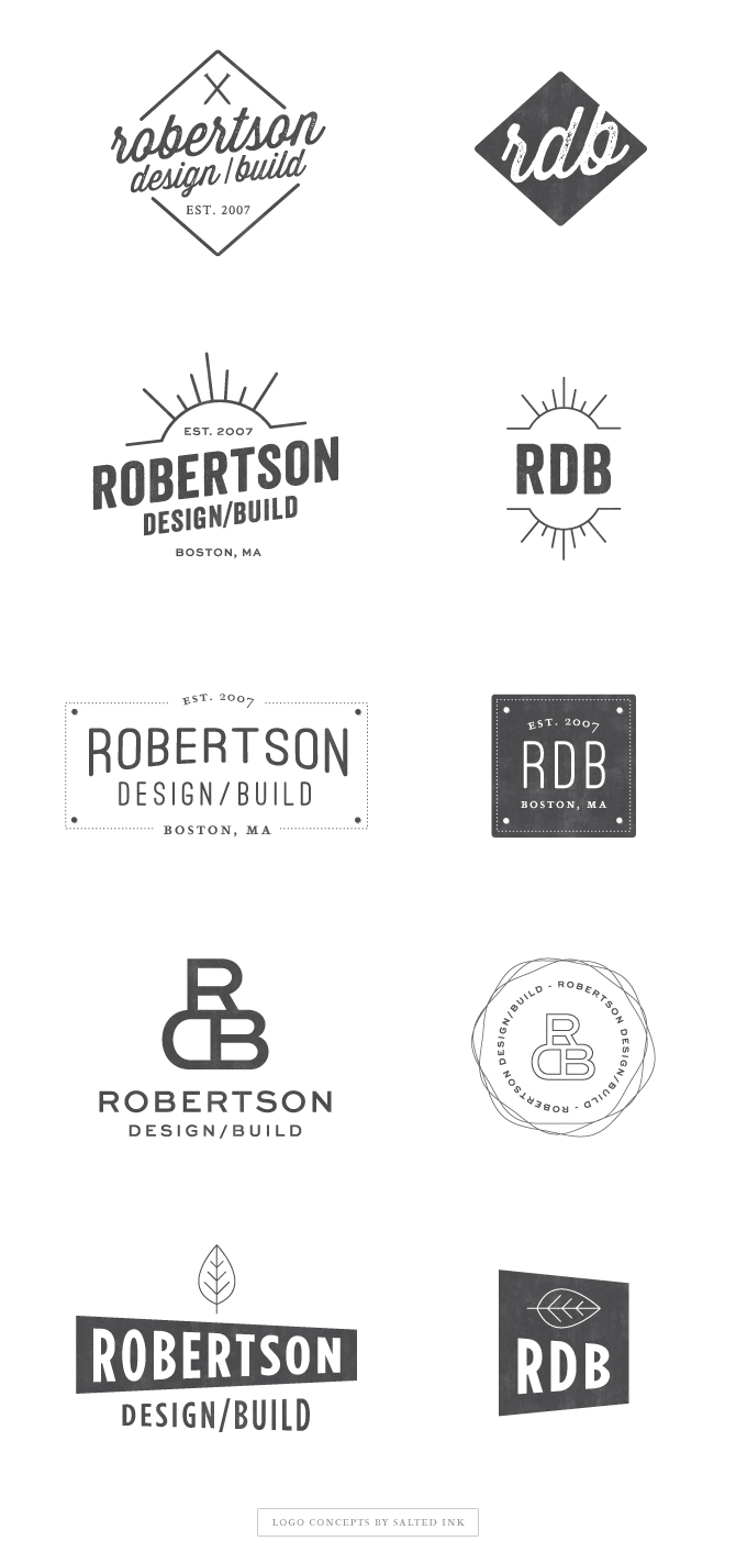
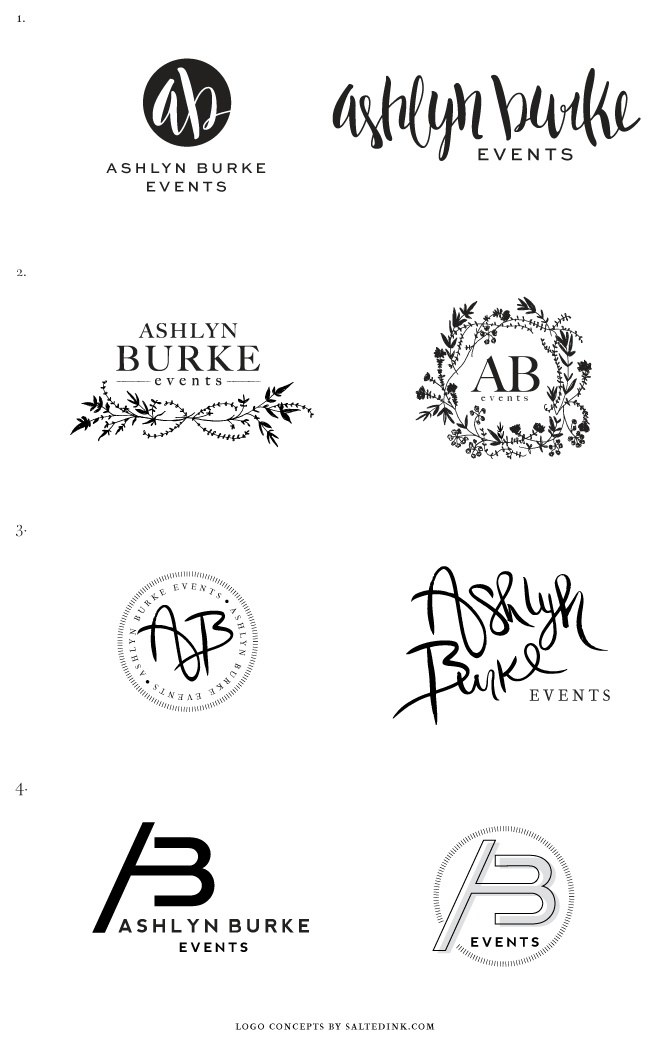
Once we established the overall mood and color palette for her new brand development, I got to work on the logo design. I had so many different ideas for this one that I actually ended up presenting quite a long list of options. I put together a variety of hand drawn lettering and elements as well as some fun font combinations.  Here are the samples:

LFRBrandingConceptsBySaltedInk

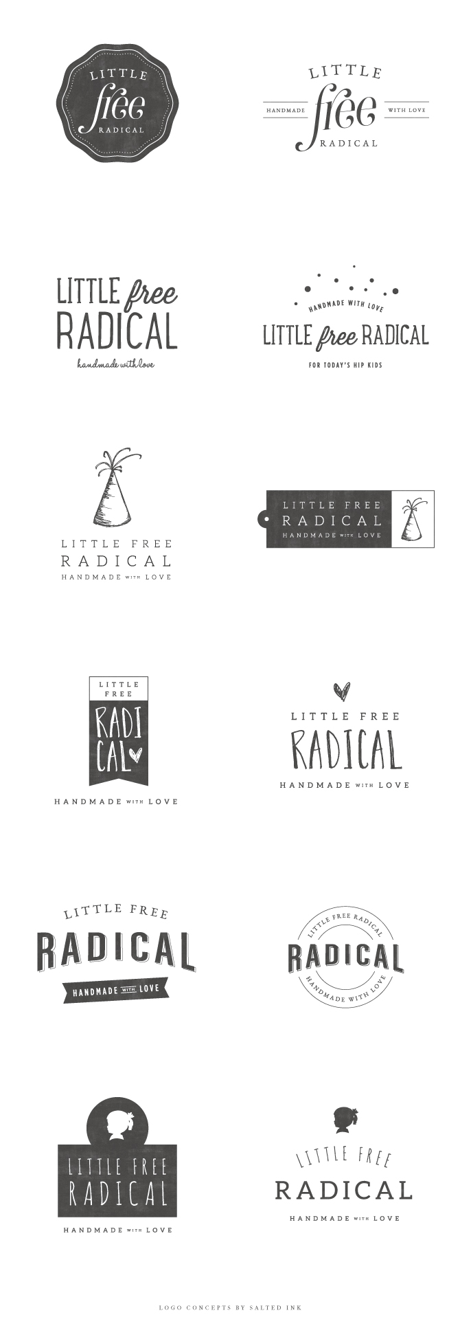
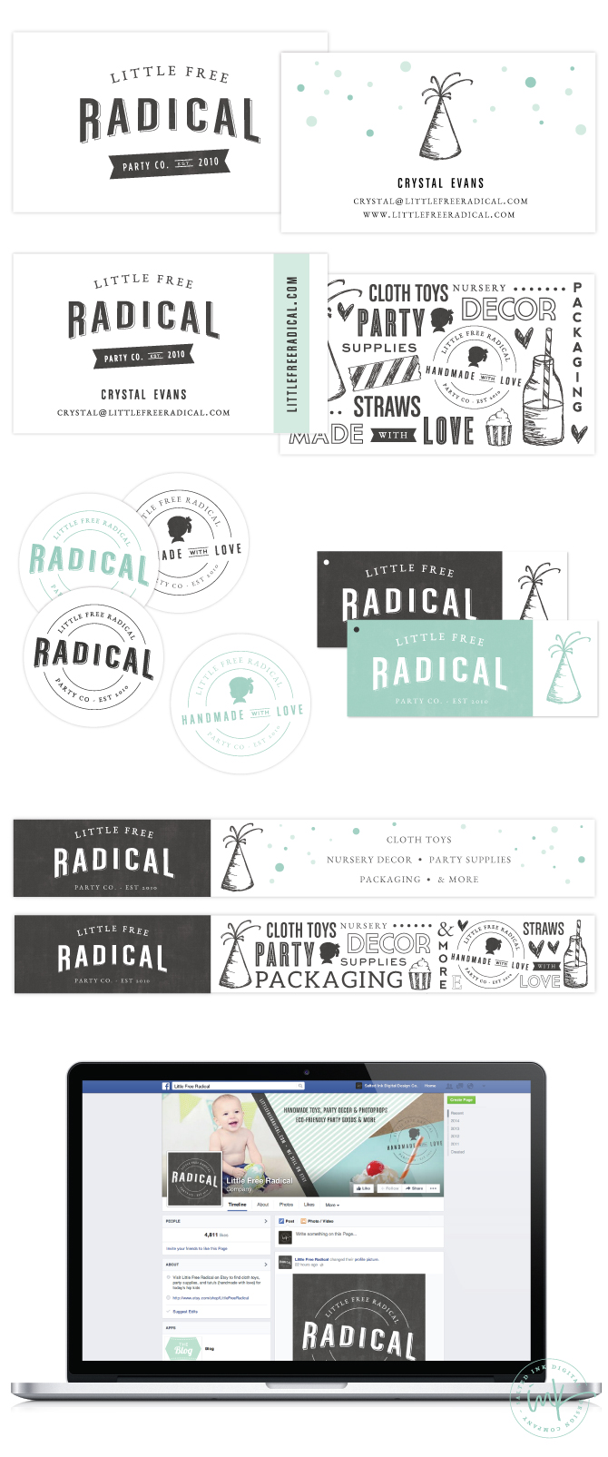
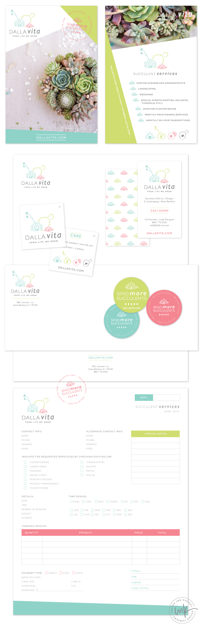
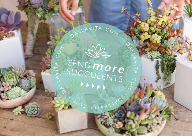
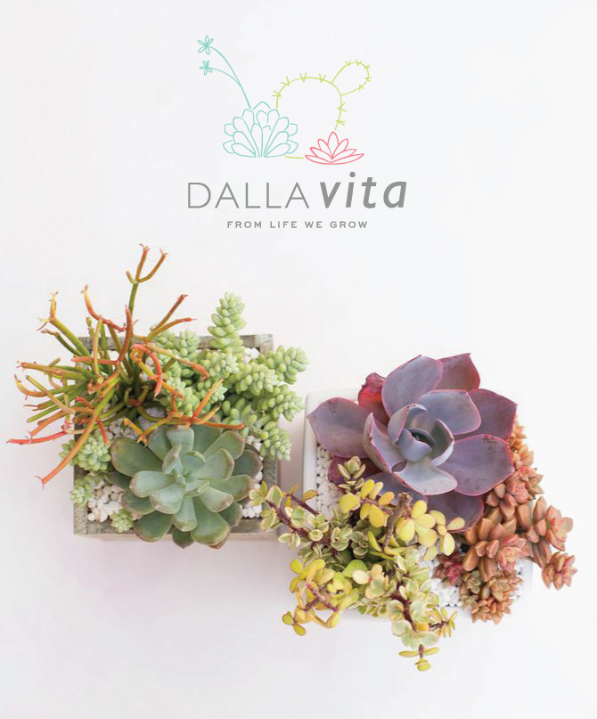
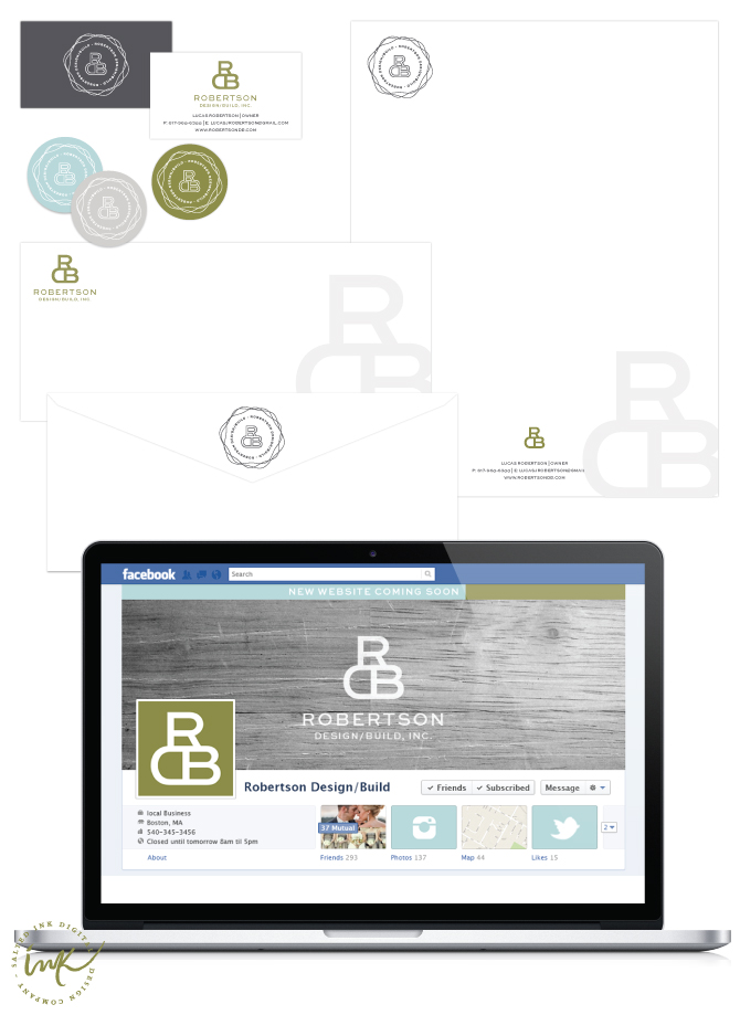
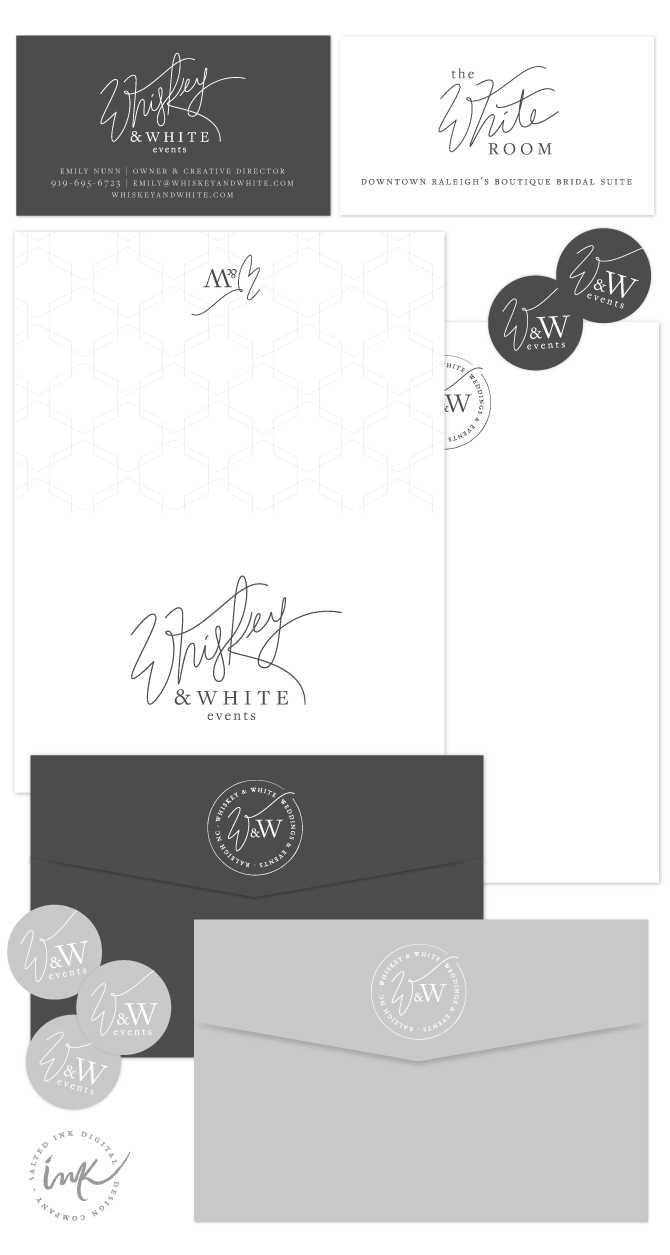
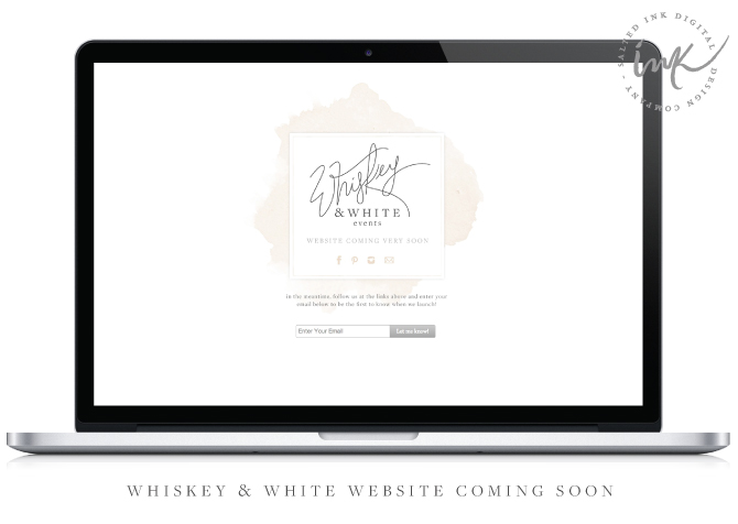
After seeing the different logo options, Crystal stuck true to her initial retro vision but also loved a lot of the elements in the other concepts like the party hat and silhouette. So, we combined and expanded on all of her favorite things to form one pretty awesome brand with lots of product sketches to be used on her new packaging. We also created some cool little tags, stickers, and stamps to get her started with plans to break ground on her new website in the fall.

LFRBrandingFinalbySaltedInk LRFstationery

Brand Launch: Dalla Vita

When Cali contacted me earlier this year about branding her new succulent delivery business, I knew I had to be a part of this awesome project.  Cali and her brother Elliot live out in Santa Barbara and are simply amazing at designing the most beautifully handcrafted succulent arrangements that you’ve ever seen.  Cali had a unique vision for Dalla Vita and it was my pleasure to help her bring it to life.  We hand drew some of her favorite succulents and paired it with a simple sans serif font combination.  The bright colors and clean white background throughout the new Dalla Vita brand and give off that fresh, vibrant look we were shooting for.  You can check out some snap shots from our design process below along with a few images of their beautiful succulent arrangements…but we aren’t done quite yet.  Currently, we are hard at work on her new custom Shopify website design launching later this summer which will feature online and same-day delivery options for these lovely little arrangements in the Santa Barbara area.

DallaVitaBrandbySaltedInkDallaVitaBrandInspirationbySaltedInk

jackie culmer | succulent 1cactus | the living co | watercolor |  illustration vintner & vine | succulent 2

DallaVitaBrandLogoConceptsbySaltedInkDallaVitaBrandStationeryDallaVitaSENDMORESUCCULENTS

DallaVitaIMAGEwithLOGO

facebookDallaVitaMockupDallaVitaBrandWebsiteLaunchingSoon3

New Brand Launch: Robertson Design/Build

This brand’s refreshing, modern/organic style had me giddy from the get-go (flash back to the RDB mood board here). Lucas is a custom builder up in Boston specializing in durable, environmentally responsible and elegant design for clients with a discerning eye.  We wanted his brand to match his clean, practical taste while giving justice to his incredible portfolio.   We chose a fresh color palette with earth tones and cool drops of color paired with a sans serif font and simple “build” of the RDB as his main element.  I hope you enjoy a glimpse into our process below and we look forward to sharing the RDB website currently under construction and launching this summer!

RobertsonDBBrandbySaltedInkRDBwoodlogo3

RobertsonLogoConceptsbySaltedInkRobertsonDBStationerySaltedInk

Ashlyn Burke Events Website Launch

Long time, no blog!  I know…it’s been some time since I’ve last updated this thing but I’ve been working on some pretty cool material in my blogging absence.  I promise to keep you entertained here with a few new brand designs and website launches in the next couple weeks.  So, let’s get this blogging streak kicked off with the new www.ashlynburkeevents.com. You guys saw a peak of what we did with Ashlyn’s new brand back in February and over the past couple months we have been hammering out her new website design to complete the look.  Ashlyn Burke Events is now branded and in business. Stop by her new home on the web and check out her very first blog post with an awesome shout out to Salted Ink…thanks Ashlyn!!!

AB-EVENTS-blogAshlynBurkeEventsFinalBrand AshlynBurkeEventsLogoConcepts AshlynBurkeEventsPrint

New Brand Launch: Whiskey & White Events – Raleigh, NC

Introducing the new Whiskey & White Events on this beautiful spring-like (finally) morning.   Emily, owner and creative director, came to Salted Ink looking for an elegant new brand design for her event planning business and bridal boutique. With a swanky space in downtown Raleigh, she offers full service event planning along with the perfect spot for the bridal party to get ready before they make their grand entrance at one of the many surrounding wedding venues.  I really enjoyed working with the limited/muted color palette and awesomely creative name of W&W.  We are currently working on their beautiful new site as we speak and will be sharing it upon launch here in the next few weeks!

WhiskeyandWhiteFInalBrand WhiskeyandWhiteLogoConcepts-by-Salted-Ink WhiskeyandWhiteStationeryWW-website-coming-soon2
 lace  // flowers  // calligraphy  //  ring

New Brand Launch: Ashlyn Burke Events

Say hello to the new Ashlyn Burke Events.  Ashlyn is extremely talented event designer & coordinator and also happens to be a very thoughtful person and good friend of mine.  We met back in November about her decision to take the leap and start her own company specializing in wedding and corporate events and I was super flattered when she asked me to design the look of her new business.  She wanted a subtle coastal feel but balanced with a cool, colorful, modern edge. We worked together and created a hand drawn logo and complimentary submark that she can use on all her awesome branded swag.    This is just the start of what is coming for AB Events and you can check out a snap shot of our process below.   We are currently working on the website and can’t wait to show you her new home on the web in the next couple months.

AshlynBurkeEventsFinalBrand AshlynBurkeEventsLogoConcepts AshlynBurkeEventsInspirationBoard

Image Credits: pattern | van | heels | MW | B | yarn | wave | amelia


AshlynBurkeEventsPrint AshlynBurkeEventsWeb

New Brand Launch: Sweetest Celebrations

Haydee has to be one of my sweetest clients to date.  She is the owner and talented event stylist and coordinator of Sweetest Celebrations located in Miami, Florida. She came to me looking for a soft feminine “parisian chic” feel for her new brand.  We hand drew the “sweetest” in a semi traditional calligraphy style and added “celebrations” in the beautiful Anna Clara typeface.  The light blush ombre watercolor provides a perfect balance to the bold romantic black and gold tones.  Haydee – I know this took me forever to post and you are already taking over the event planning world by now!

SweetestCelebrationsBrandingBoard SweetestCelebrationsinspirationboard

photo credits:  pattern | table | black invite | dresses | cheers | heart pillow | flowers | box font

goldlogosweetestcelebrations

sweetestcelebrationsprint


New Brand Launch: The Fit Foodie

Pretty pumped to show off the new look I created with Carly from The Fit Foodie.   She is a registered dietitian out in San Deigo/La Jolla, CA area who was on a mission to develop a fresh new brand for her business.  Carly was going for a clean, modern look with a touch of hand written scrip and kraft to pull it all together.   We developed a soft, mostly neutral color palette with pops of mint and blush to add a feminine touch.  Carly’s custom WordPress website followed suit with clean white spaces, bold lines and color blocked buttons.  Check out a snapshot of the new Fit Foodie Brand below and be sure to visit her new site to see more.  Carly – Thanks for trusting me with your new brand!  I enjoyed working with you and can’t wait to see where you take your new business from here.

FitFoodieNewBrandbySaltedInkTheFitFoodieLogoBySaltedInkBlue FitFoodieNewIMAGECOLOREDWATERMARKFitFoodieStationeryFitFoodieSiteHOME FitFoodieSiteMENU FitFoodieSiteBLOGFitFoodieSiteFACEBOOK

New Brand Launch: Lattice & Ivy

Get ready for some preppy southern charm…today is the official launch day for Lattice and Ivy and I am so excited to finally share this project with you guys.  I hopped on board with their team in early summer and am so pumped to have been a part of creating this colorful new brand.  Lattice and Ivy is a new company targeted towards the fashionable female entrepreneur and pays top commissions on personalized, stylish, fun products you love.   I worked with the Lattice and Ivy creative team to design a clean, modern, colorful logo that embodied their trendy products and overall essence of their brand.  The logo element that we created using a subtle combination of the “l” and the ‘i” made for a lovely pattern…so much so that they decided to use it on some of their product line {see the awesome monogramed coaster image below}!  We kicked off this project by developing a Pinterest inspiration board and it all snowballed from there.  Below is a little recap the process and how it all came together.  Be sure to check them out!

LatticeIvyFinalInspirationBoardbySaltedInk

LatticeIvyFinalBrandBoardbySaltedInkLatticeIvyPrintMaterial5  LatticeIvyPrintMaterial4 ImagePropertofLattice&Ivy ImagePropertofLattice&Ivy2  LatticeandIvyWebsiteDesignbySaltedInkLatticeandIvyWebsiteDesignbySaltedInk2 LatticeandIvyFacebookDesignbySaltedInk

Inspiration Board Image Sources: Door | Carpet | Necklace | Teacup Set | Desk | Bed | Green Door | Pink Jacket

Professional Images Watermarked with Lattice & Ivy are property of Lattice & Ivy – All rights reserved.

New Brand Launch: Bliss Bridal Beauty

It’s been a while since I’ve posted, but I promise it’s for good reason.  I have so many awesome brands in the works right now I can barely stand it and Bliss Bridal Beauty is one of them.  Marissa came to me in search of a soft, feminine brand that will appeal to her upscale bridal clientele.  We started with a mix of blush pinks, mints and grays and added in the gold glitter for that little something extra.  The new Bliss look is simple and elegant, with a subtle romantic flair.  The secondary logo is perfect for use with stickers, stamps, and profile images for social media platforms.  The new Bliss website is currently in the works and we will be sure to share when we launch.  If you are a bride in the Southern California area, check out Bliss Bridal Beauty!

BlissInspirationBoard

pink couch | pink leaves | gray linens | bridal makeup photos by bliss | wooden font | mint painted wall 

Bliss-Branding-By-Salted-Ink-Digital-Design-Co.Bliss-Branding-By-Salted-Ink-Digital-Design-Co2.BlissWebsiteComingSoon